This client came through the Freelancer.com website, where I won a contest to create the company’s logo. From that first project, they kept working with me on other jobs.
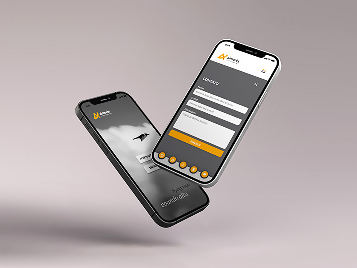
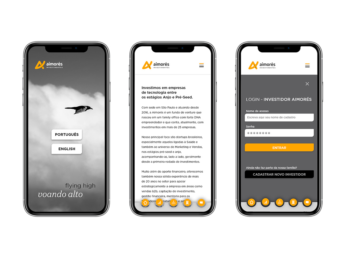
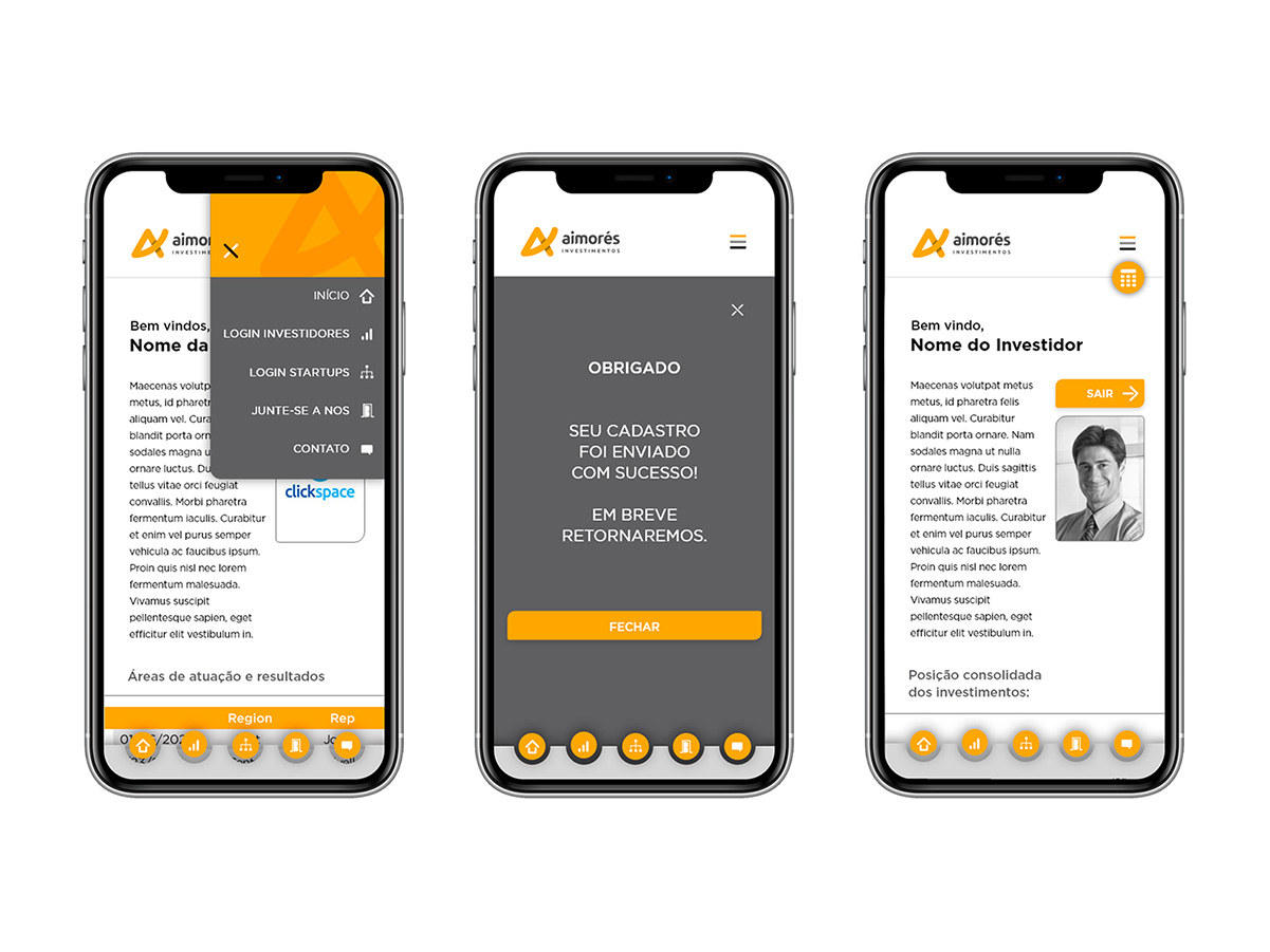
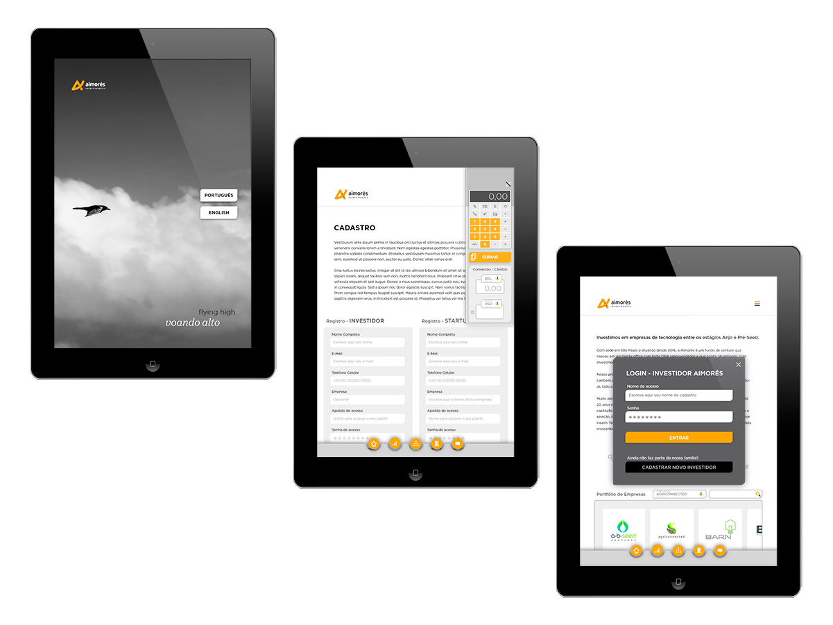
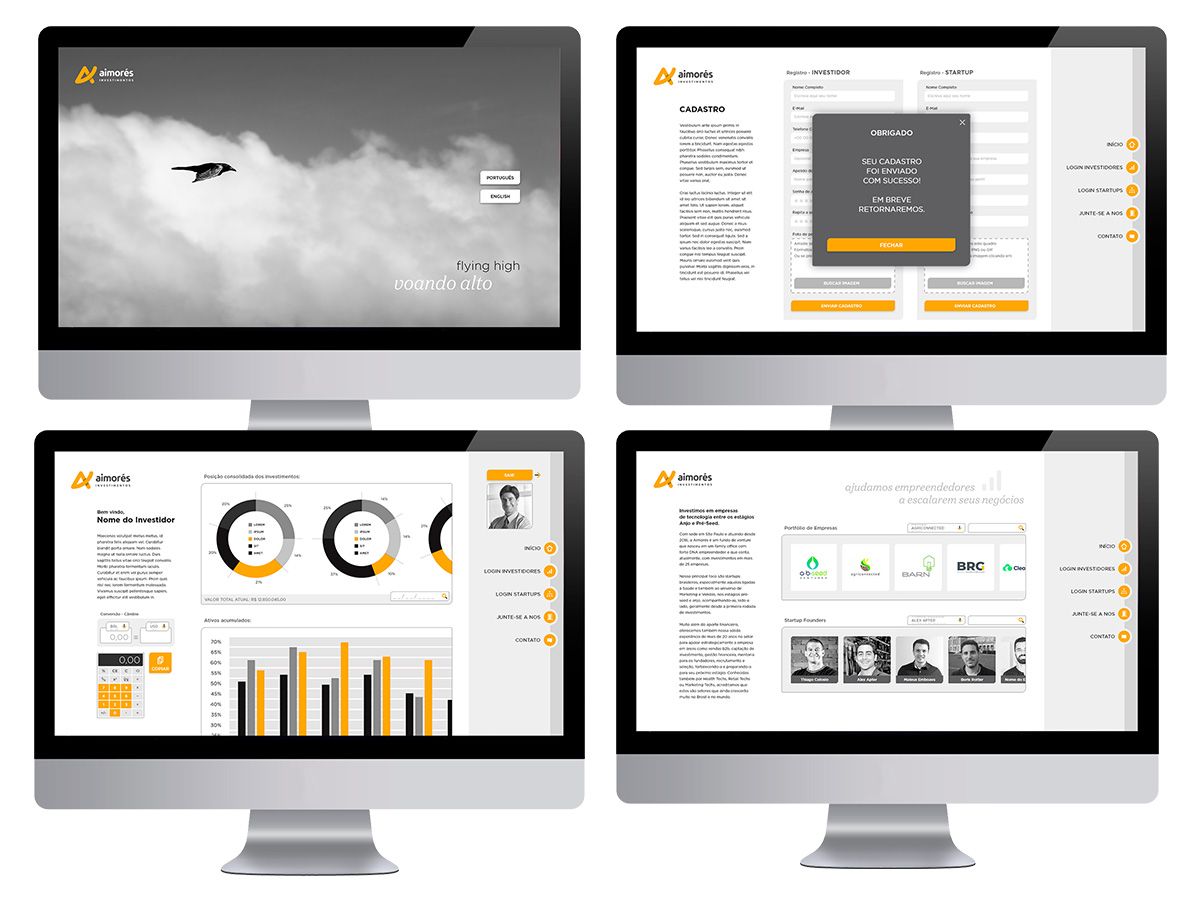
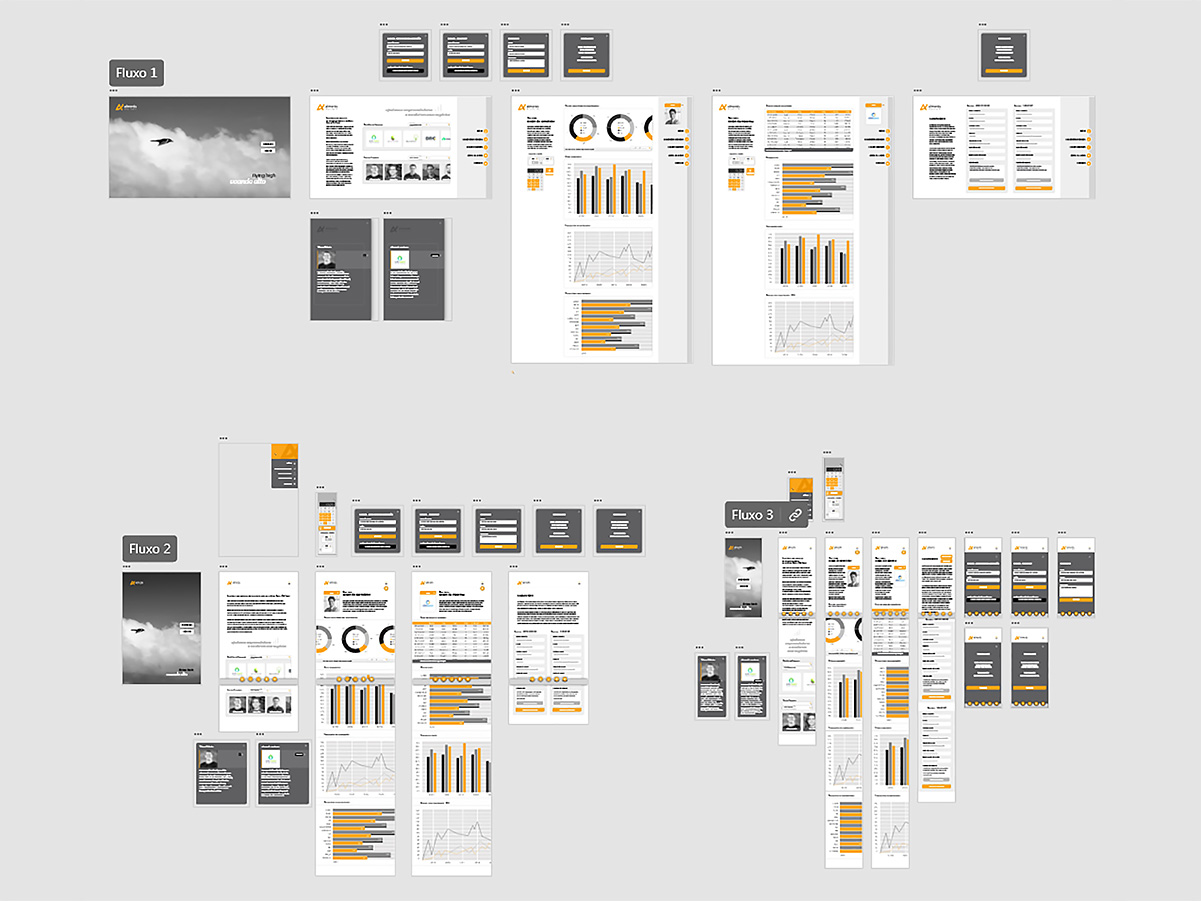
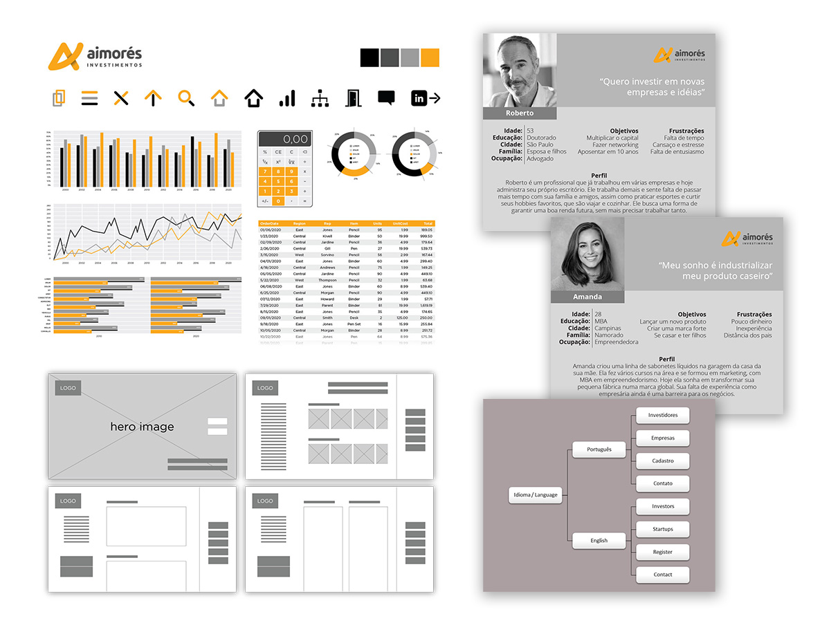
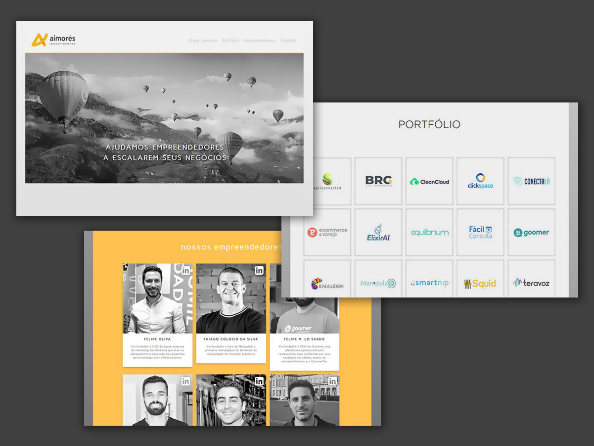
I had the opportunity to lead the brand’s rebranding and, following that, redesign the company’s corporate website. I then developed a clickable prototype, exploring the main user journeys for an app for this investment fund in São Paulo.
Logos aiming to convey solidity and permanence, with more classic lines. Most were developed for logo contests on Freelancer.com.
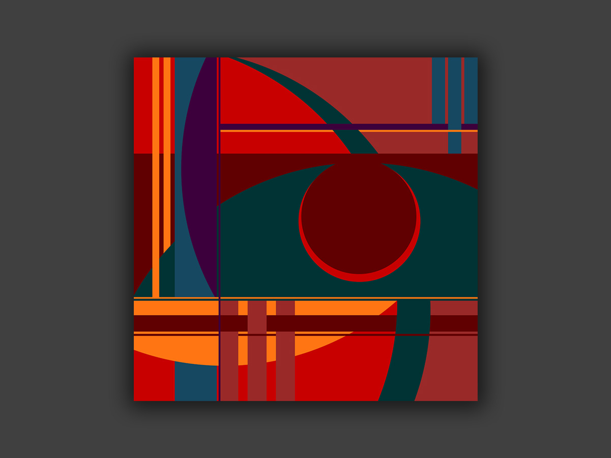
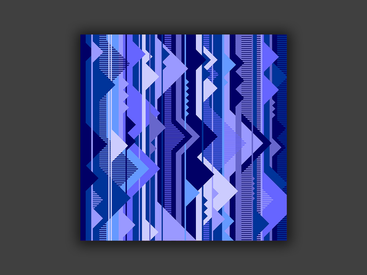
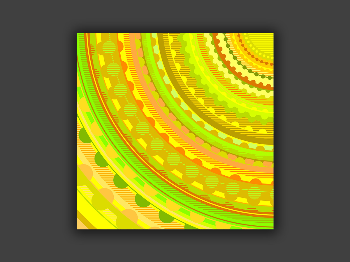
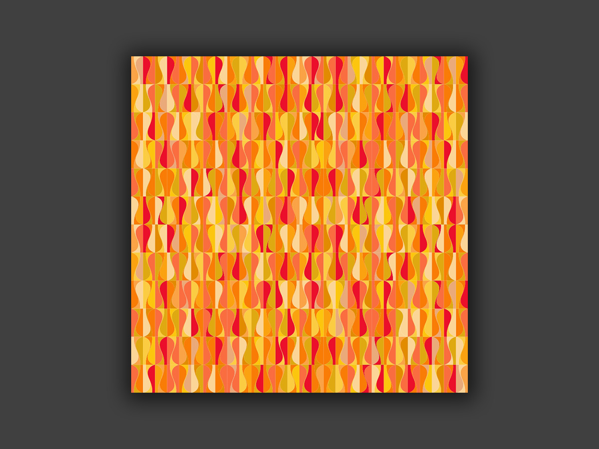
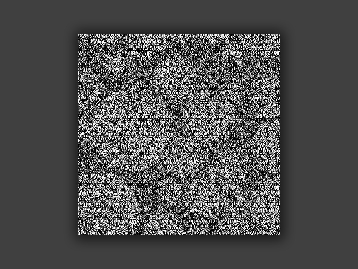
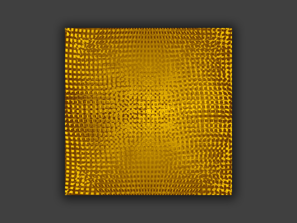
The compositions explore shapes, textures and colors with no direct figurative reference, as a free visual exercise. These pieces are vector-based, so they can be printed as high-quality canvases in any size.
My art can also be seen on this Instagram.
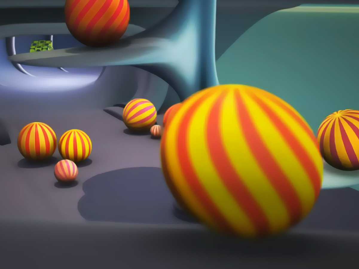
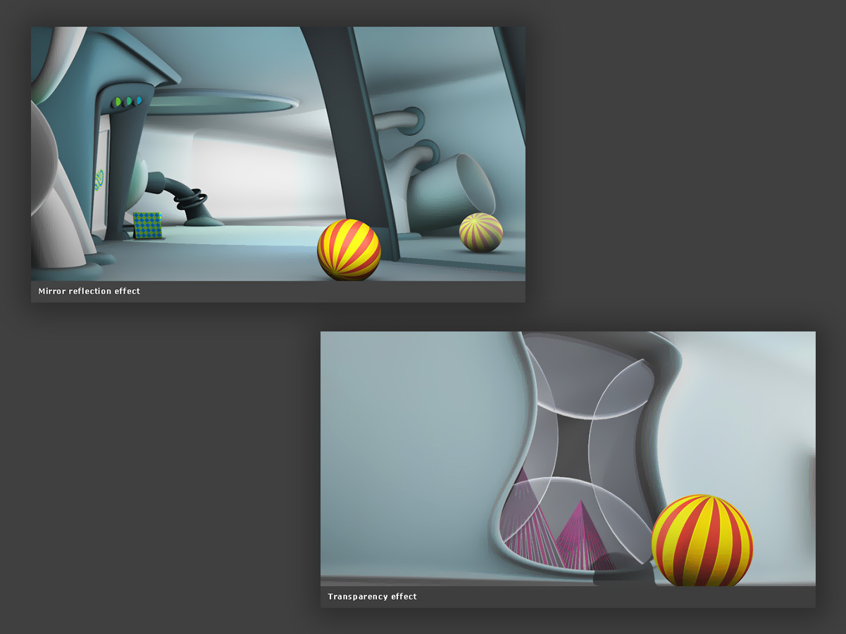
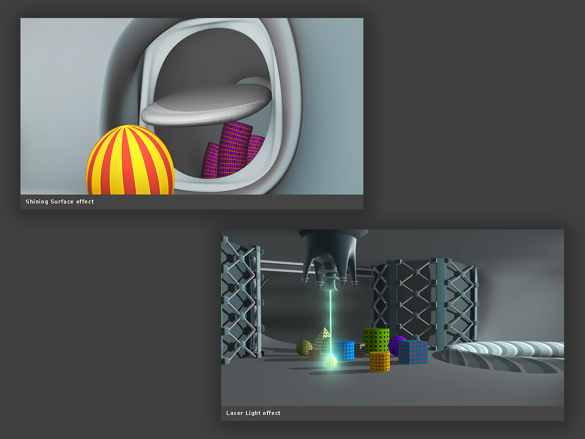
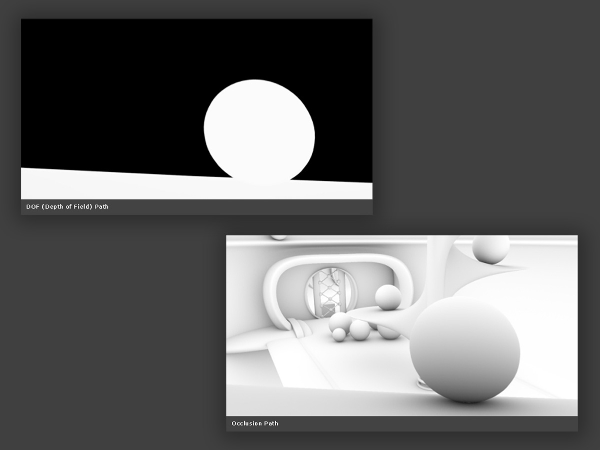
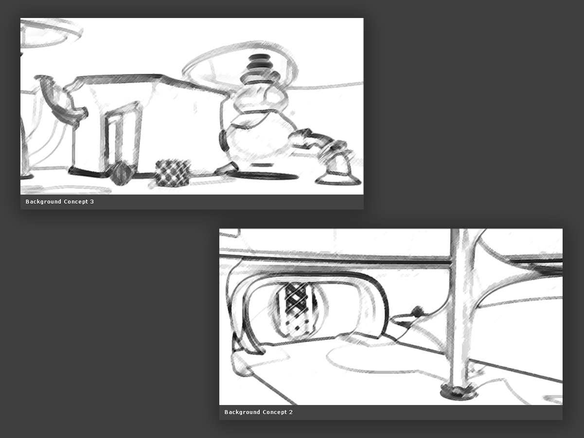
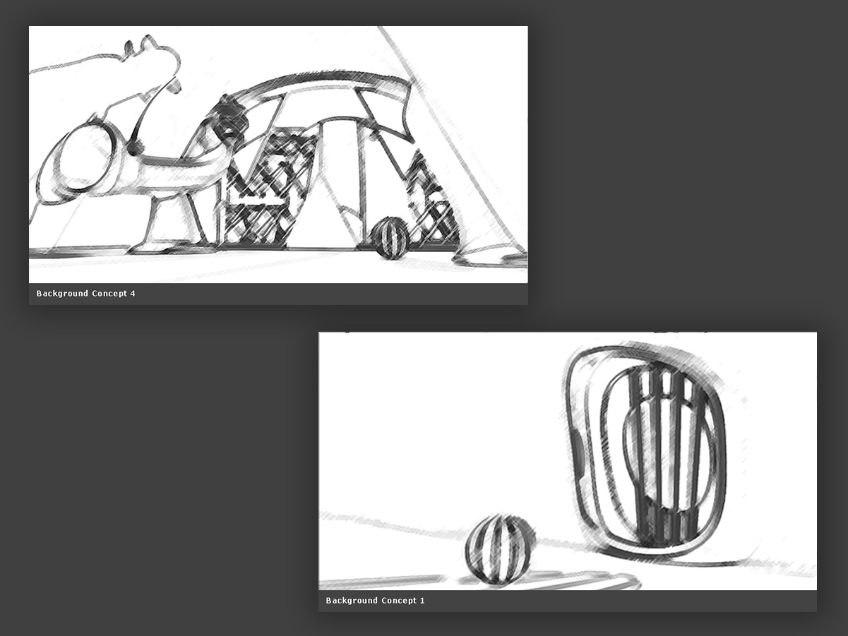
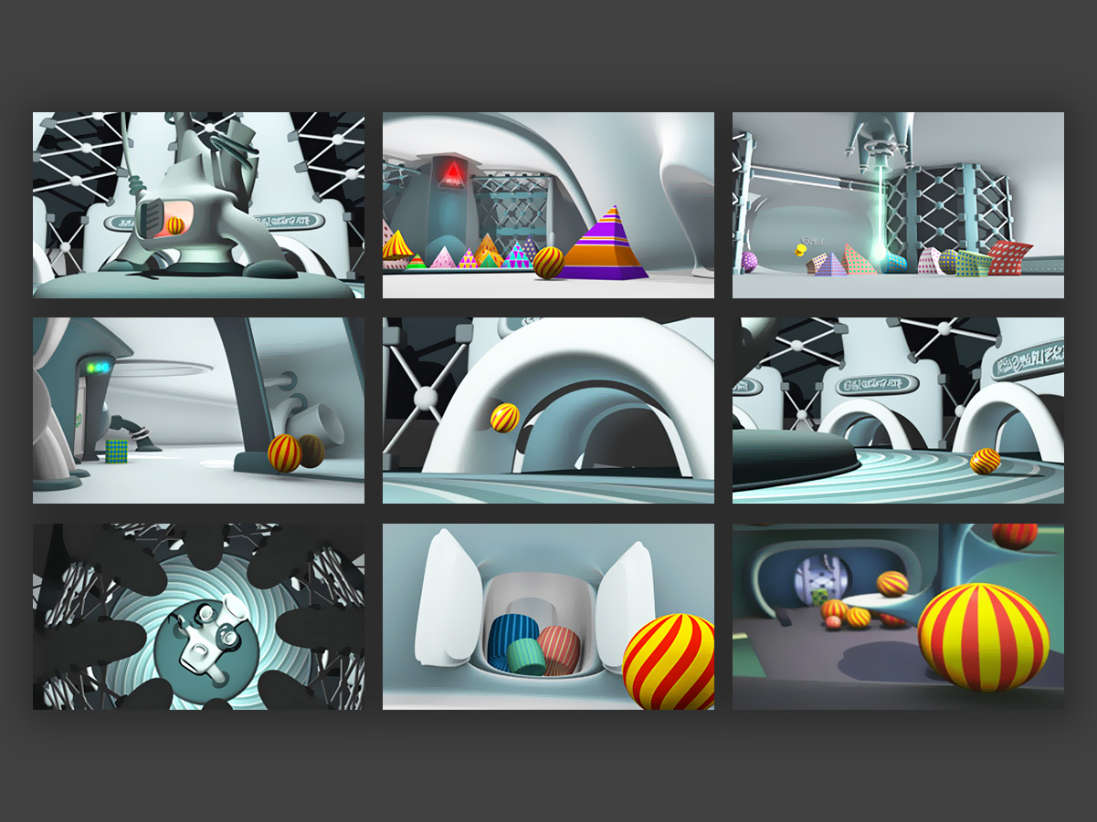
A personal short film about inclusion, made with no commercial ties, as the final project for the Voyage course at Méliès — School of Cinema, 3D and Animation. The program, which lasted over a year, covered every stage of animation production, from the initial script to post-production. At the time, the AI tools available today didn’t exist yet, so the entire project was developed digitally by hand.
Music and Sound Design: Daniel de Lucca / danielkdelucca@hotmail.com
The full film can be watched in this video.
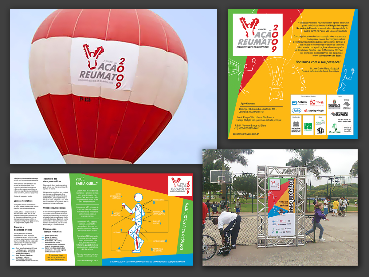
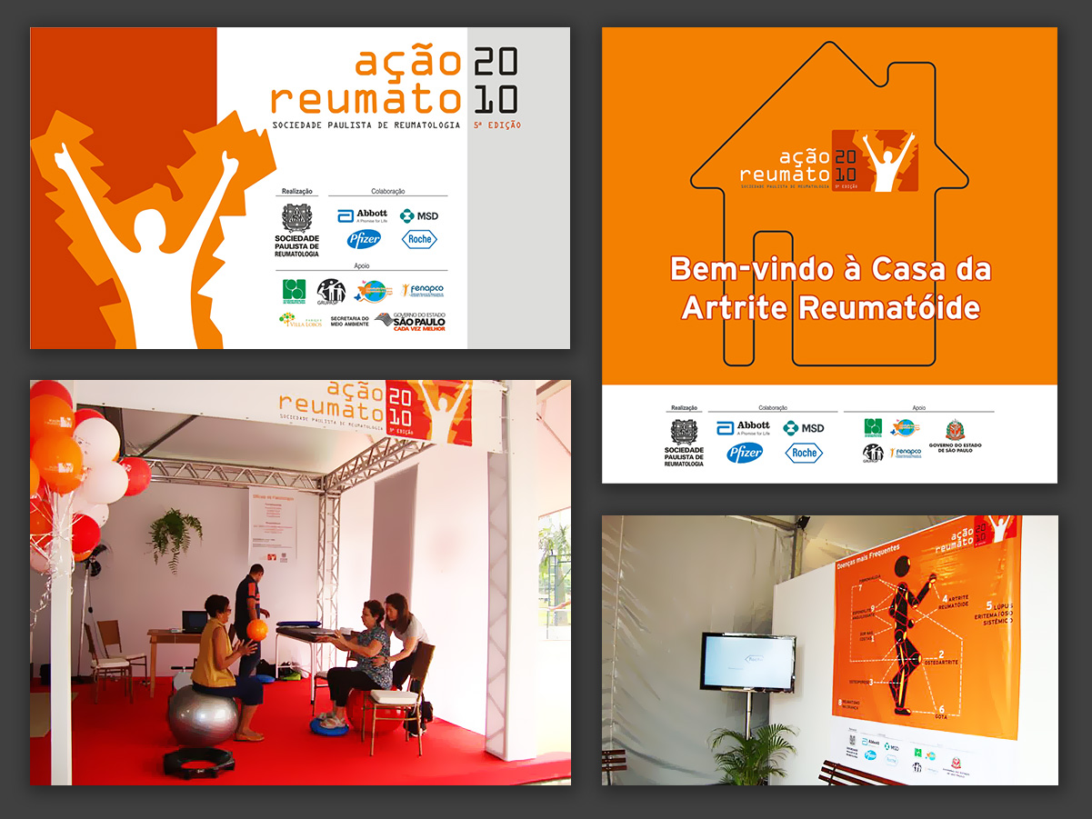
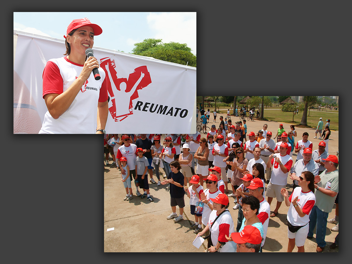
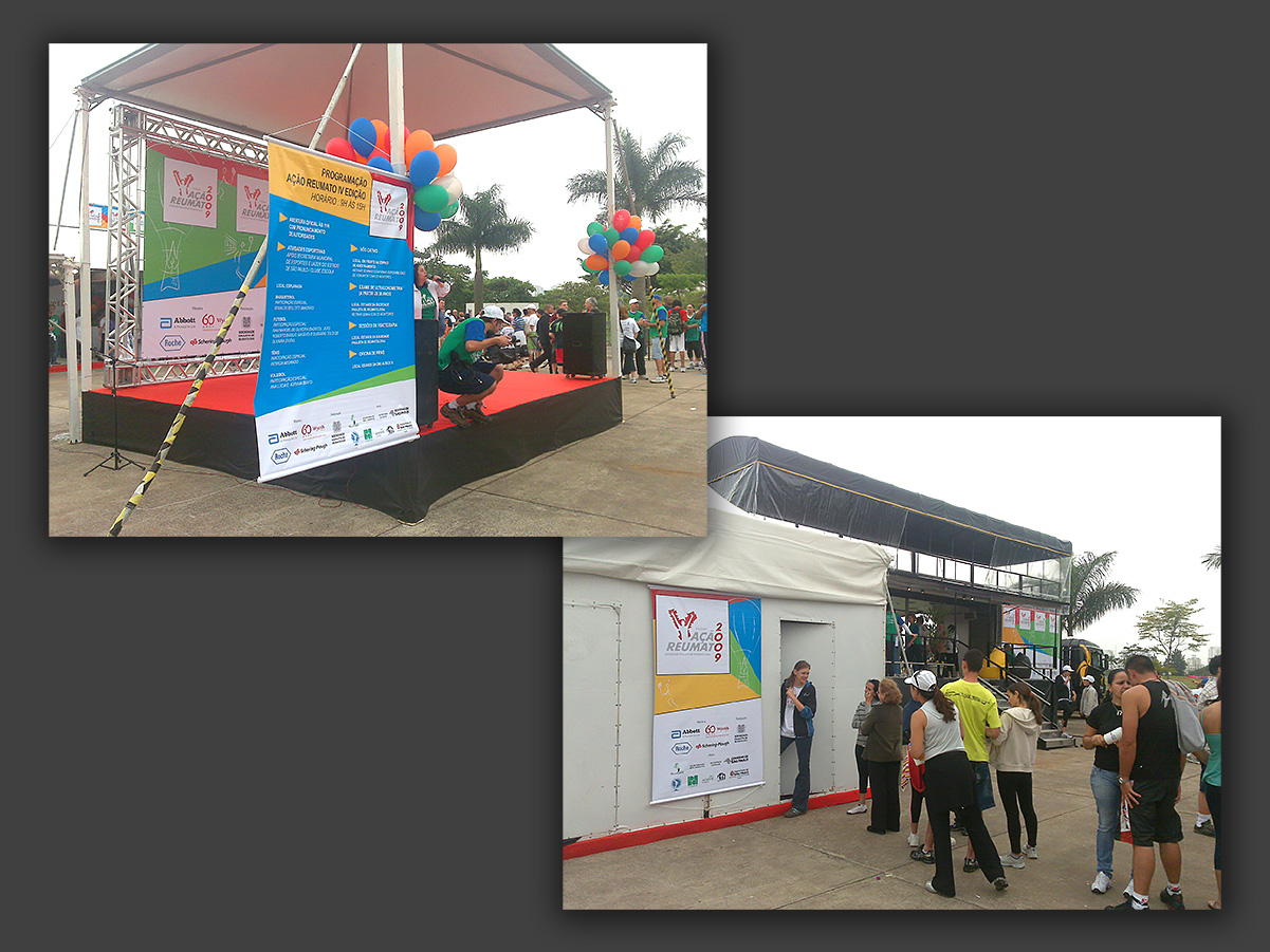
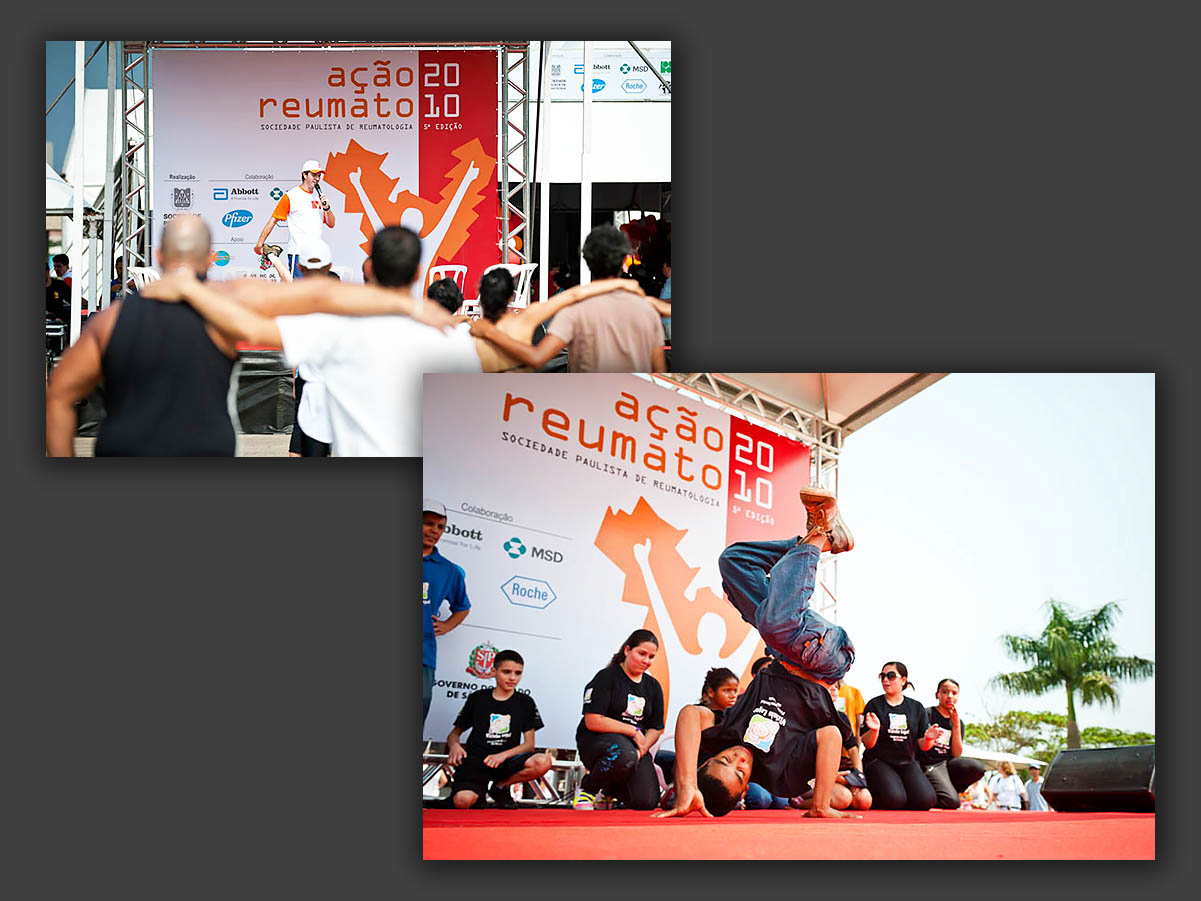
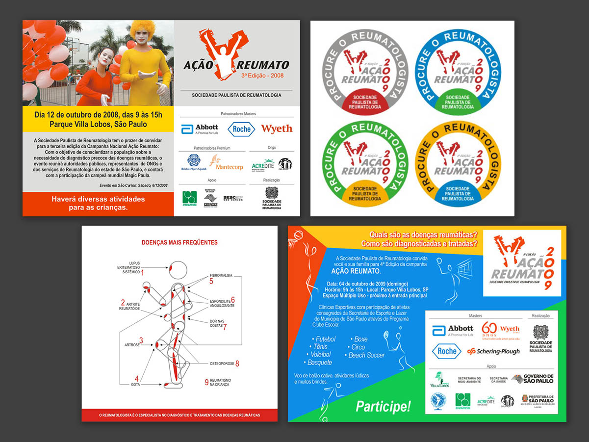
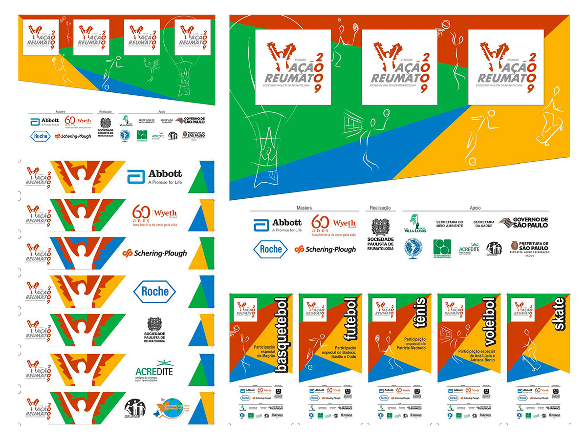
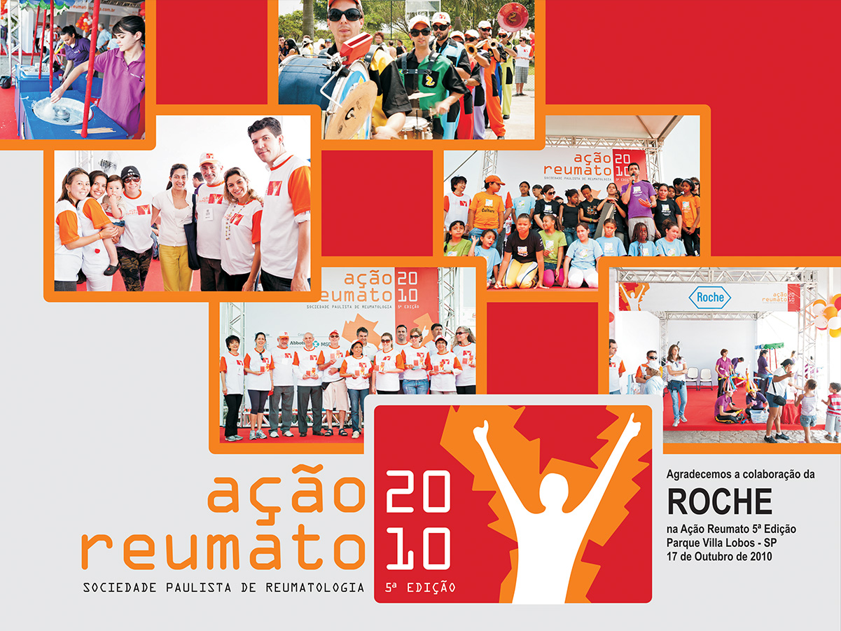
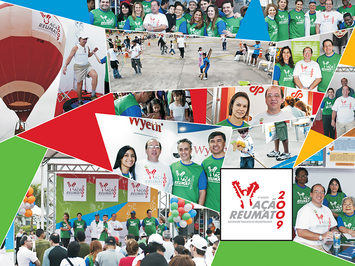
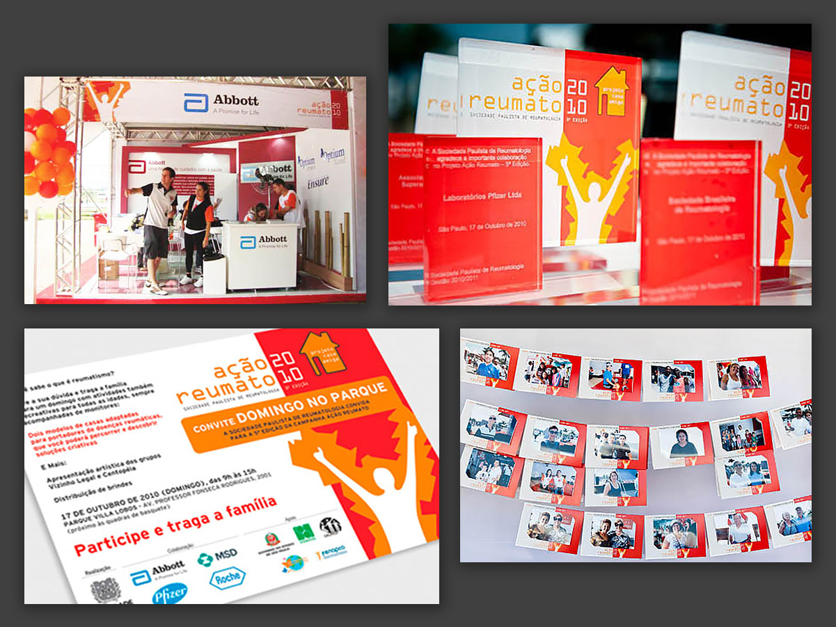
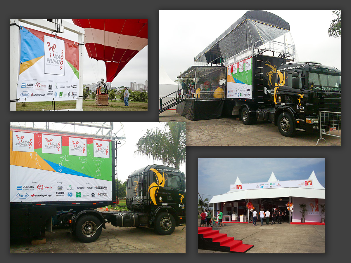
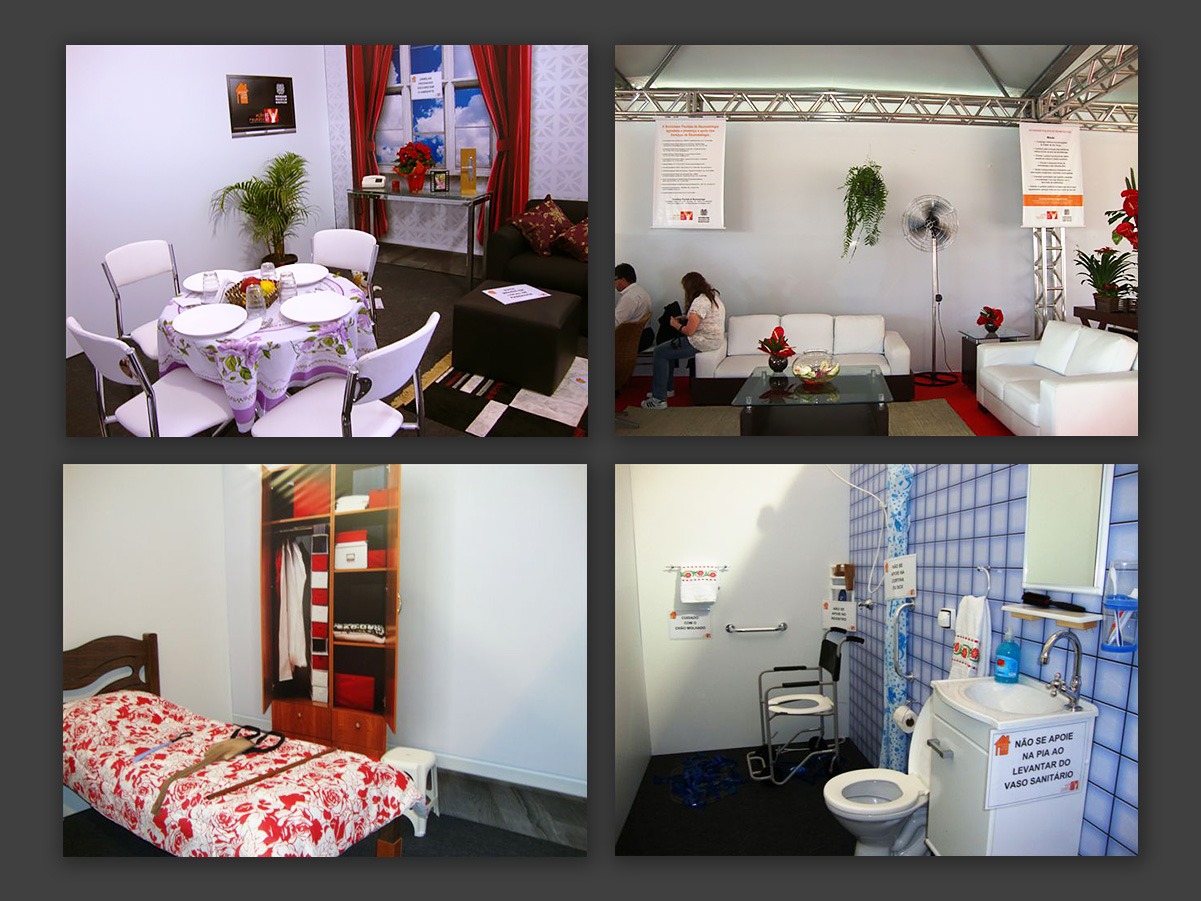
The Ação Reumato (Rheumatic Action) event took place at Parque Villa-Lobos, in São Paulo, and I took part in it for three years, developing everything from the visual identity to the event’s full communications, including print and digital materials, promotional items and signage.
Besides the sports activities, the event featured areas dedicated to exams and screenings to help identify possible rheumatic conditions.
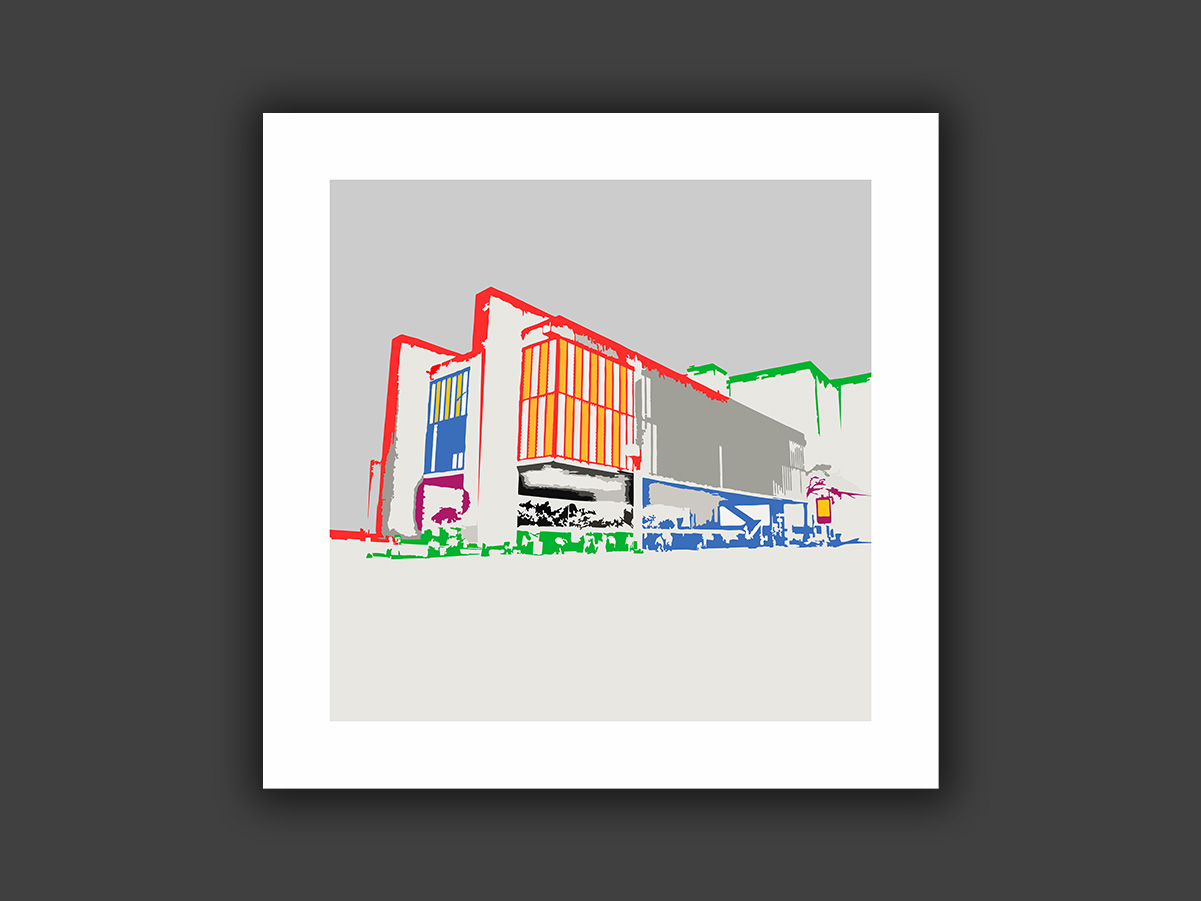
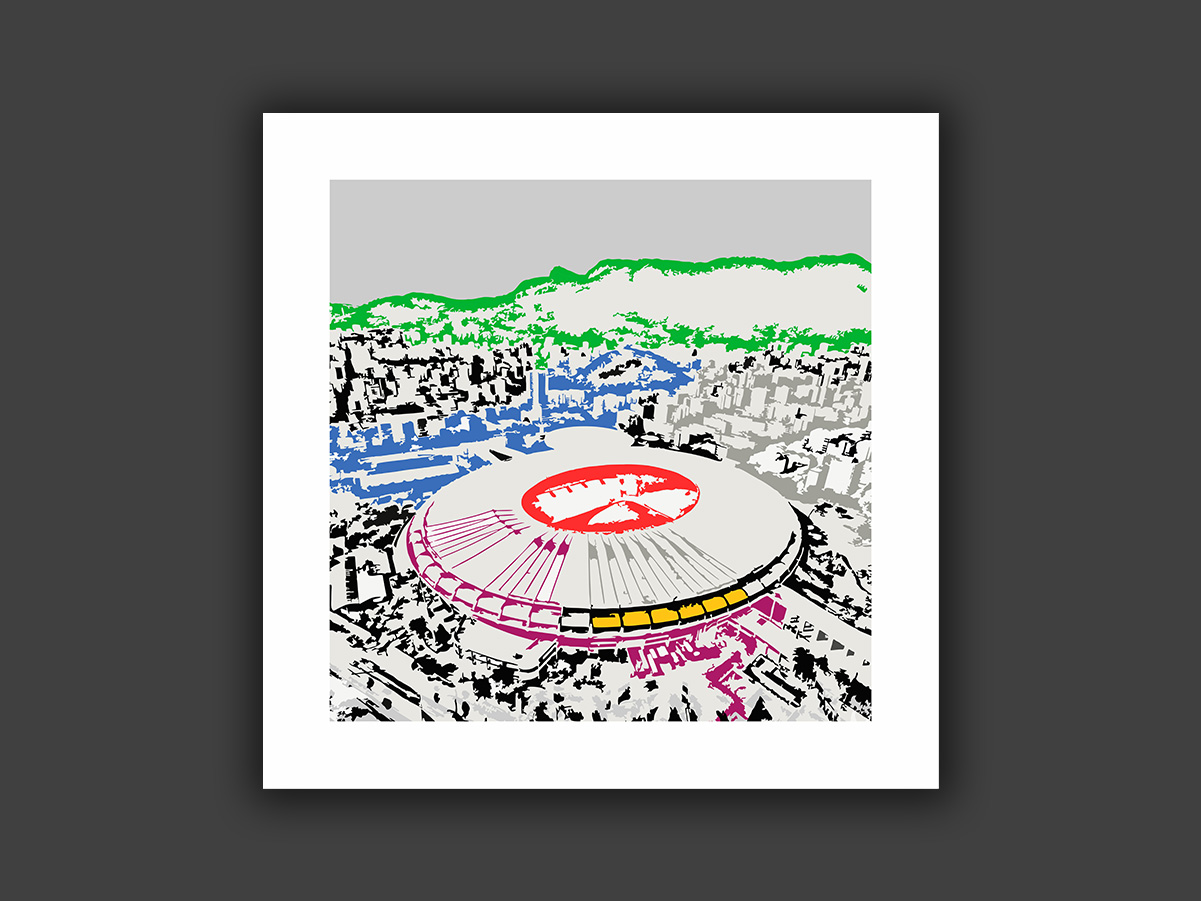
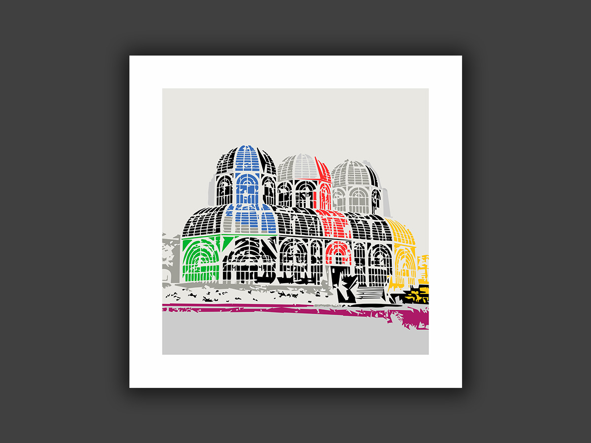
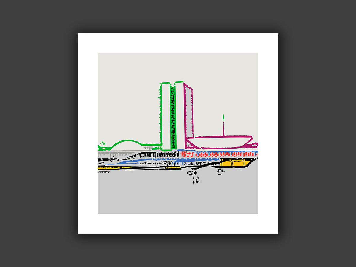
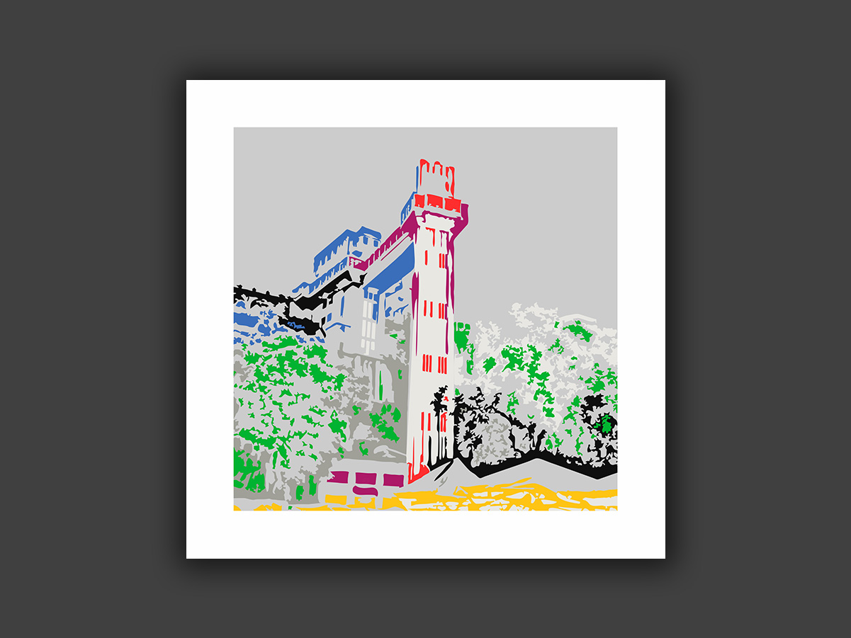
Personal compositions inspired by photographs of major Brazilian architectural landmarks, such as MASP in São Paulo, the Maracanã stadium in Rio de Janeiro, the Crystal Palace in Curitiba, the Palácio do Planalto in Brasília, and the Lacerda Elevator in Salvador. The images were reinterpreted through painting, exploring shapes, colors and architectural elements from a personal perspective.
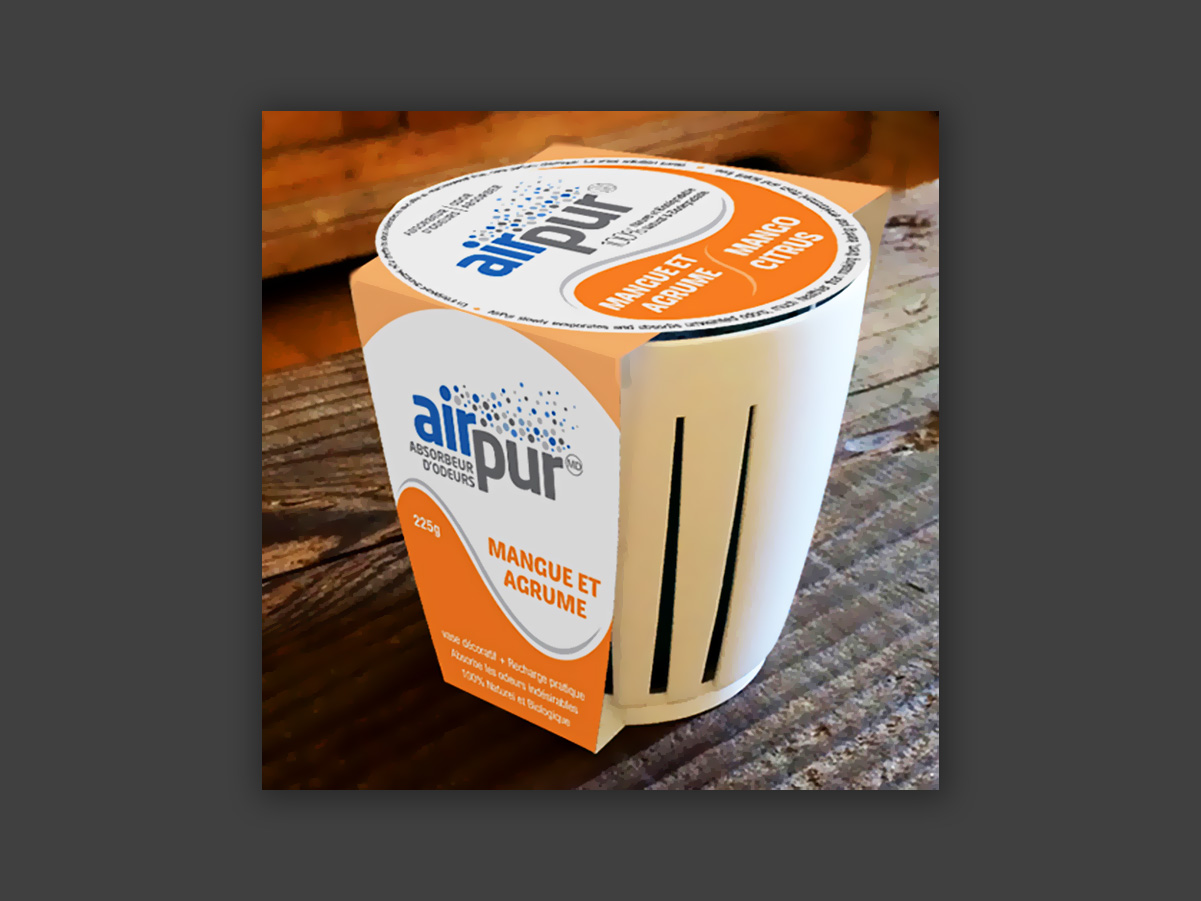
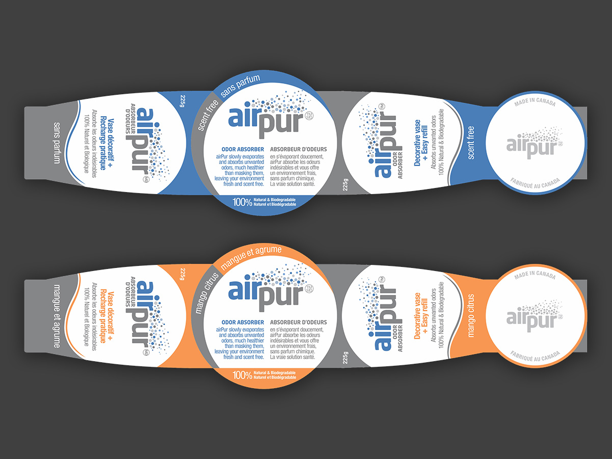
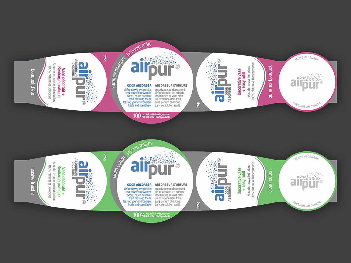
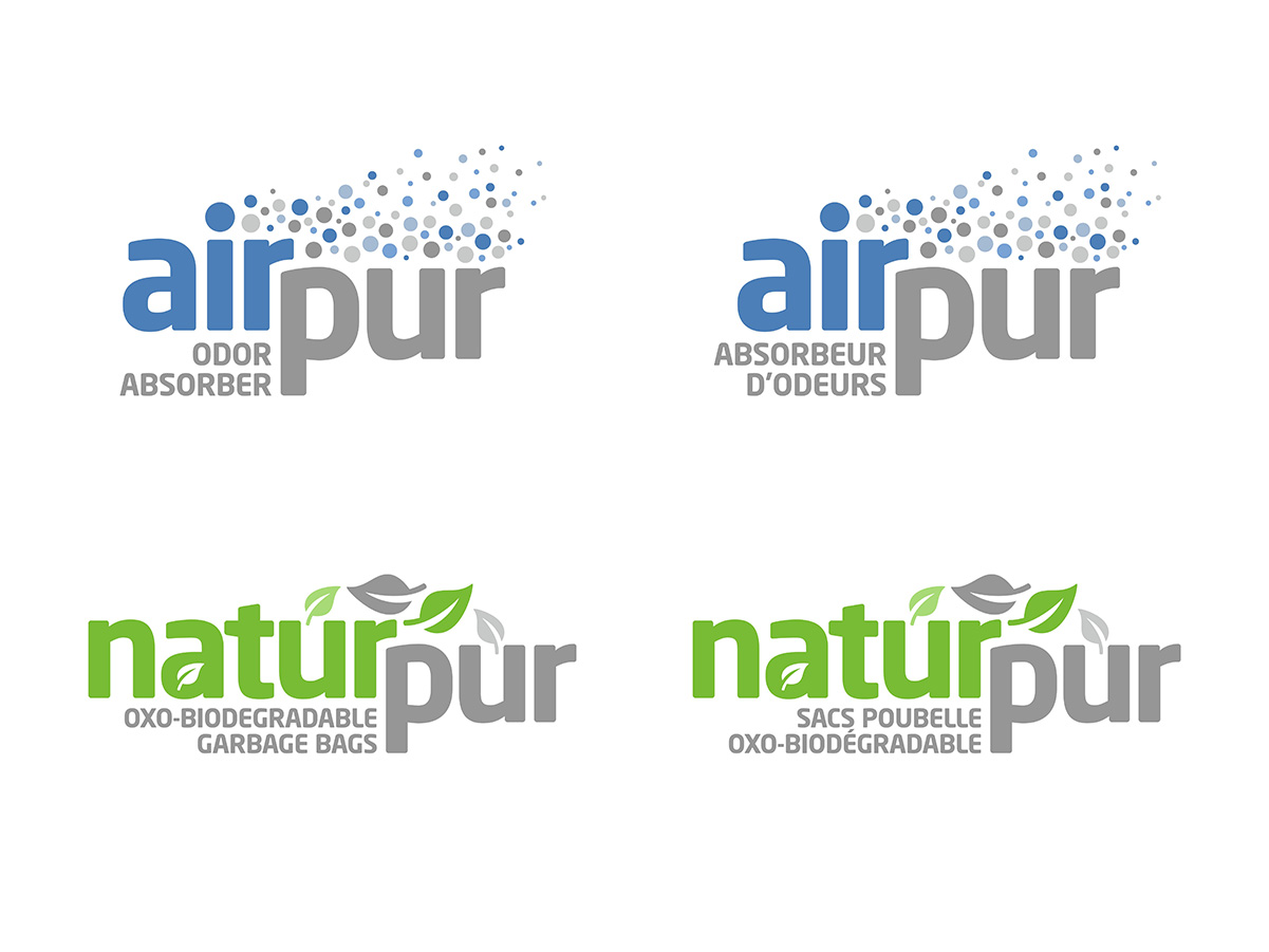
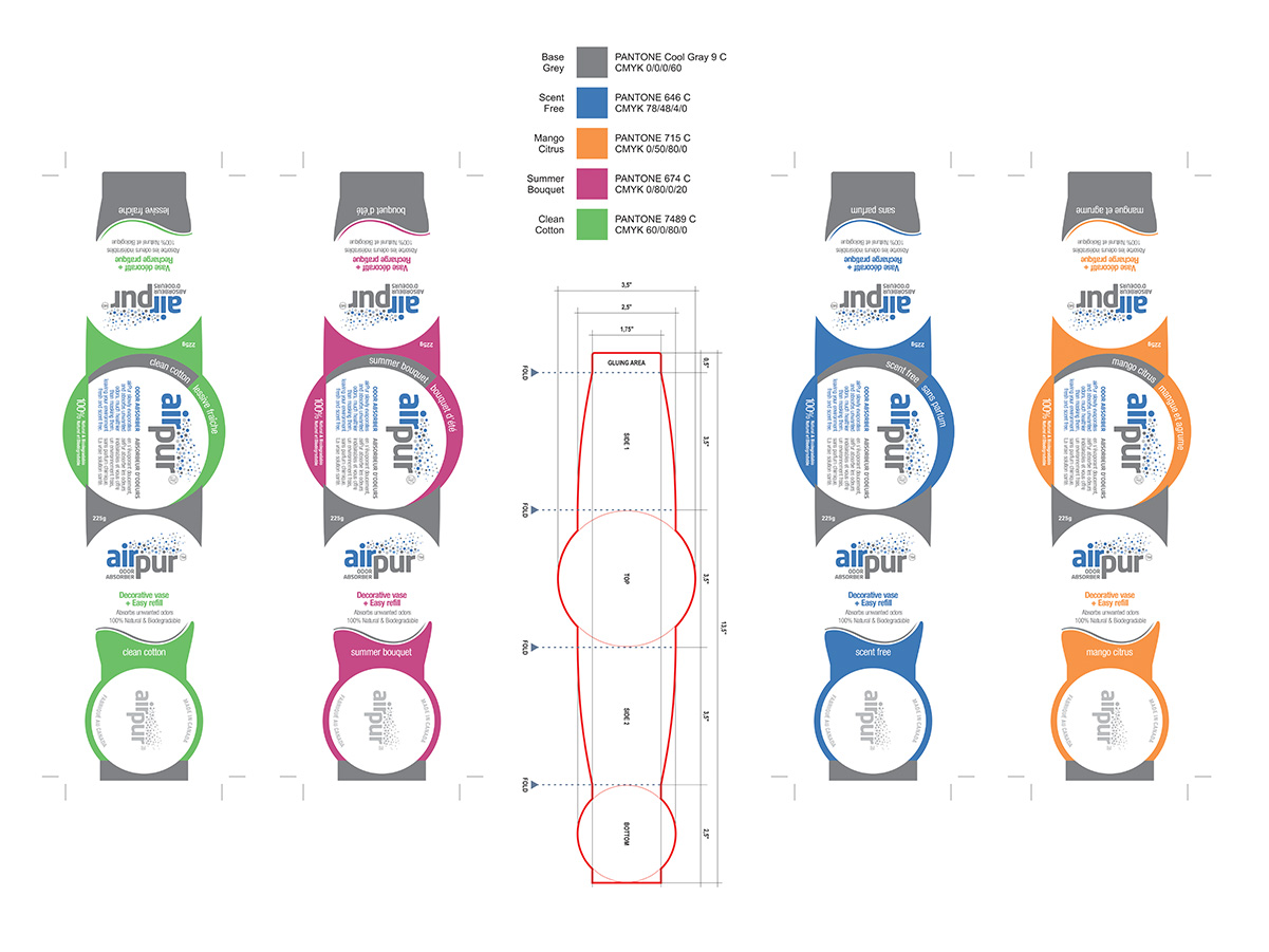
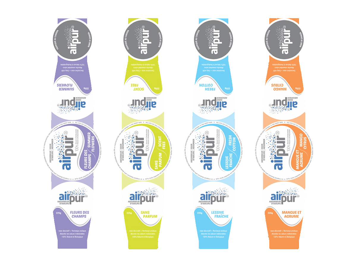
Logo design for a line of products focused on air purification and quality. The project came from a visual identity contest on Freelancer.com, where I was chosen to develop the Airpur brand, in English and French versions (the client was Canadian). Following that, I was hired directly to create Naturpur, also bilingual, along with its packaging labels.
Logos that bring together graphic elements and the company name in an integrated way, balancing the two. Most were developed for logo contests on Freelancer.com.
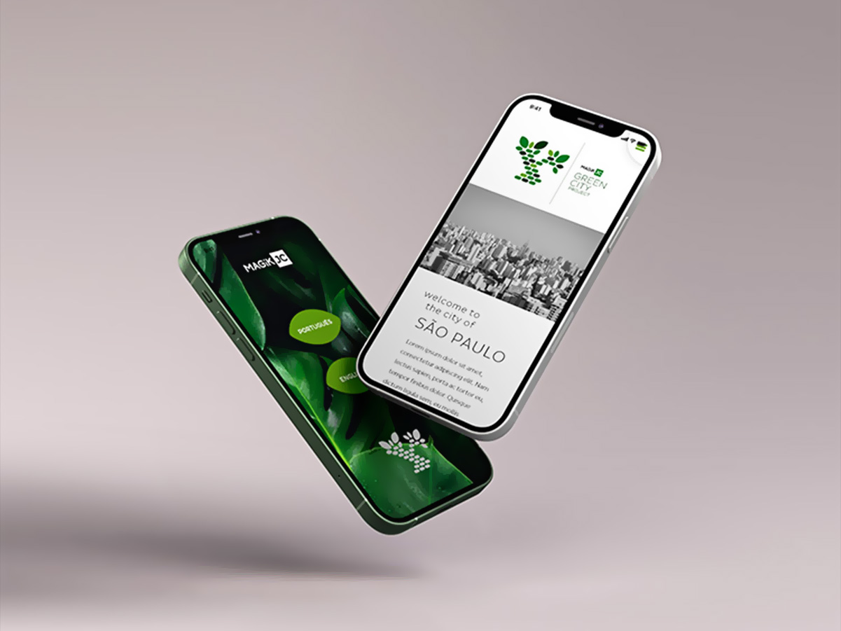
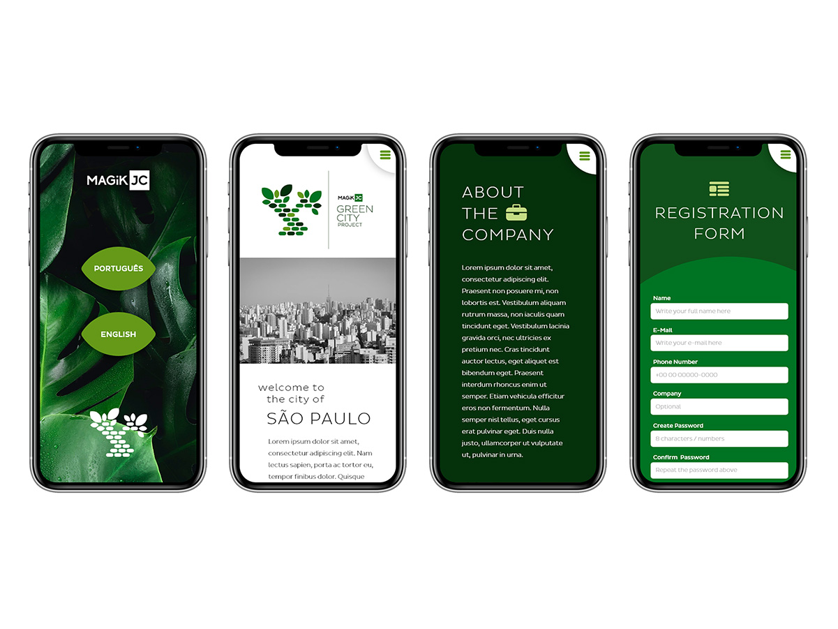
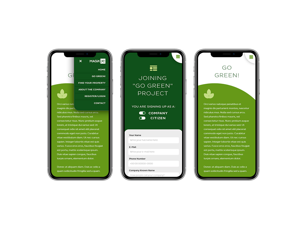
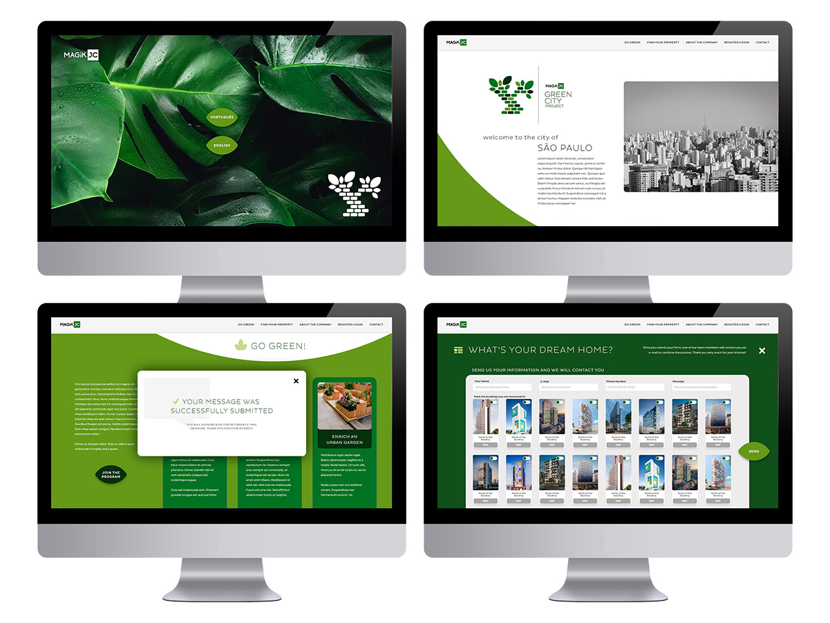
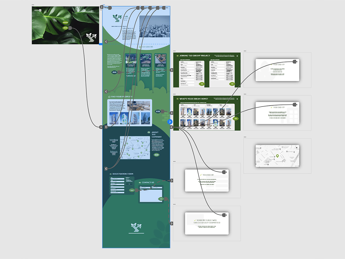
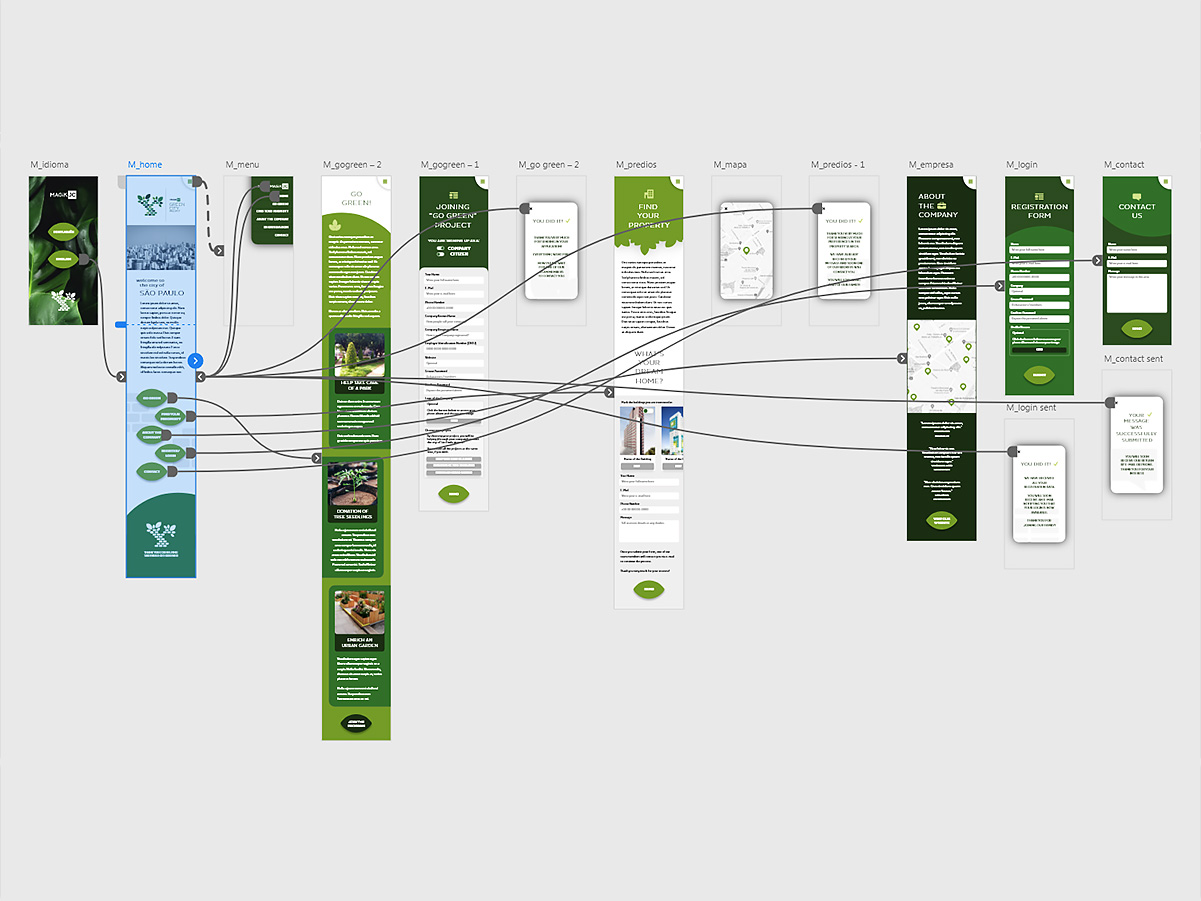
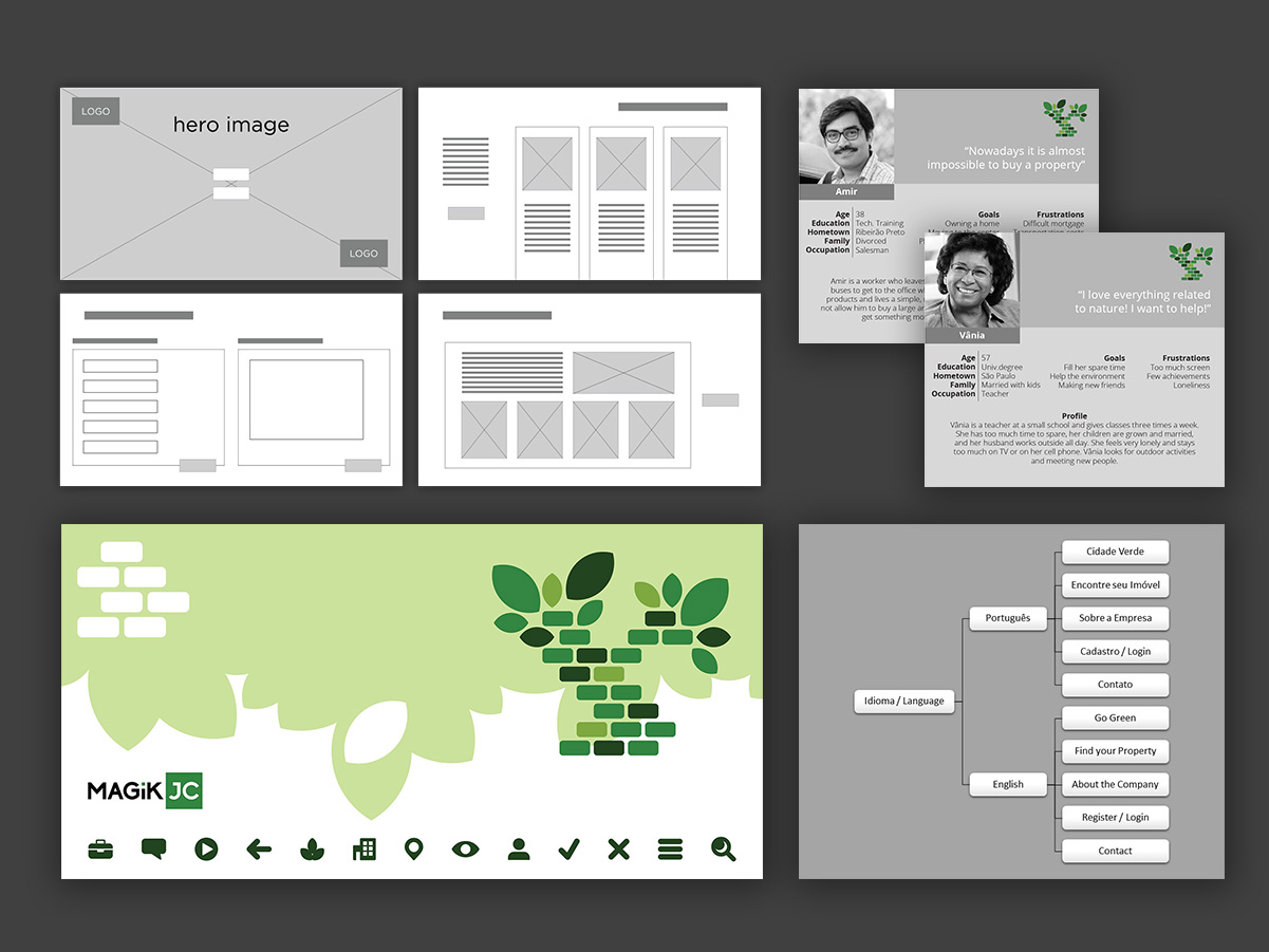
UX/UI project for Go Green, an initiative by the company MagikJC, including the creation of a dedicated logo for the project, defining screens and navigation flows, and developing prototypes for mobile and desktop.
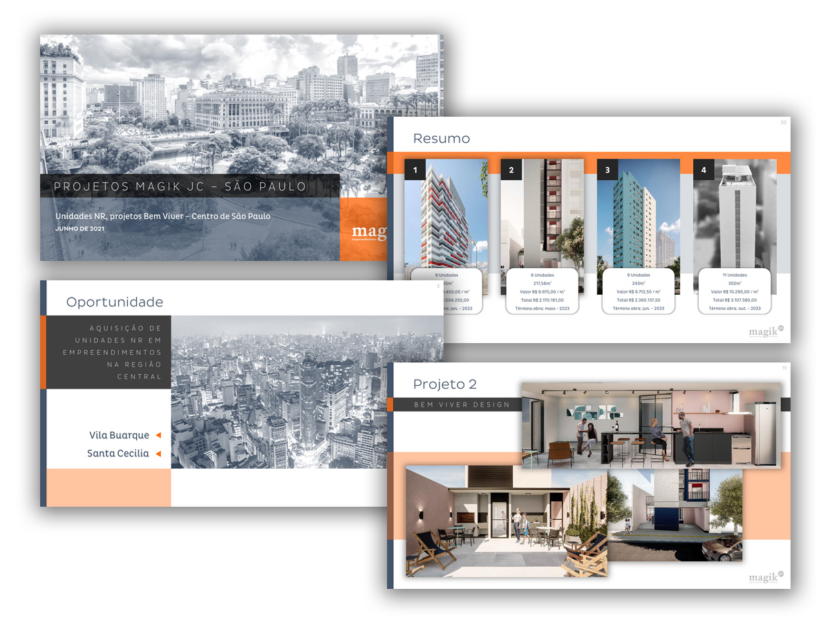
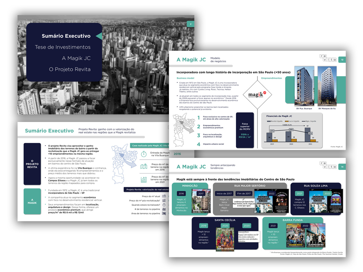
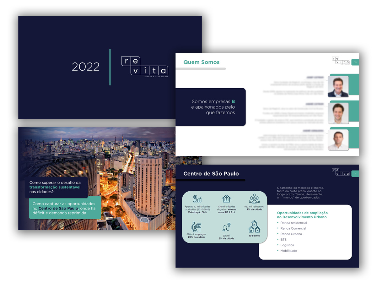
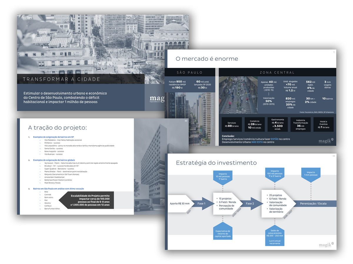
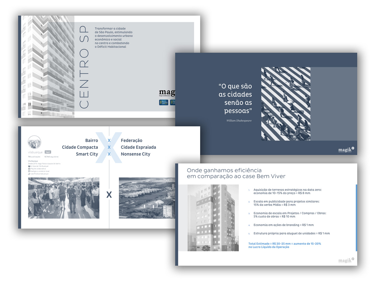
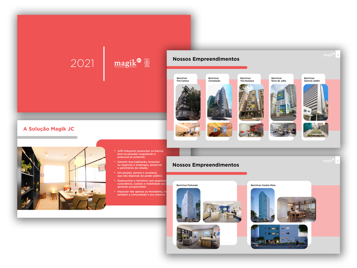
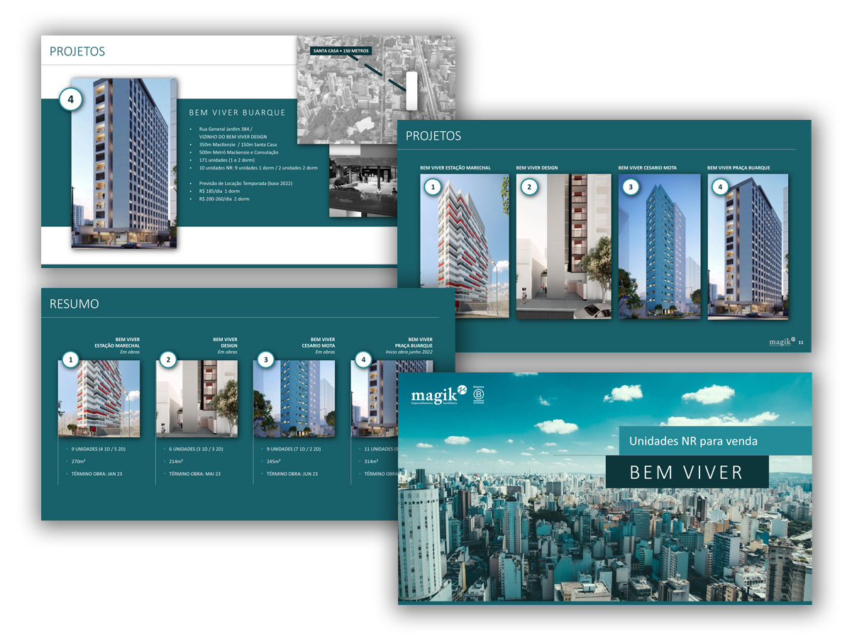
A system of institutional slides developed to support the company’s sales presentations — focused on sales, marketing and the developer’s internal HR department.
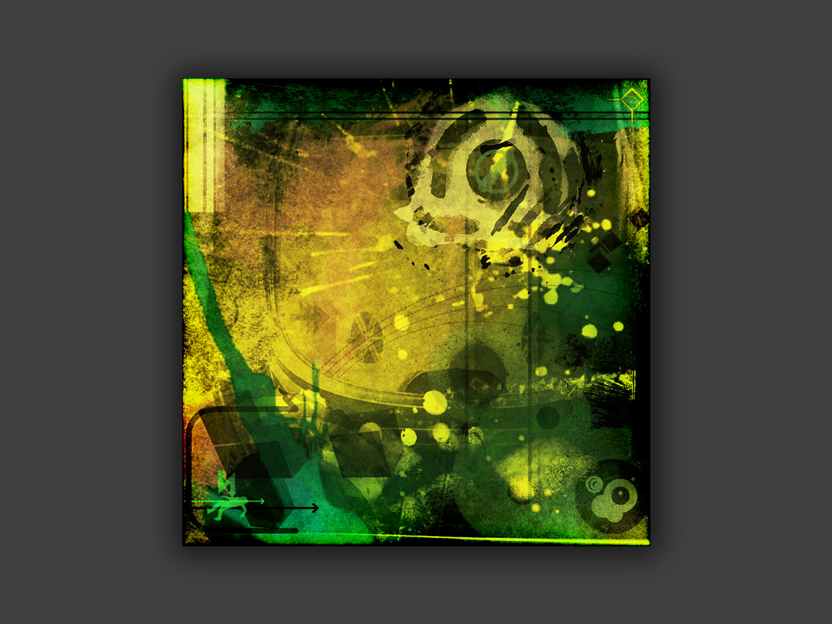
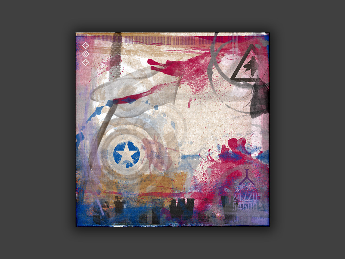
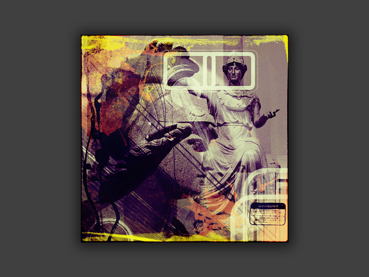
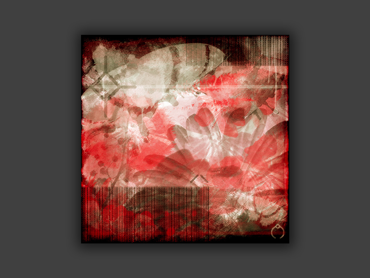
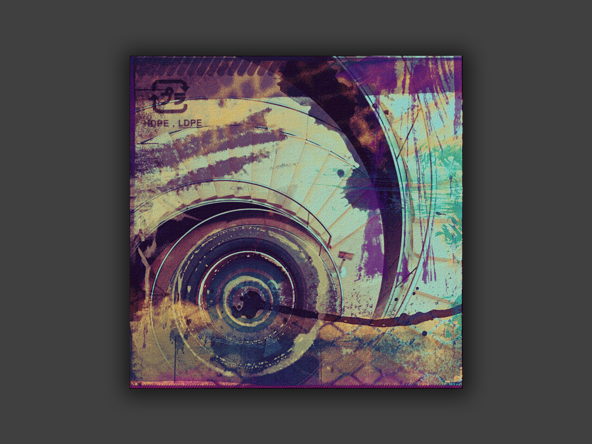
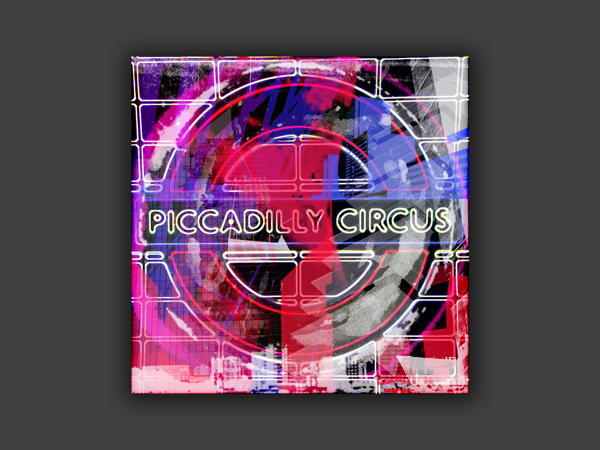
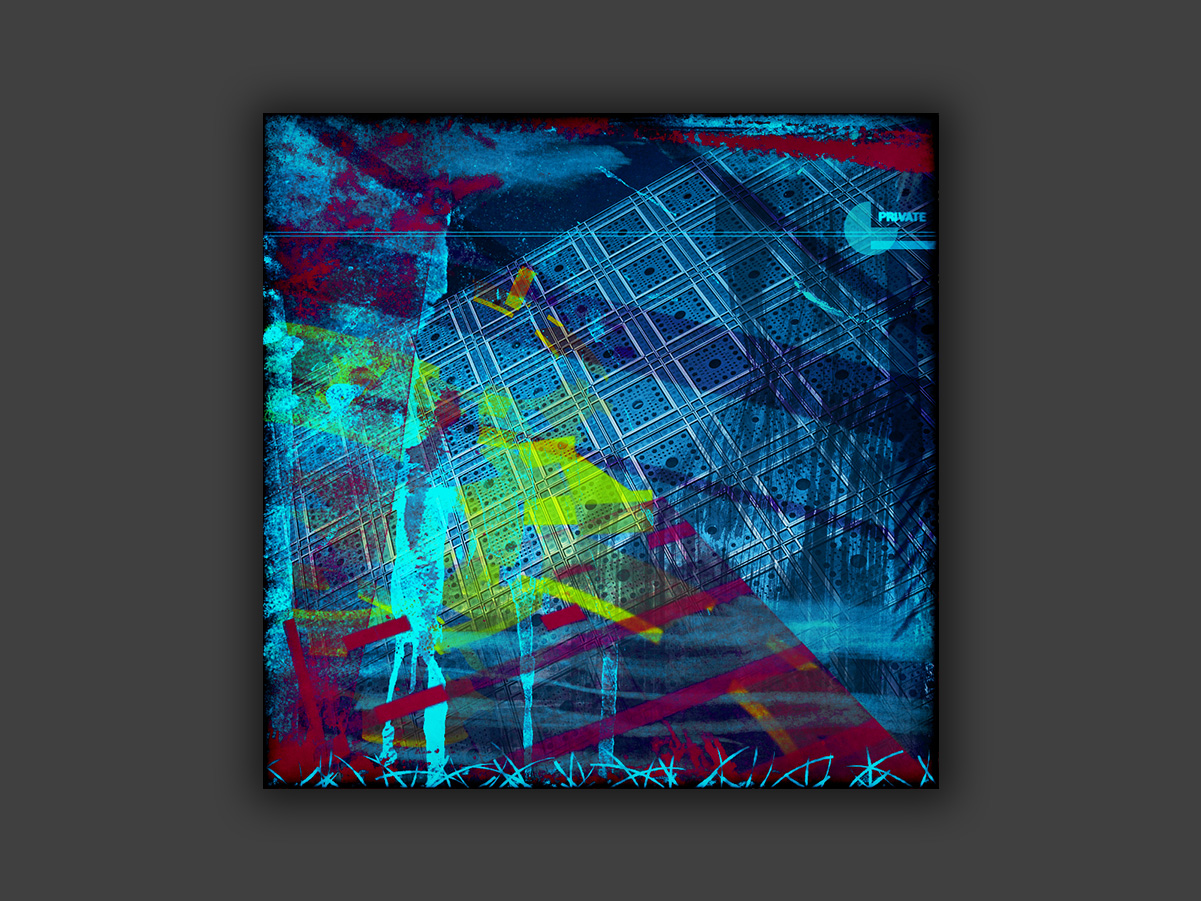
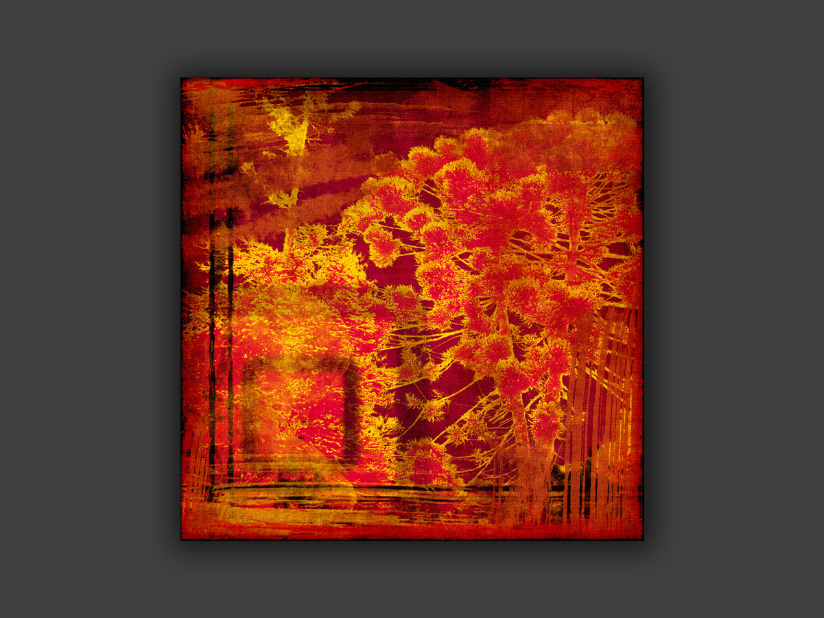
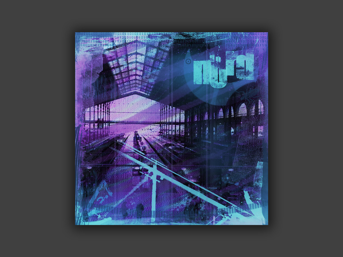
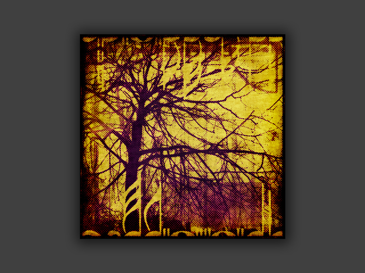
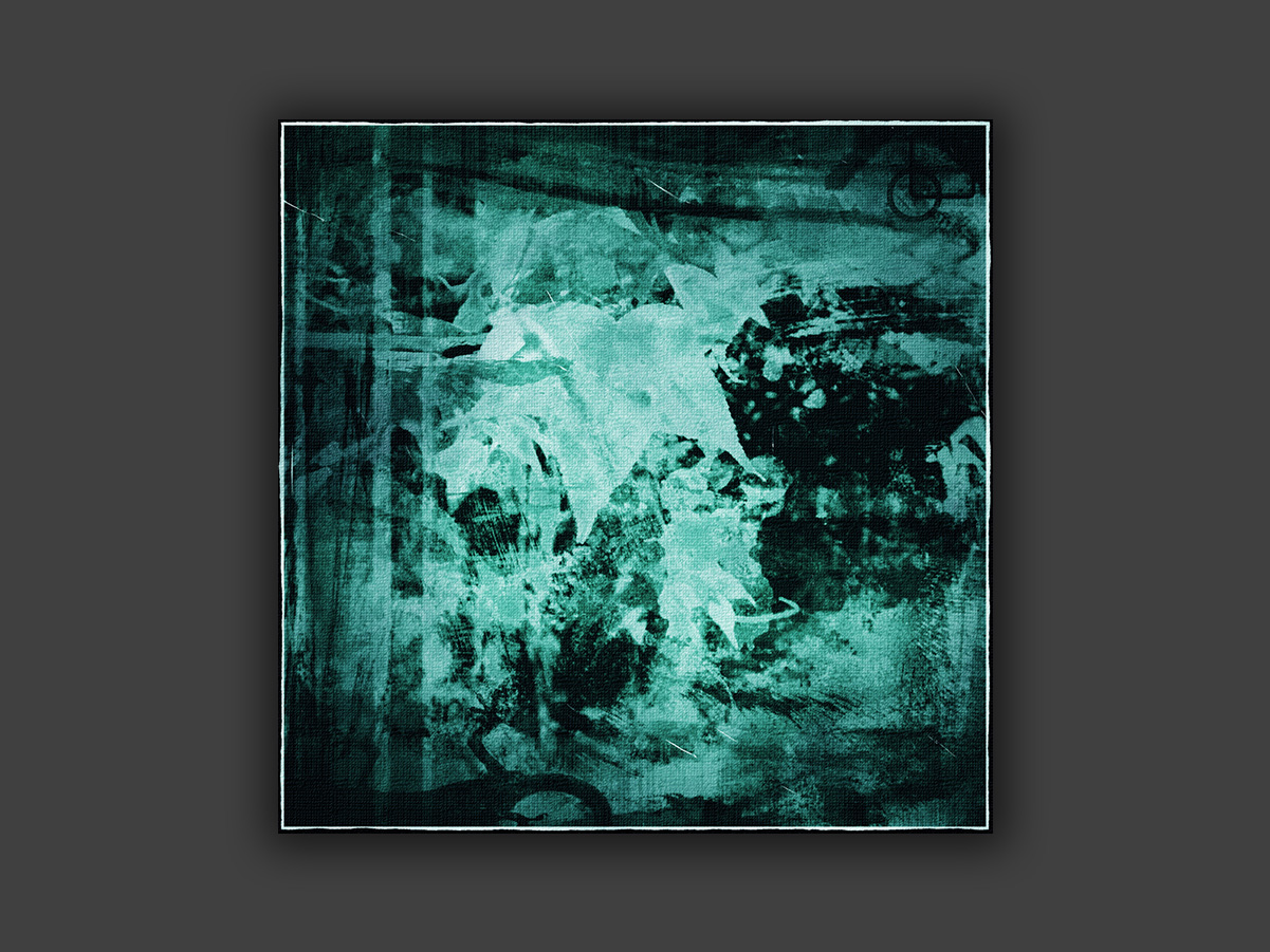
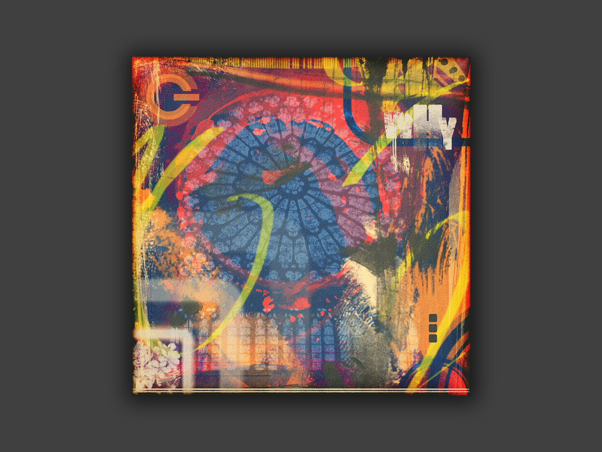
Pieces that start from existing photographs and elements, digitally recombined into new compositions.
Produced in low resolution, without the quality needed for canvas printing.
My art can also be seen on this Instagram.
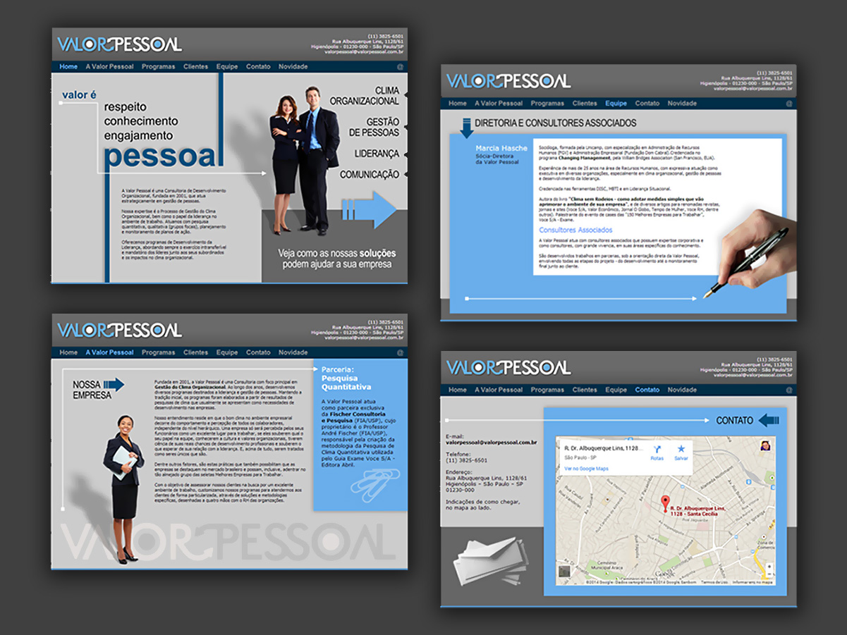
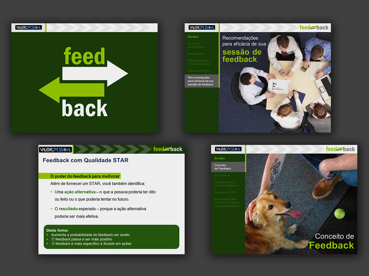
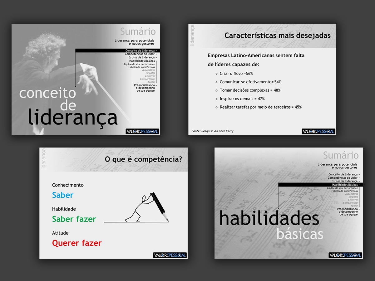
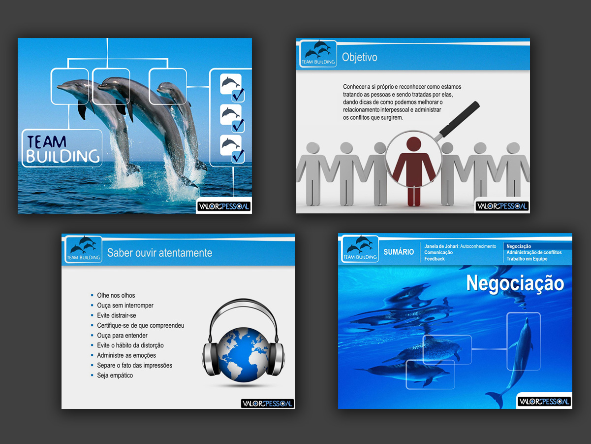
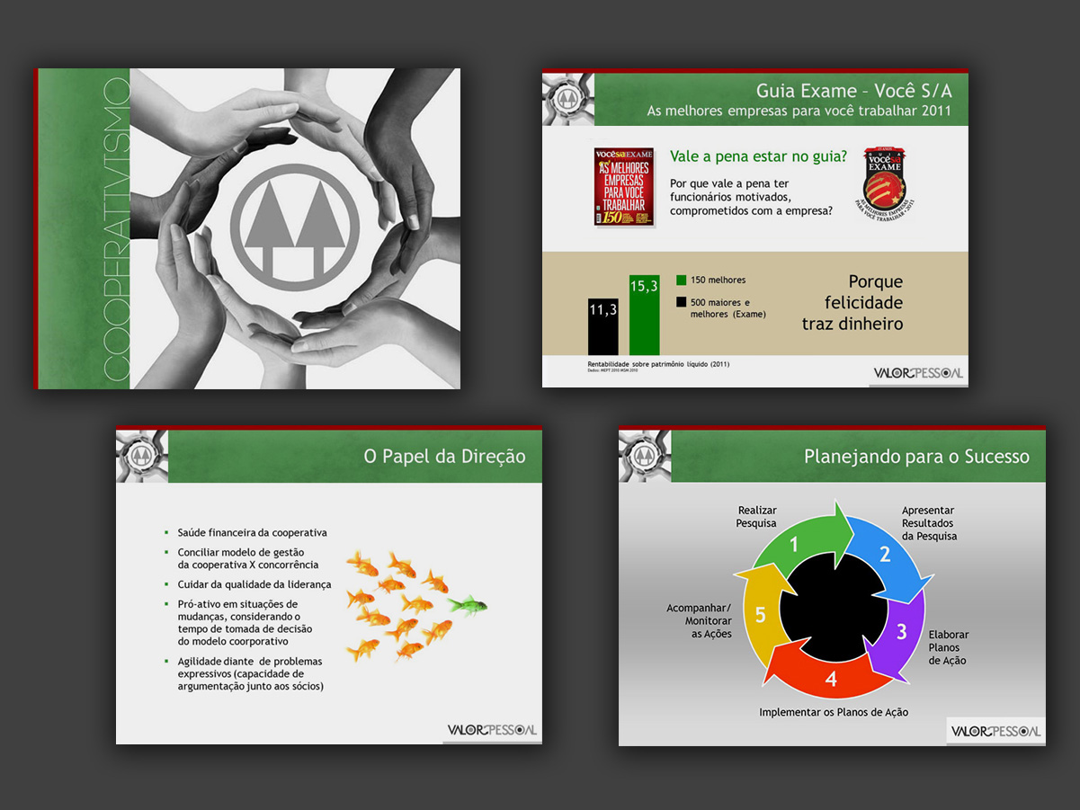

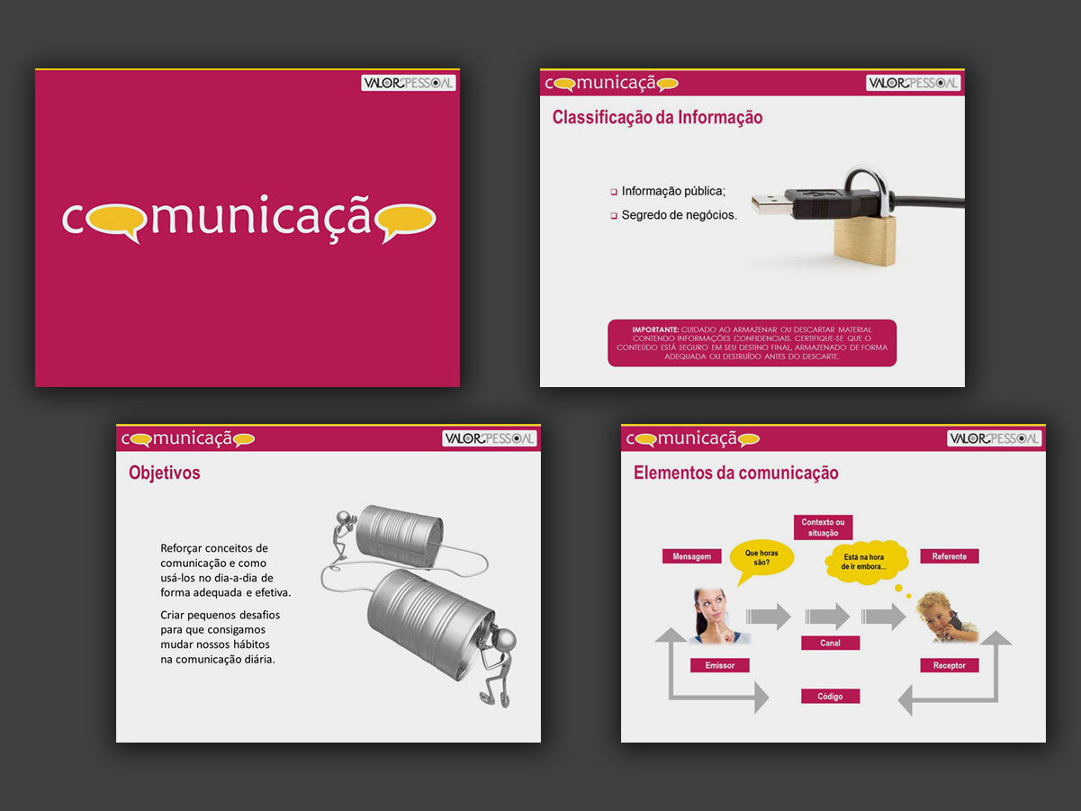
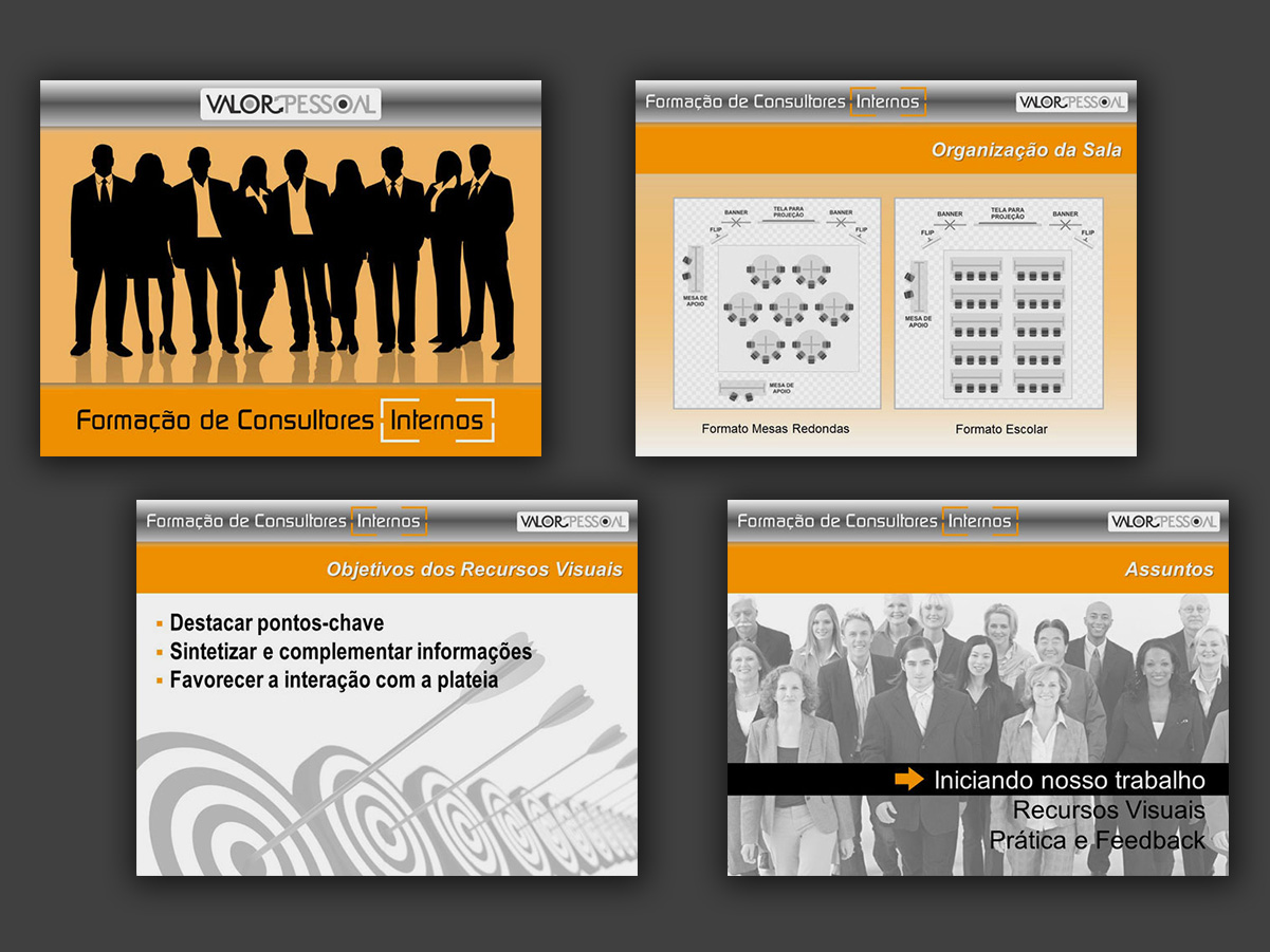
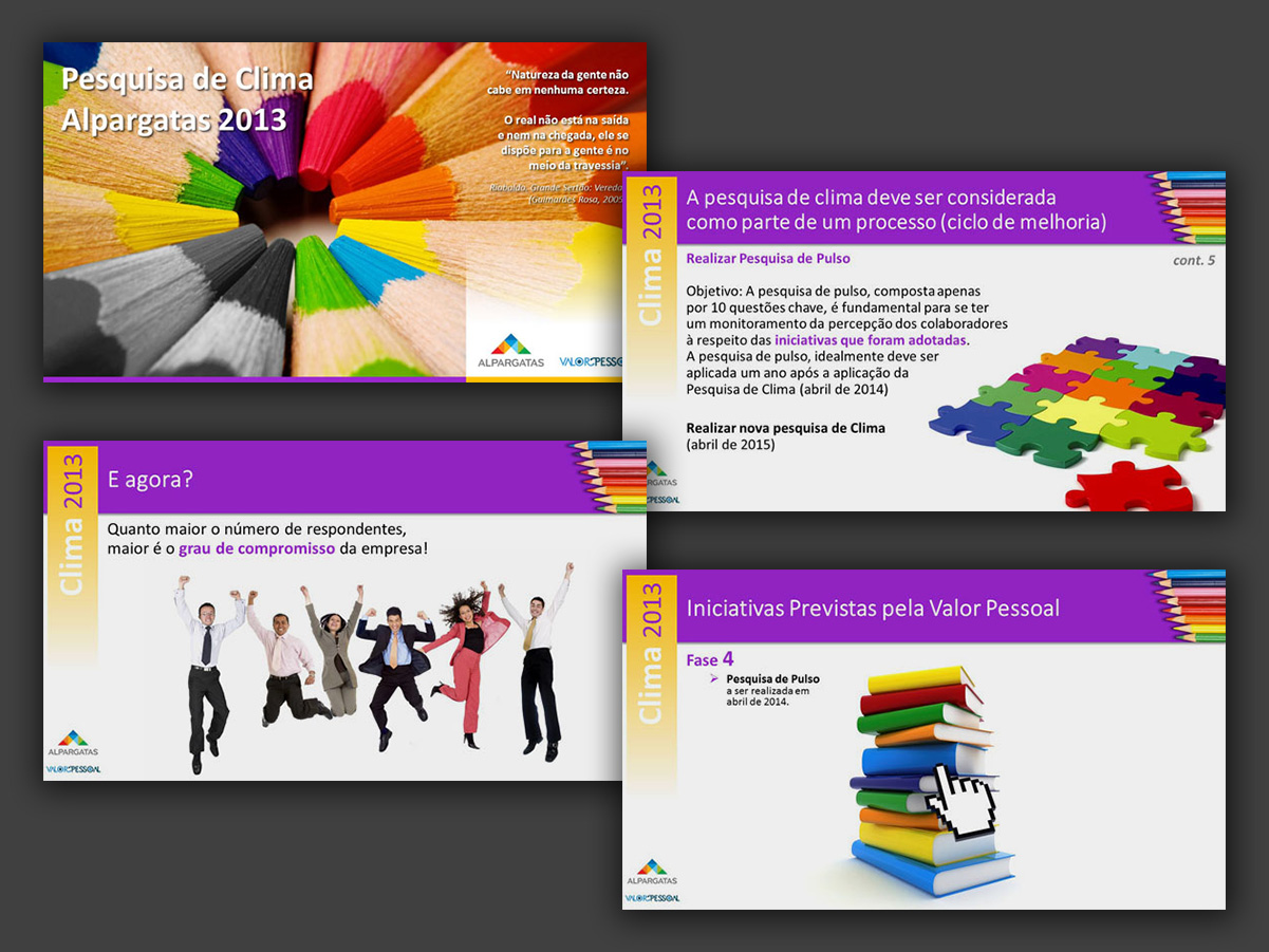
For each topic in the talks given by Valor Pessoal, I created a template and refined the presentation slide by slide. This gallery shows only a few screens from these sets.
I also developed the brand’s rebranding, along with its stationery, corporate website and course support materials.
Logos developed for businesses looking for a more approachable, accessible, laid-back and maybe even “fun” tone. Most were developed for logo contests on Freelancer.com.
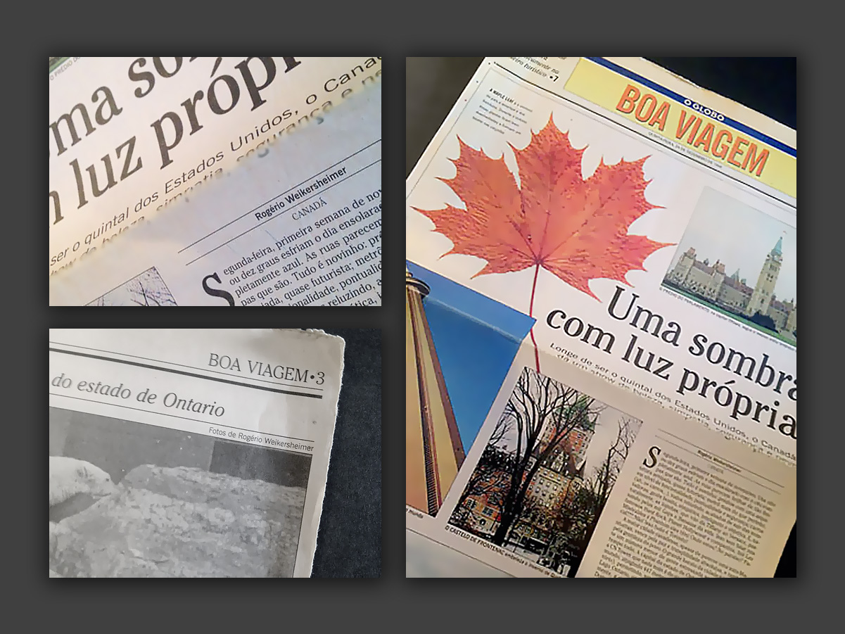
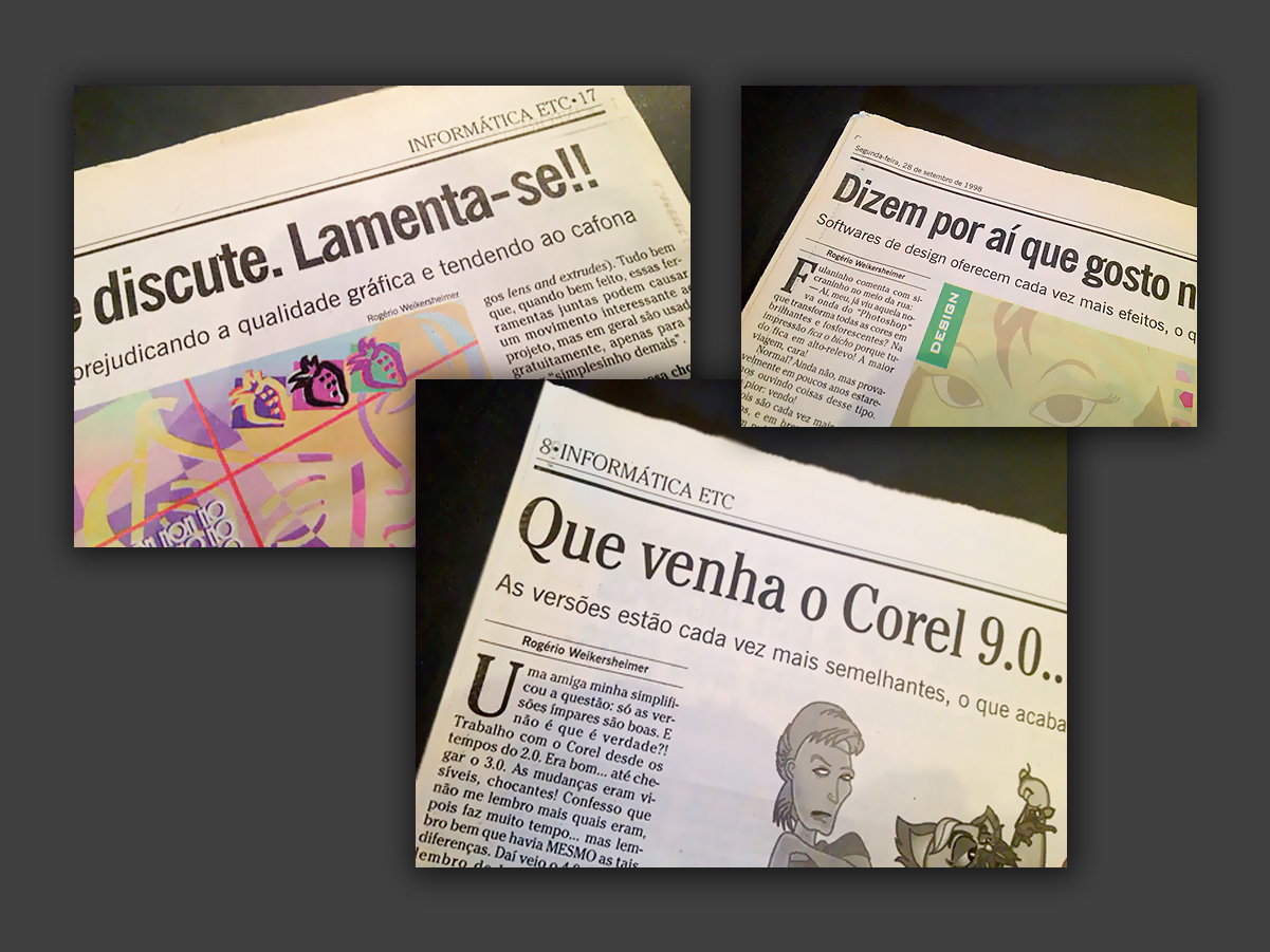
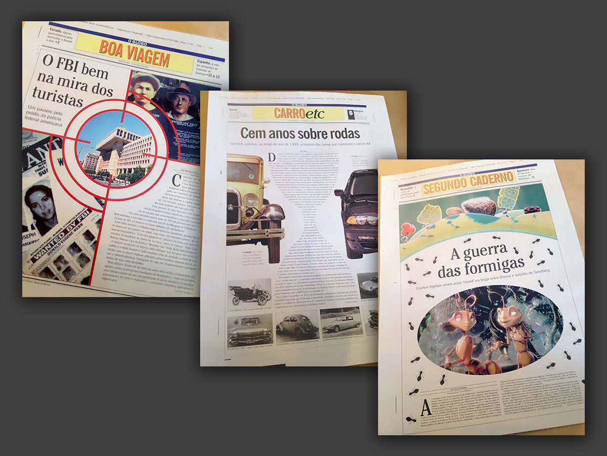
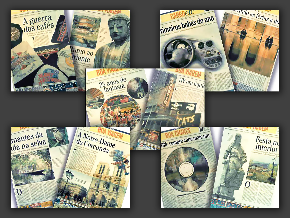
I worked for three years at the print newspaper O Globo, in Rio de Janeiro, where, besides working as a page designer, I had the chance to publish my own texts, photographs and illustrations. These contributions appeared in sections such as Boa Viagem, Jornal da Família, Carro Etc., Boa Chance, Revista da TV, Rio Show, Ela and Informática Etc.
As a page designer, I took part in producing hundreds of sections and pages on a daily rhythm, including designing the paper’s front-page masthead for desks like National, Economy and International. In the supplements, however, there was more freedom to explore graphic solutions and also develop my own content.
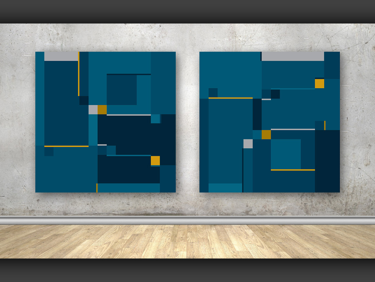
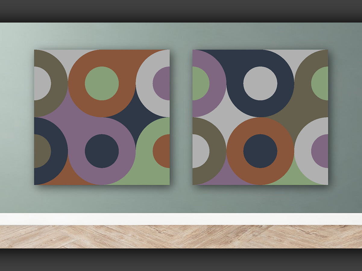
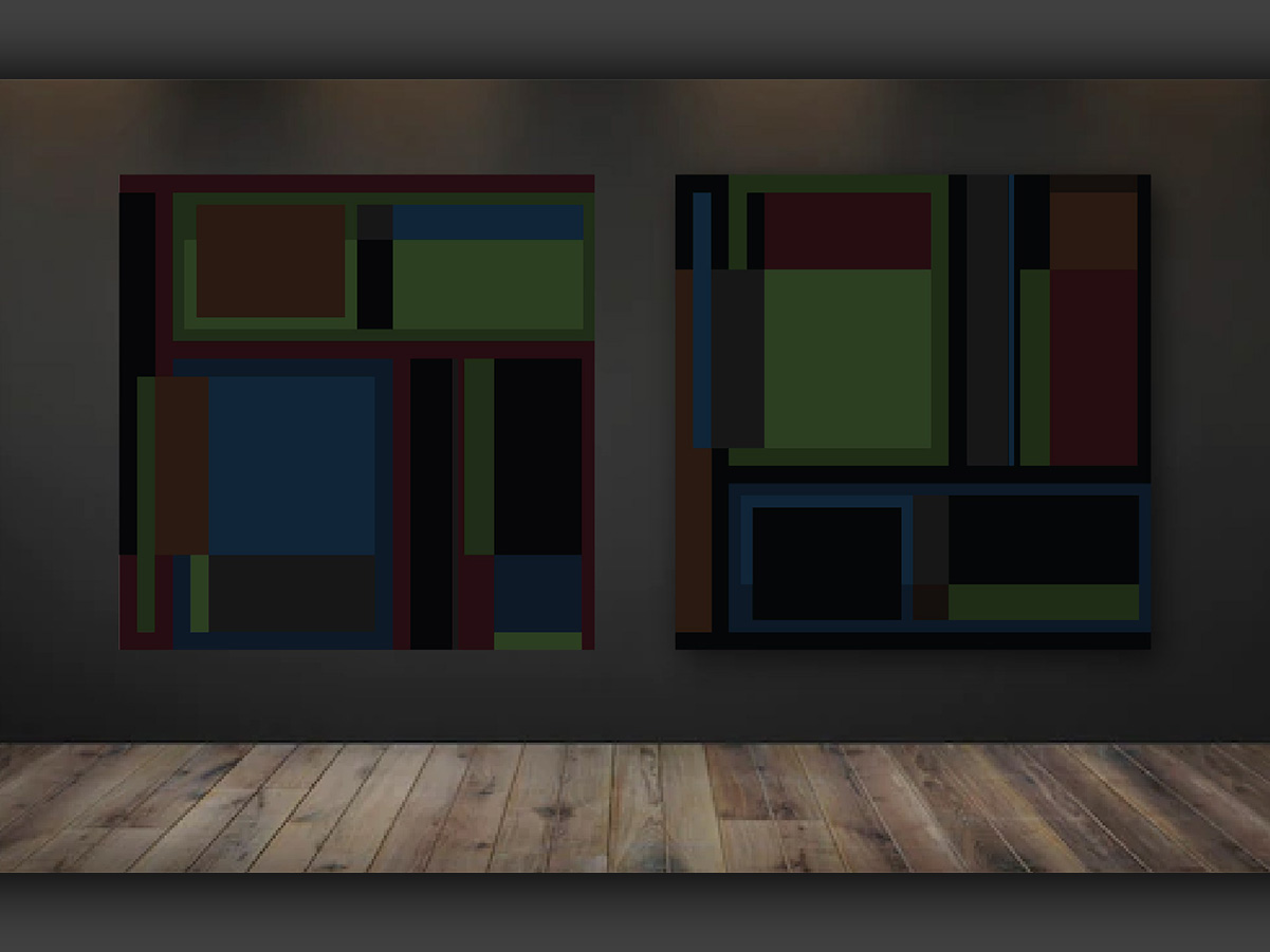
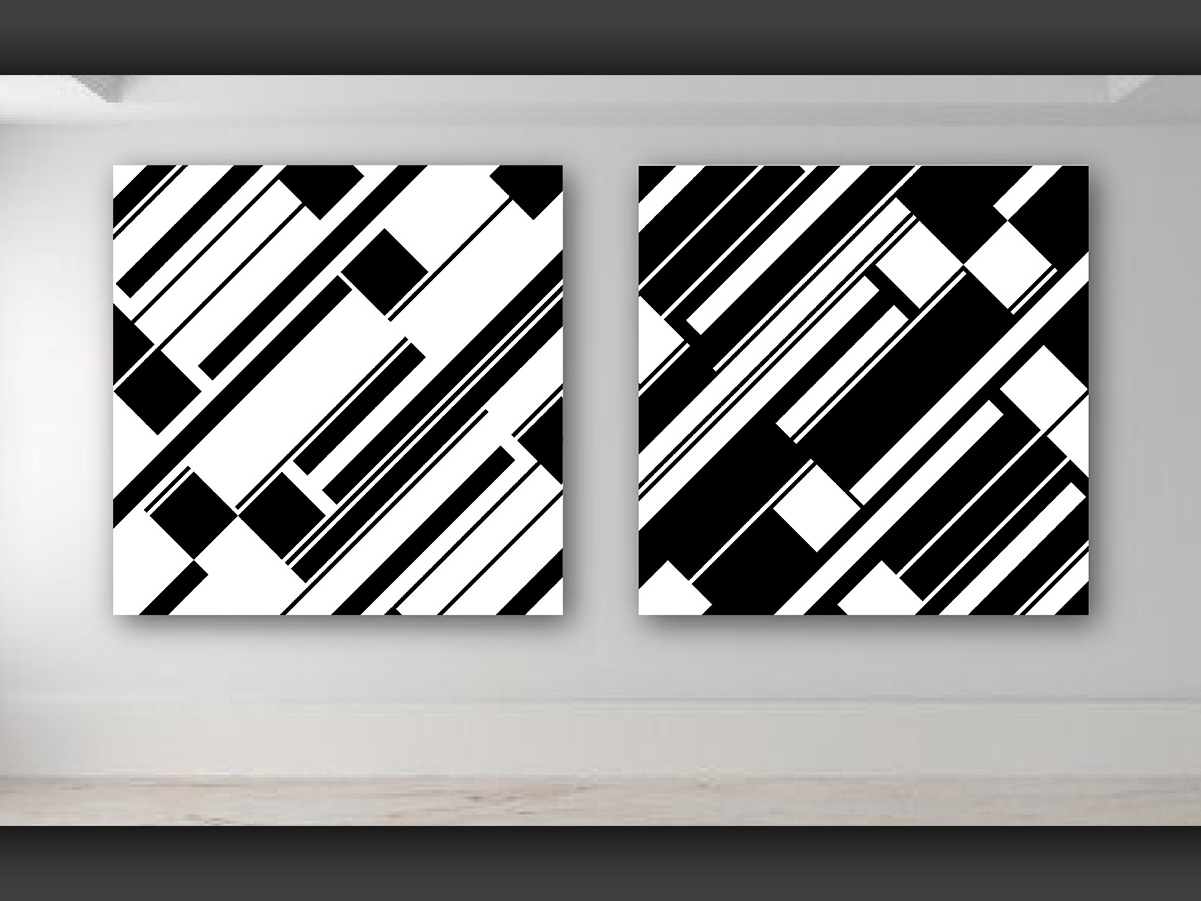
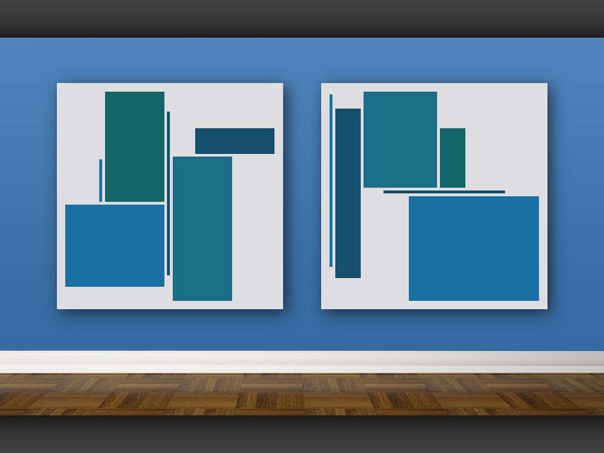
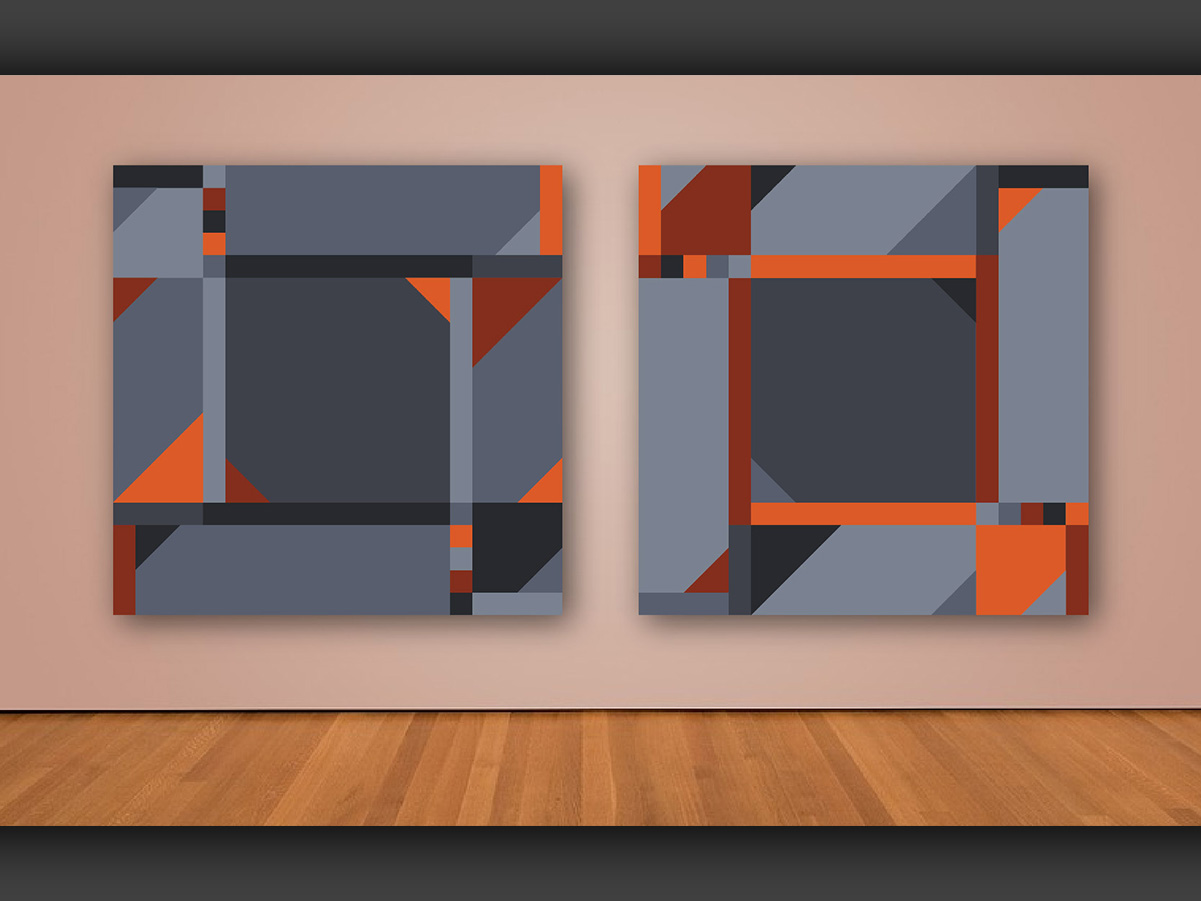
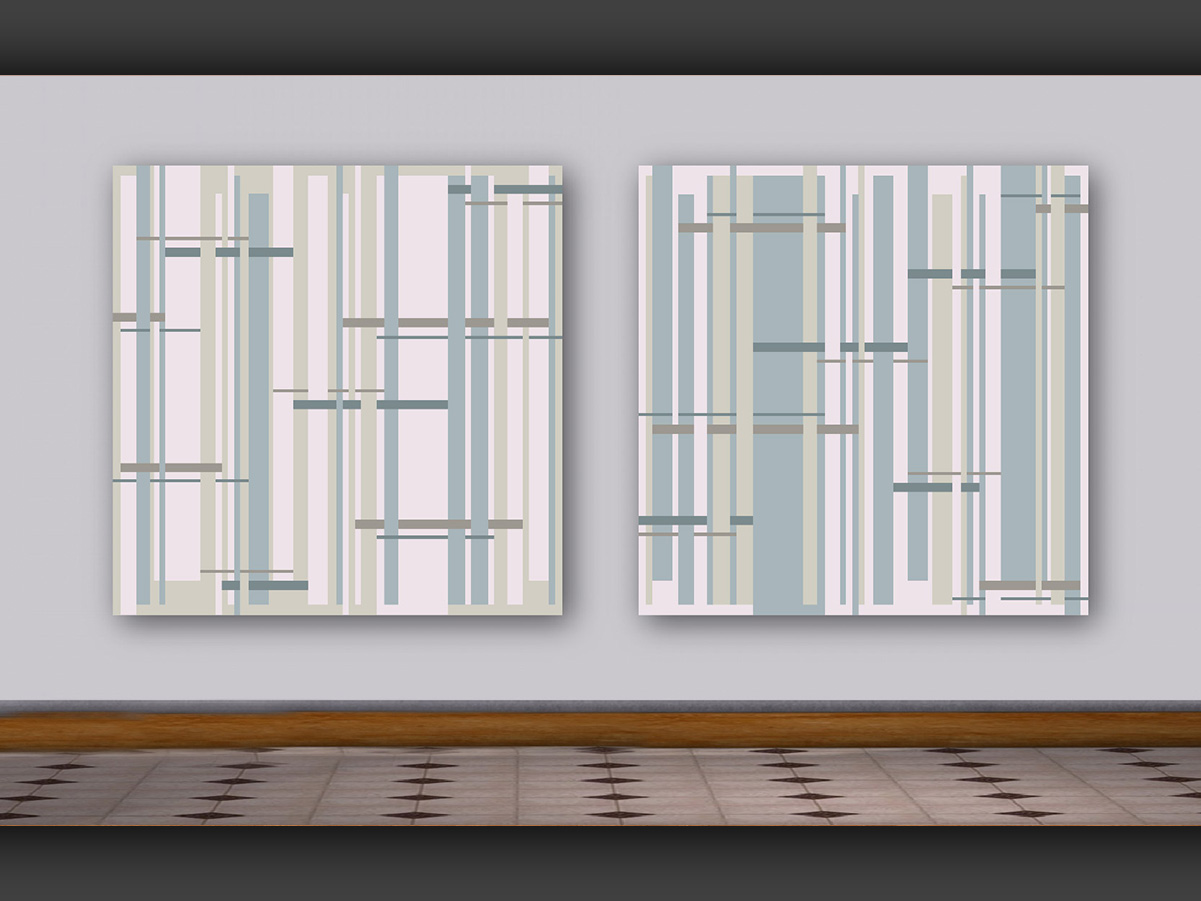
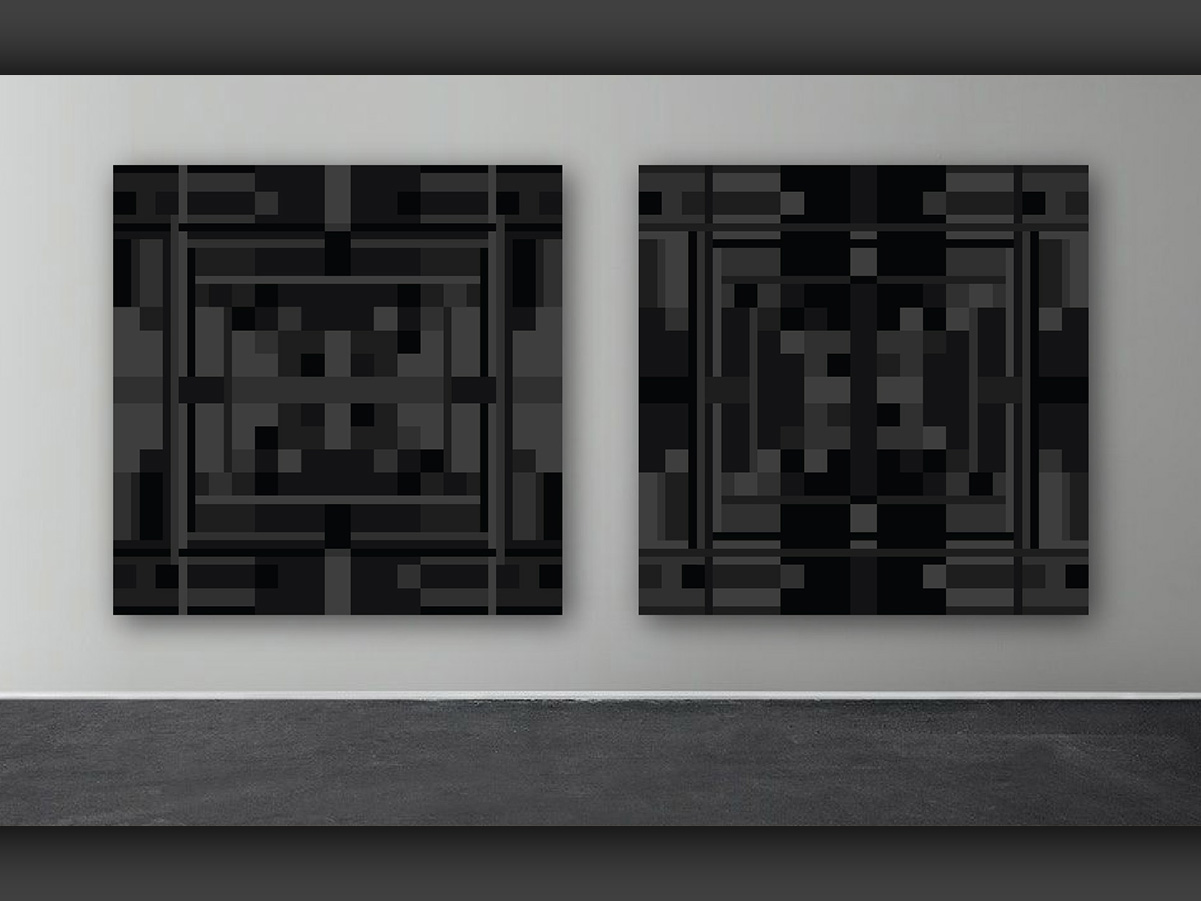
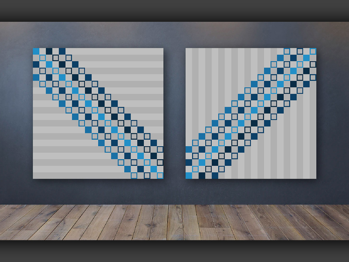
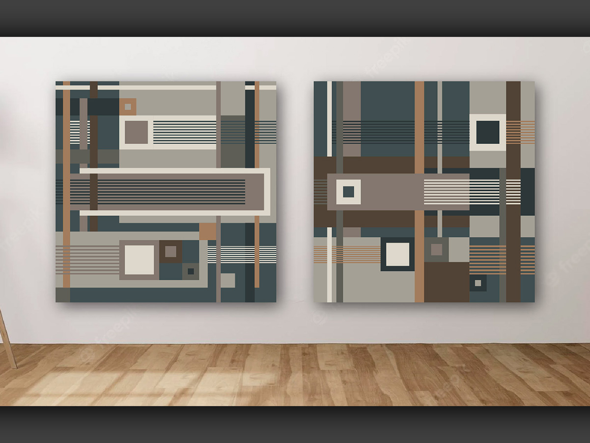
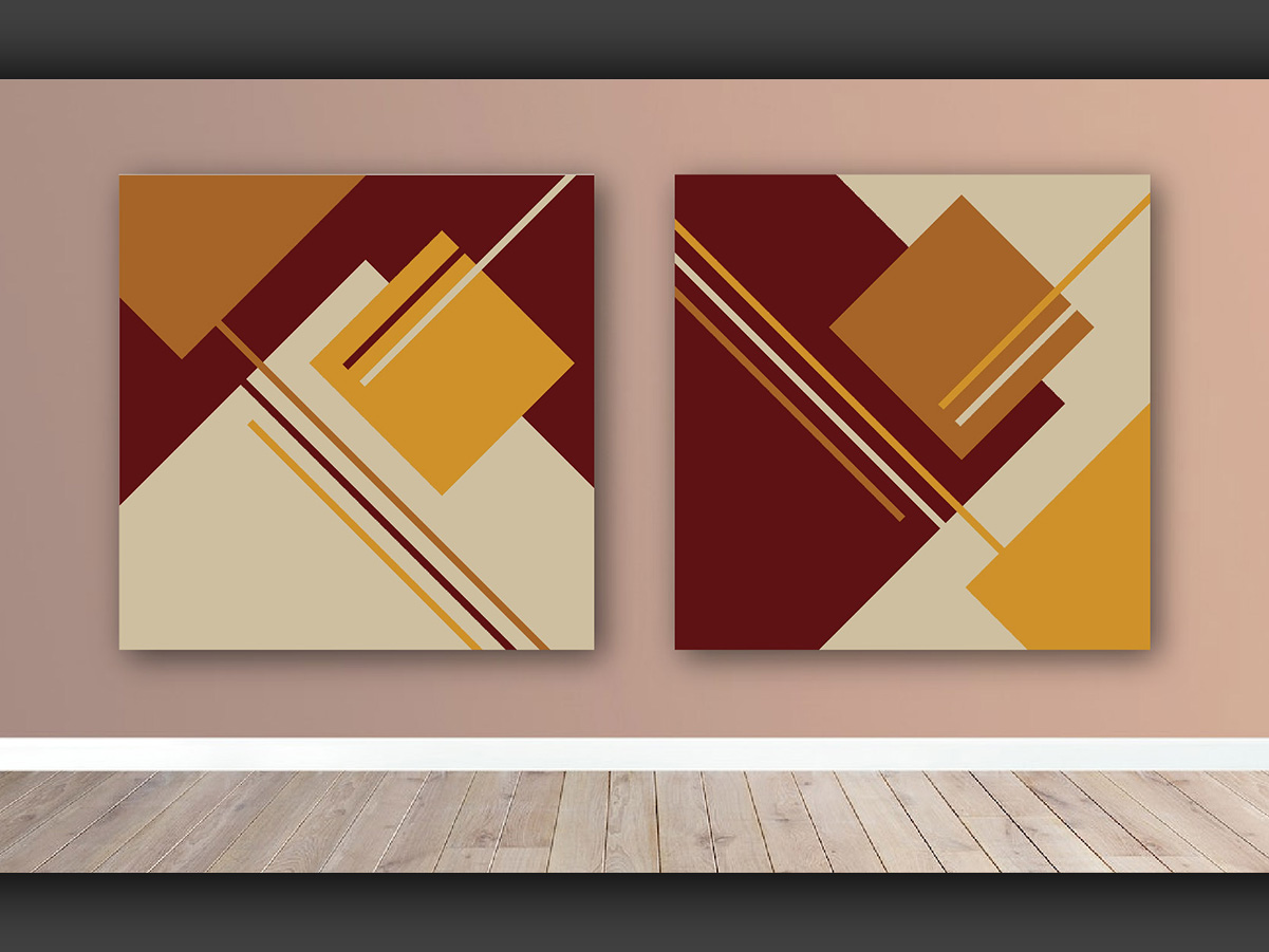
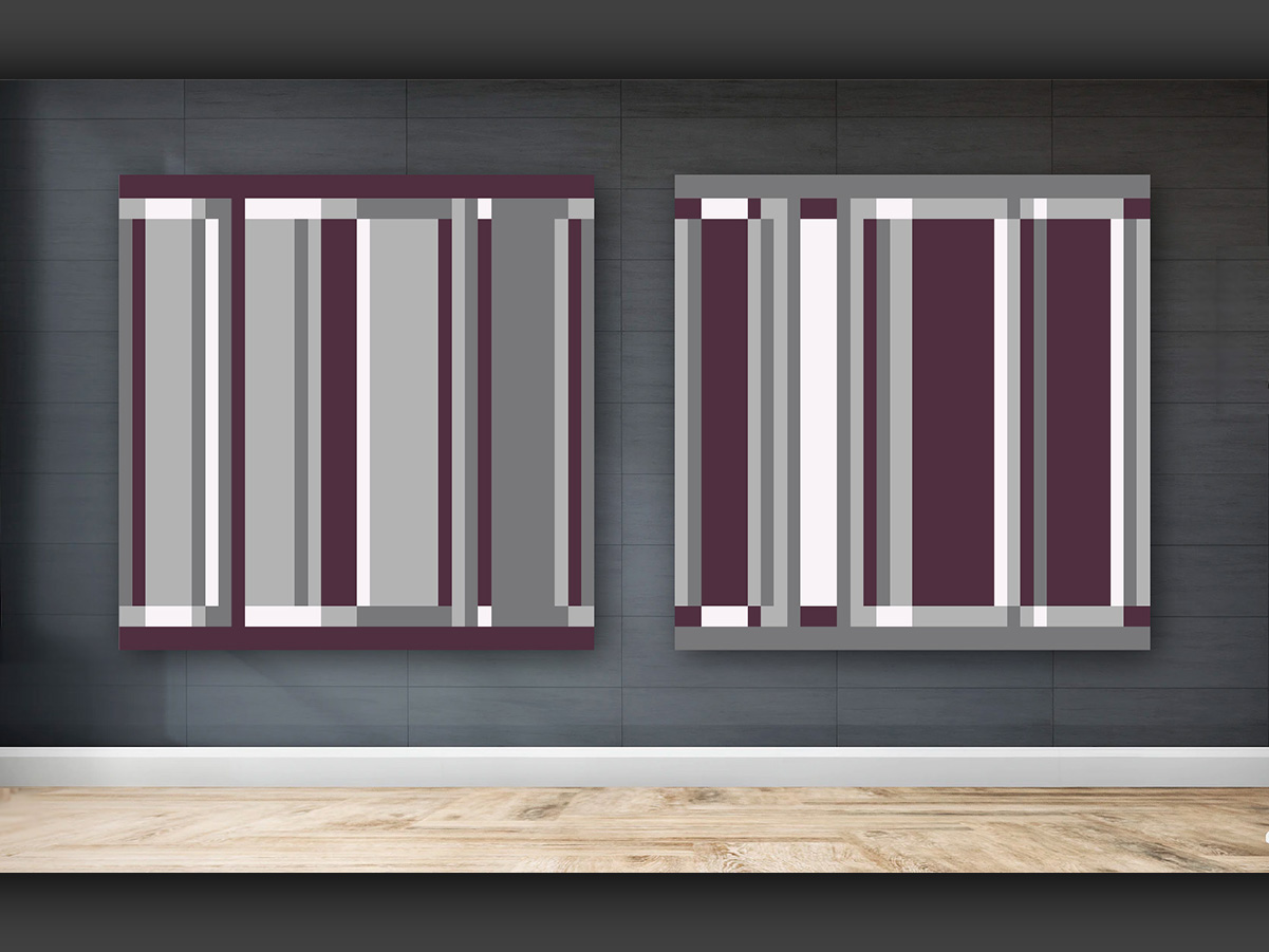
Compositions designed to be displayed in pairs, visually relating to one another. These pieces are vector-based, so they can be printed as high-quality canvases in any size.
The scenes (floor and wall) shown on these models are for illustration purposes only.
My art can also be seen on this Instagram.
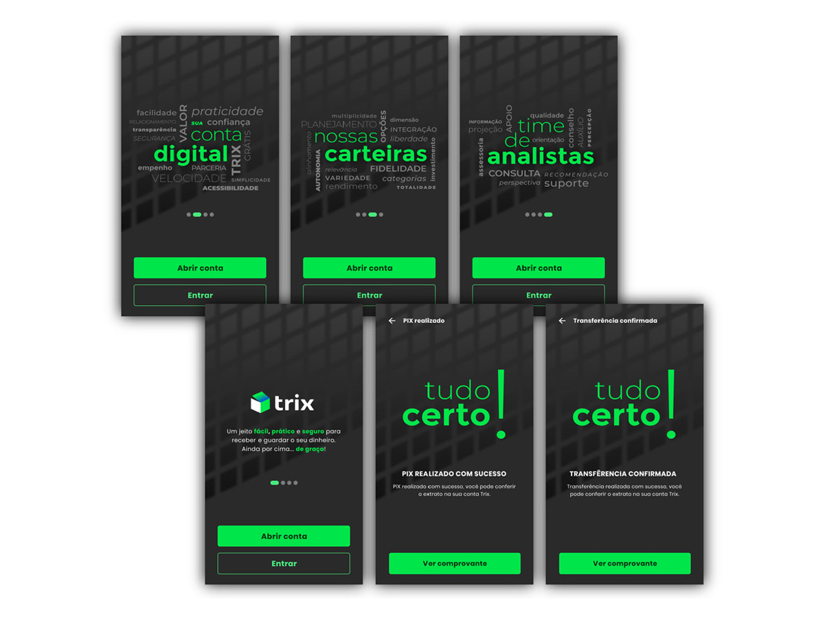
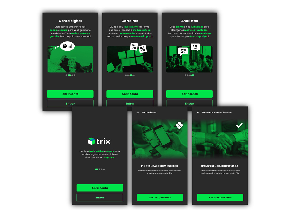
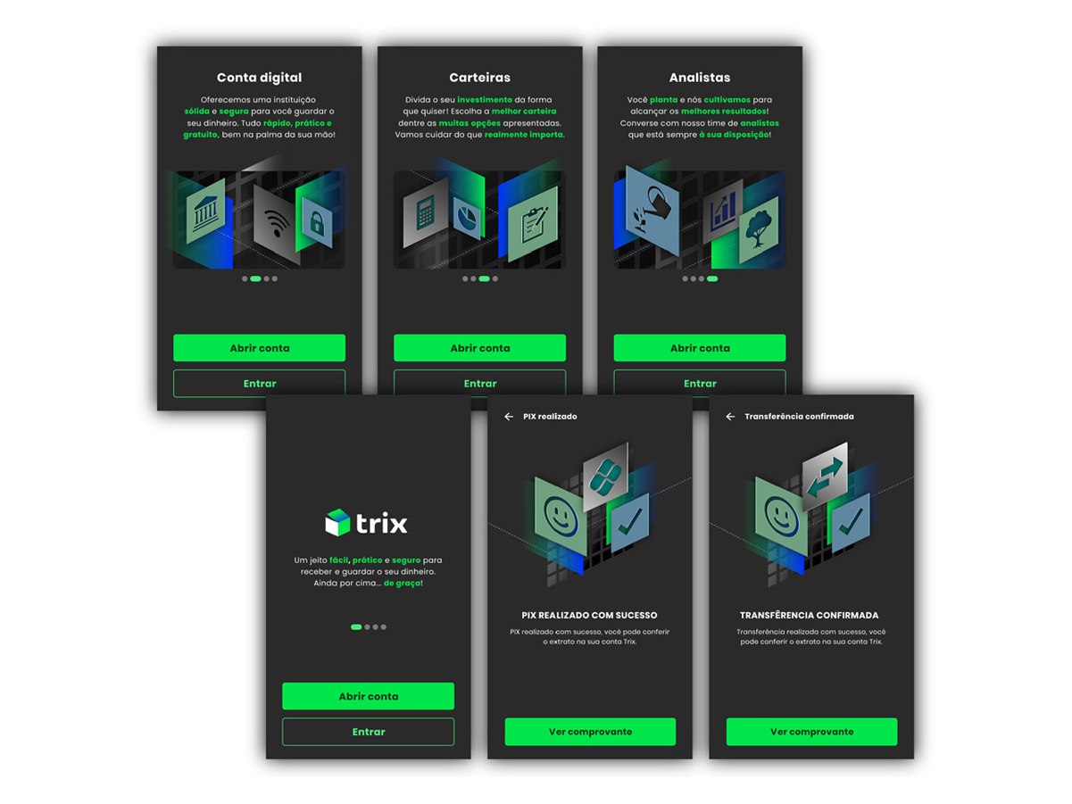
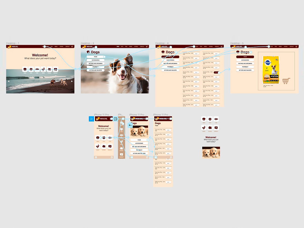
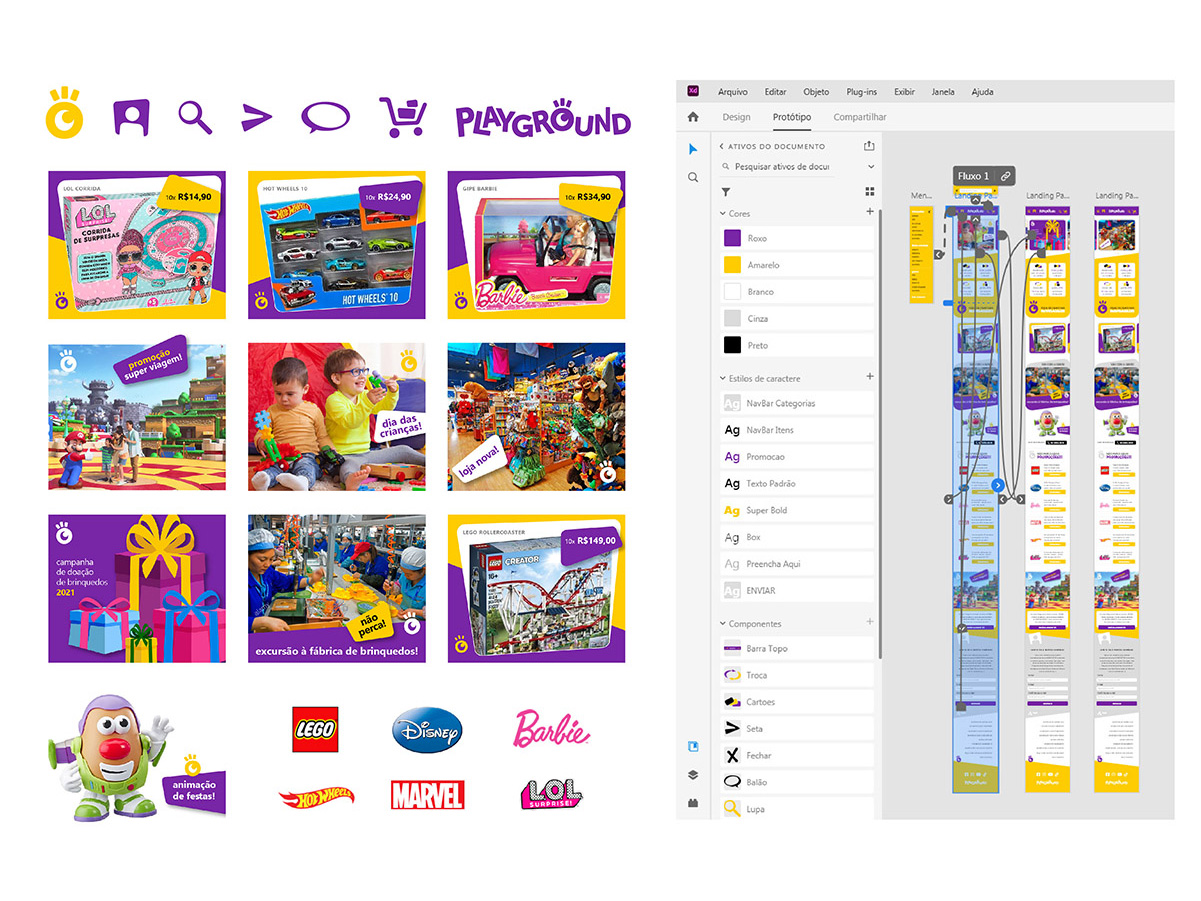
Screen studies for the Trix app, along with wireframes and flow tests produced as an exploratory exercise, with no ties to any specific client.
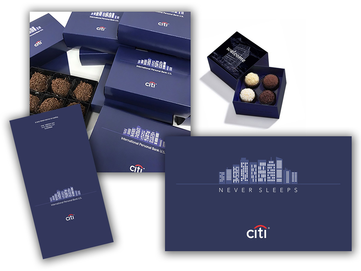
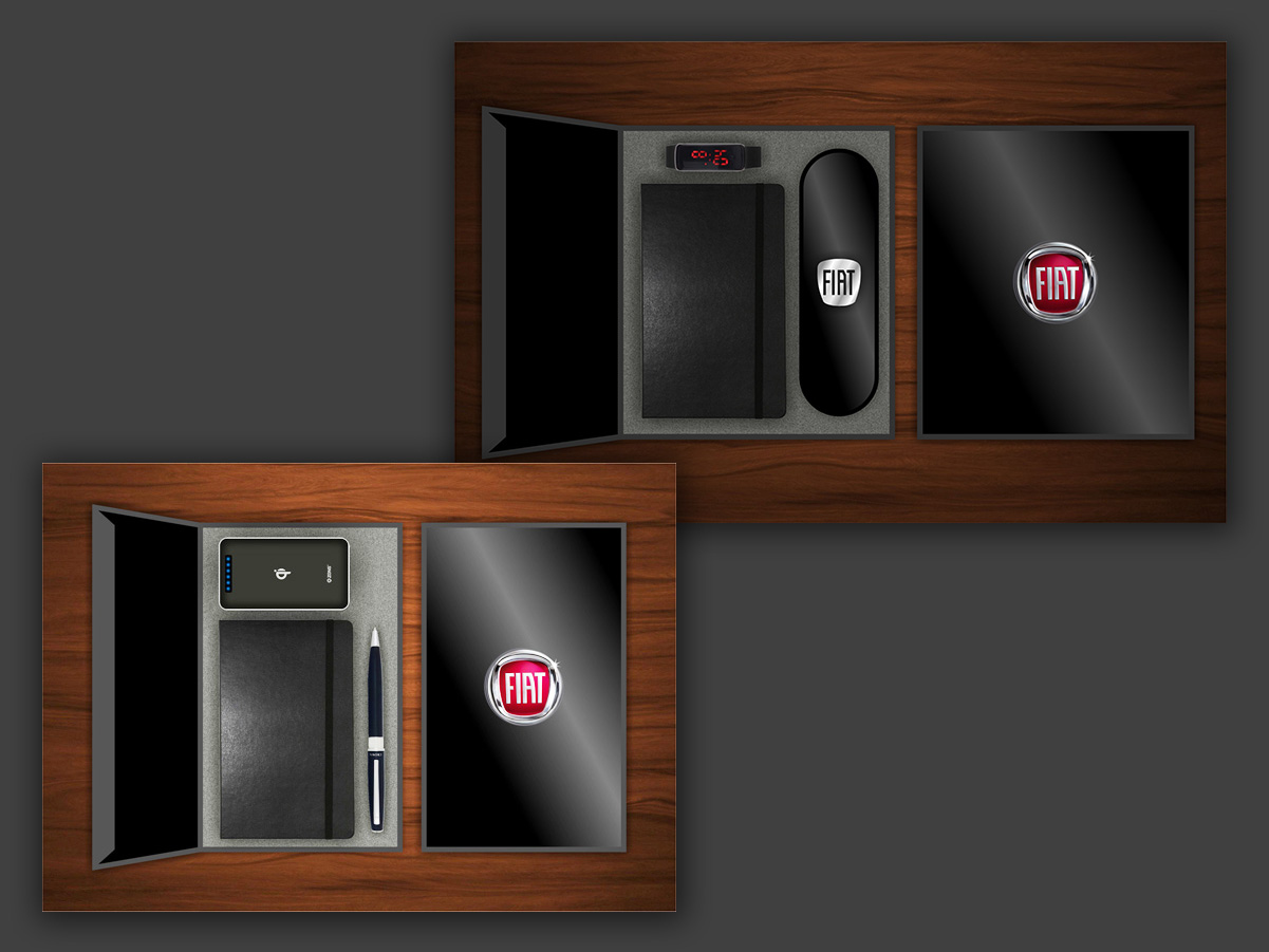
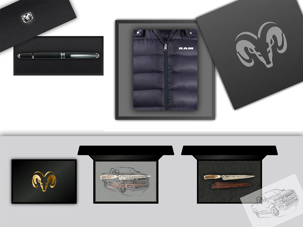
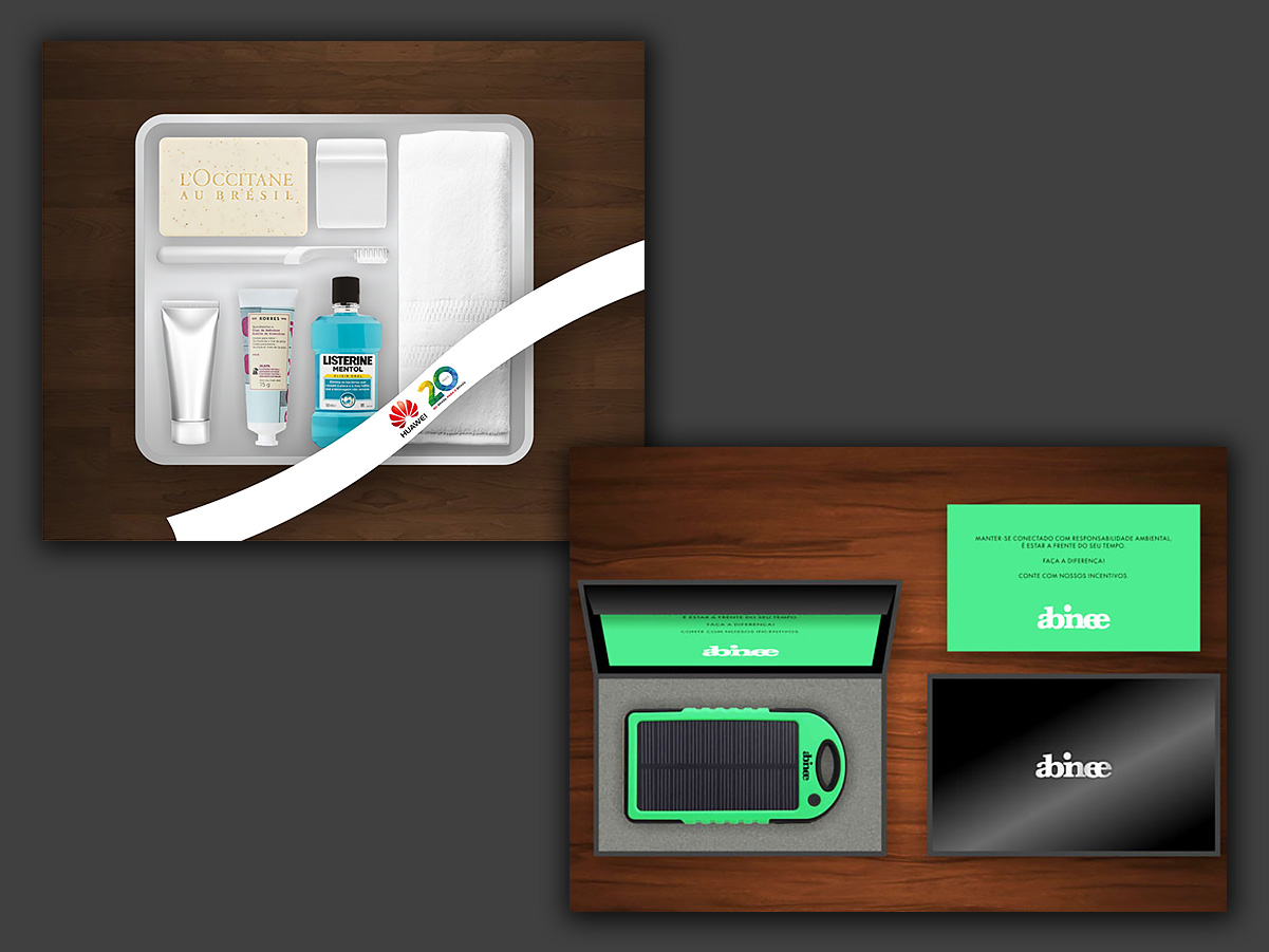
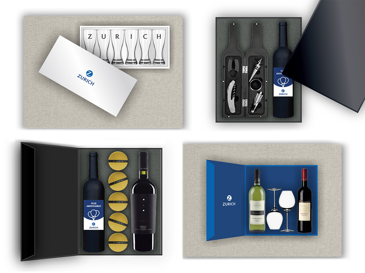
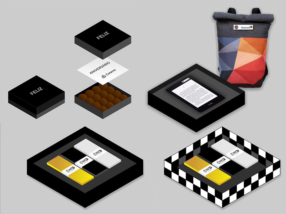
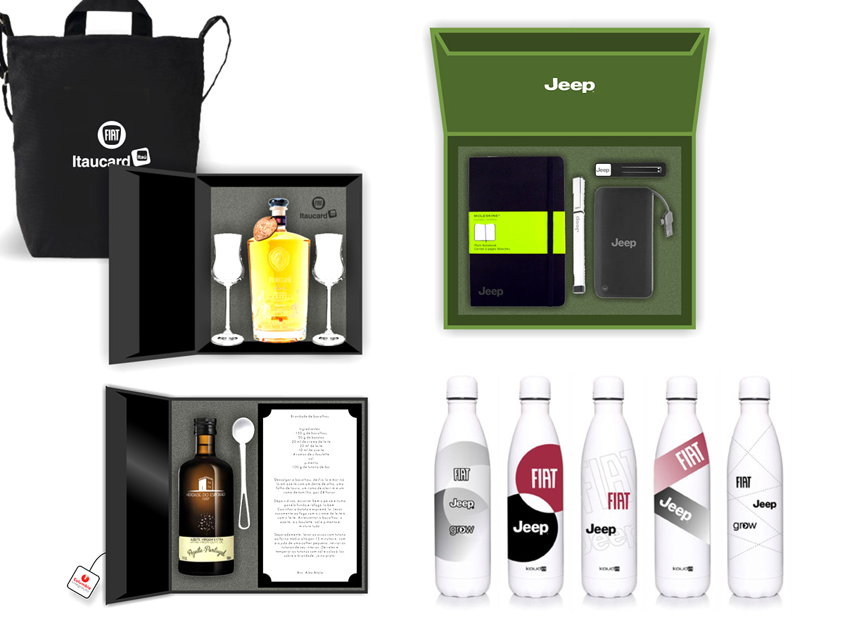
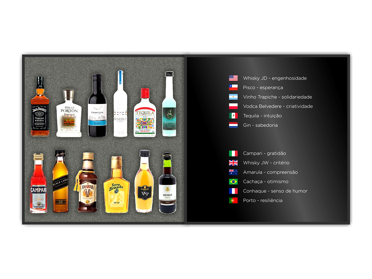
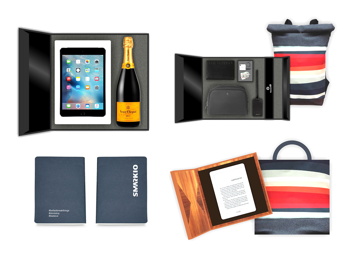
For a few years, I provided design services for Unique, a corporate promotional-items company in São Paulo. My work involved creating previews of products customized with clients’ brands, used to present proposals, as well as finalizing the artwork for print once approved. I also took part in producing the company’s promotional catalog, contributing to both the print and digital versions.
Logos developed with clean, geometric lines, aligned with a simplified aesthetic. Most were developed for logo contests on Freelancer.com.
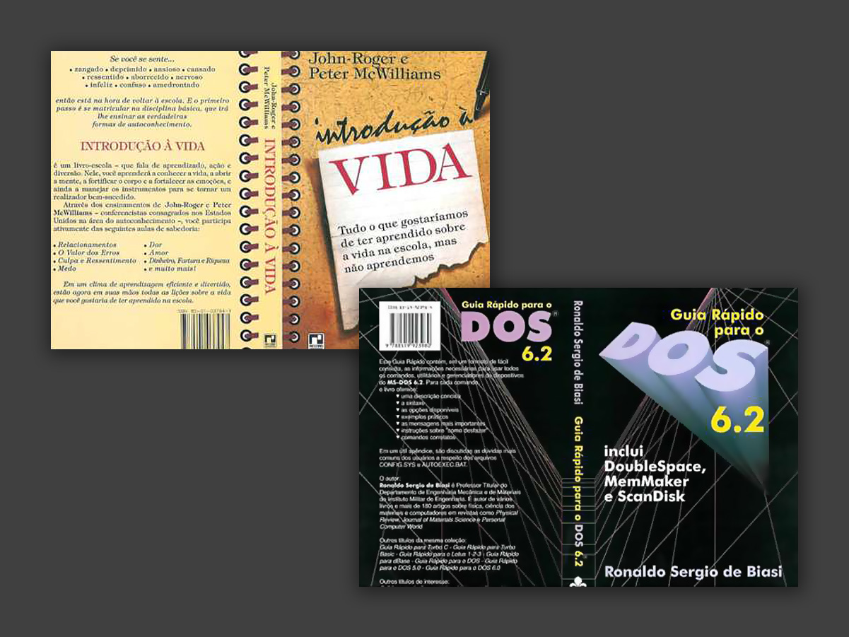
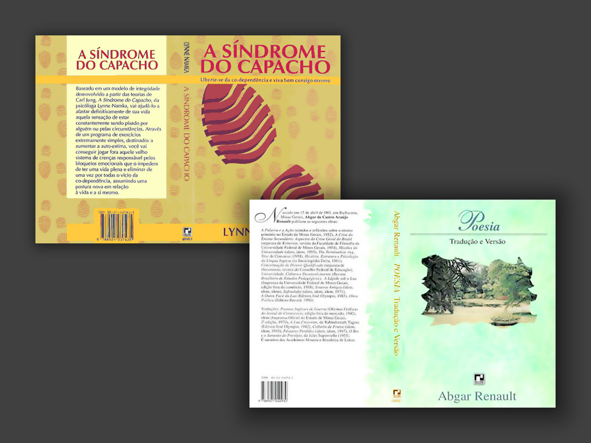
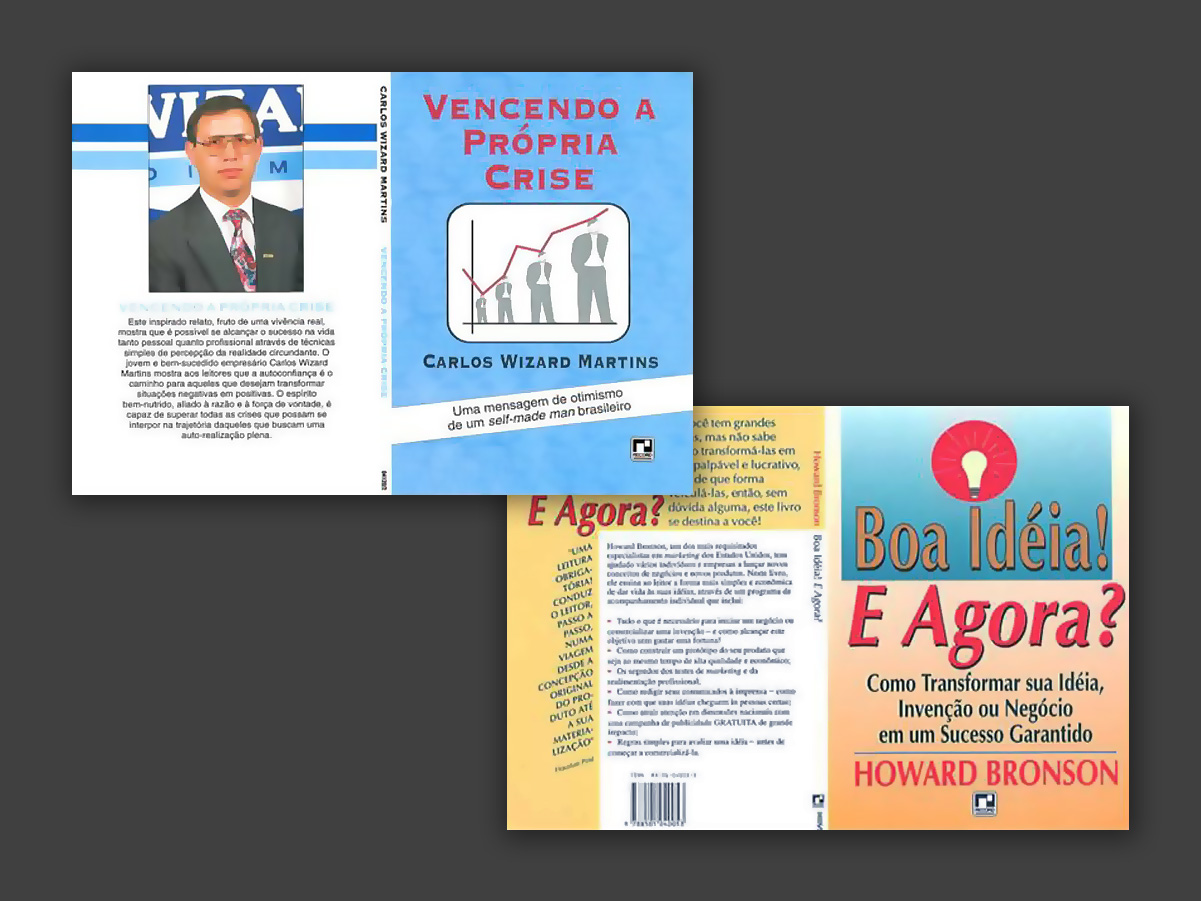
I worked for two years at Editora Record, in Rio de Janeiro — the first major company in my professional path. It was an internship during university, in the covers and graphic pieces department. The experience stood out especially for the chance to see up close how a major publisher operates, with a large print shop literally right below my office. The work shown here also reflects the visual language and graphic resources common in the popular publishing market of that period, naturally quite different from today’s aesthetic and technological standards.
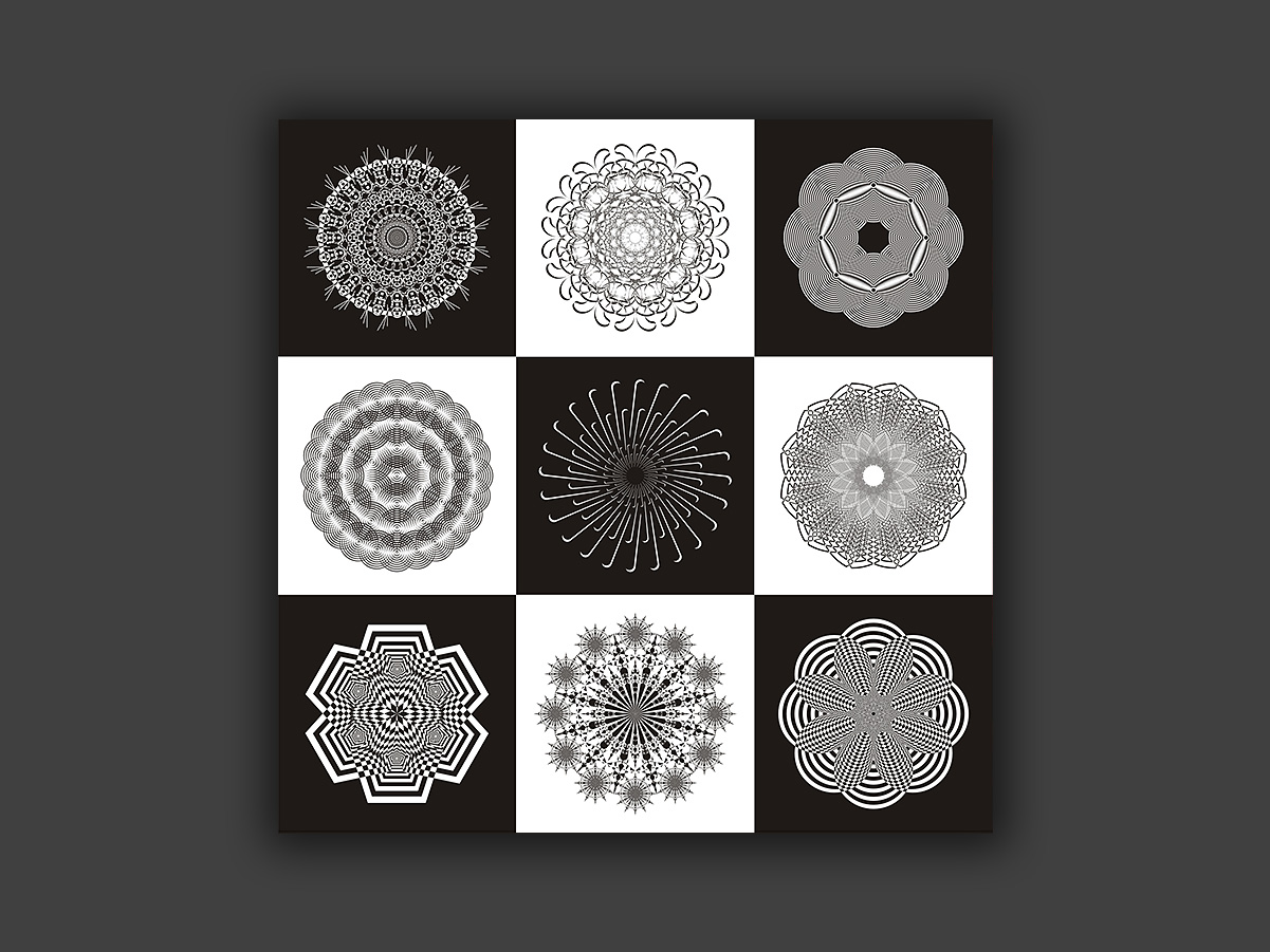
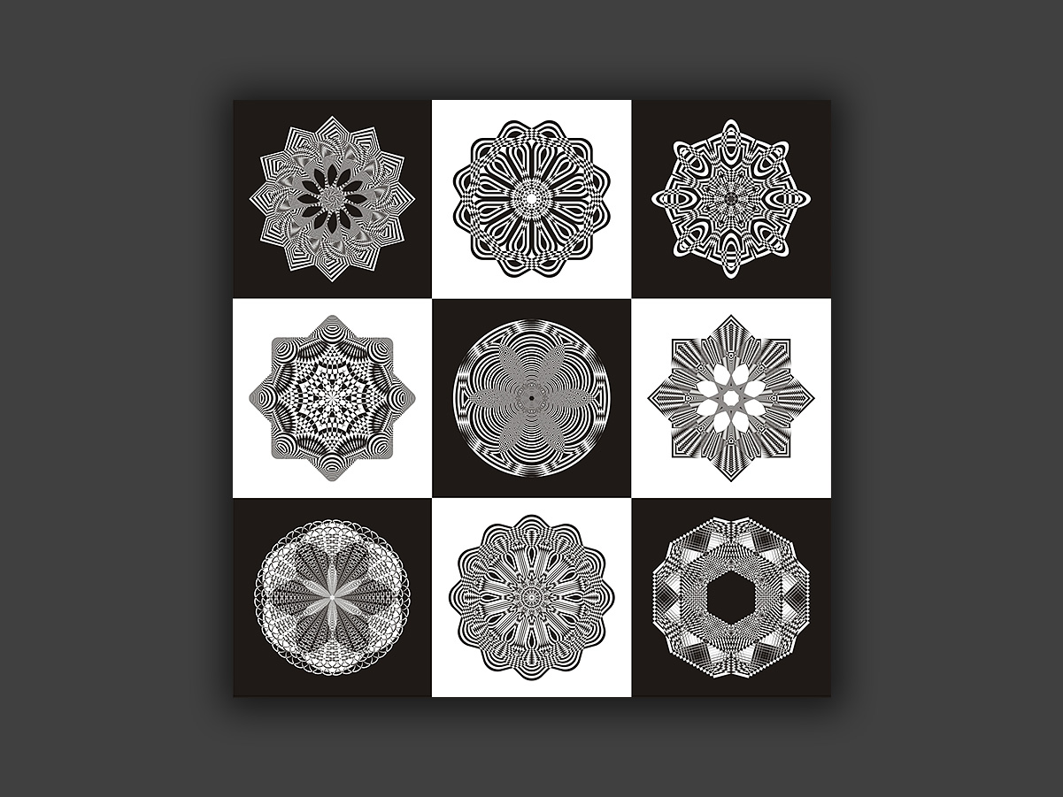
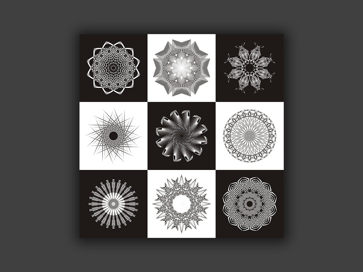
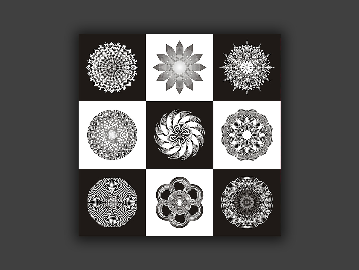
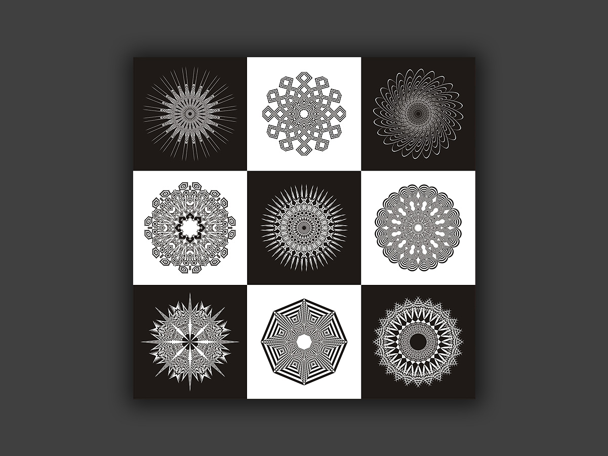
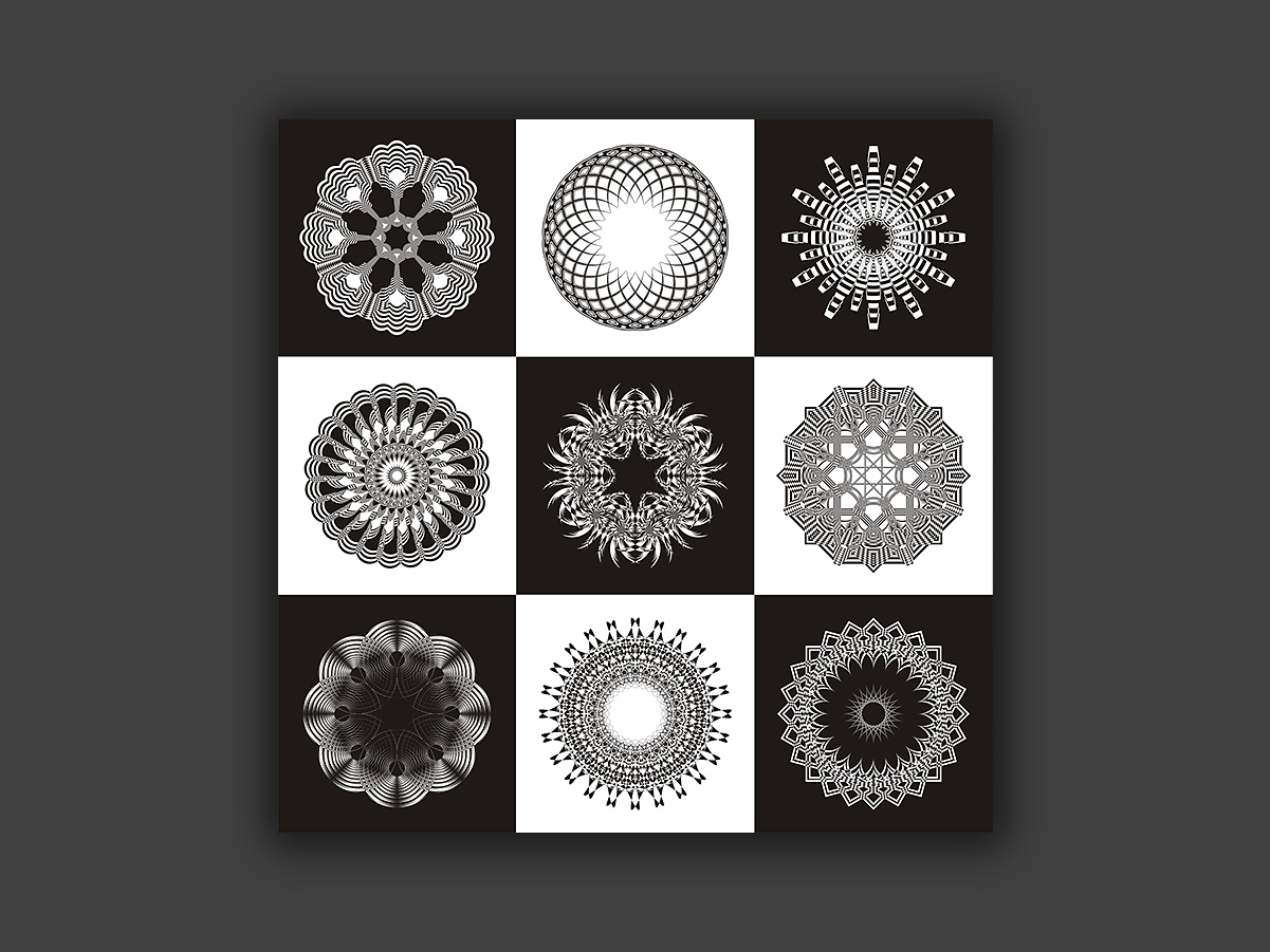
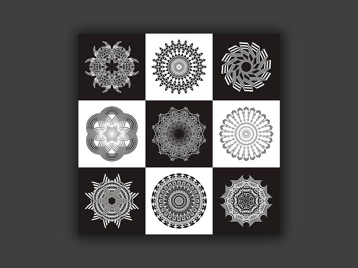
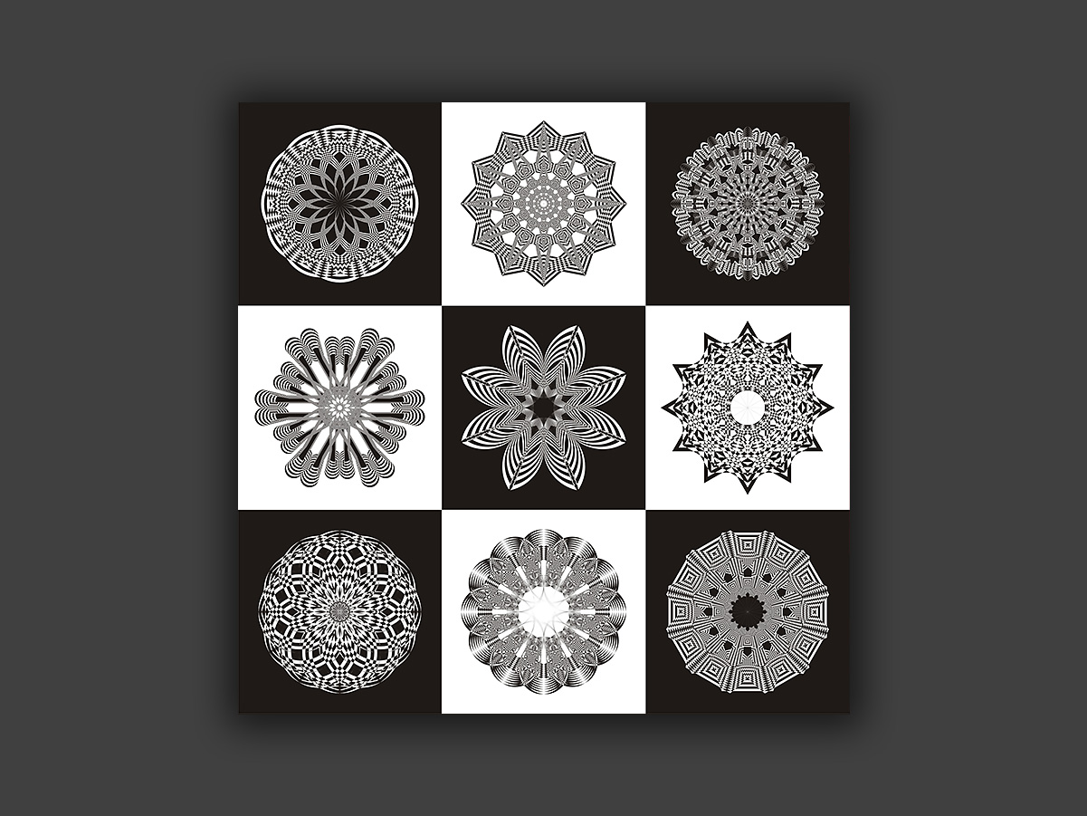
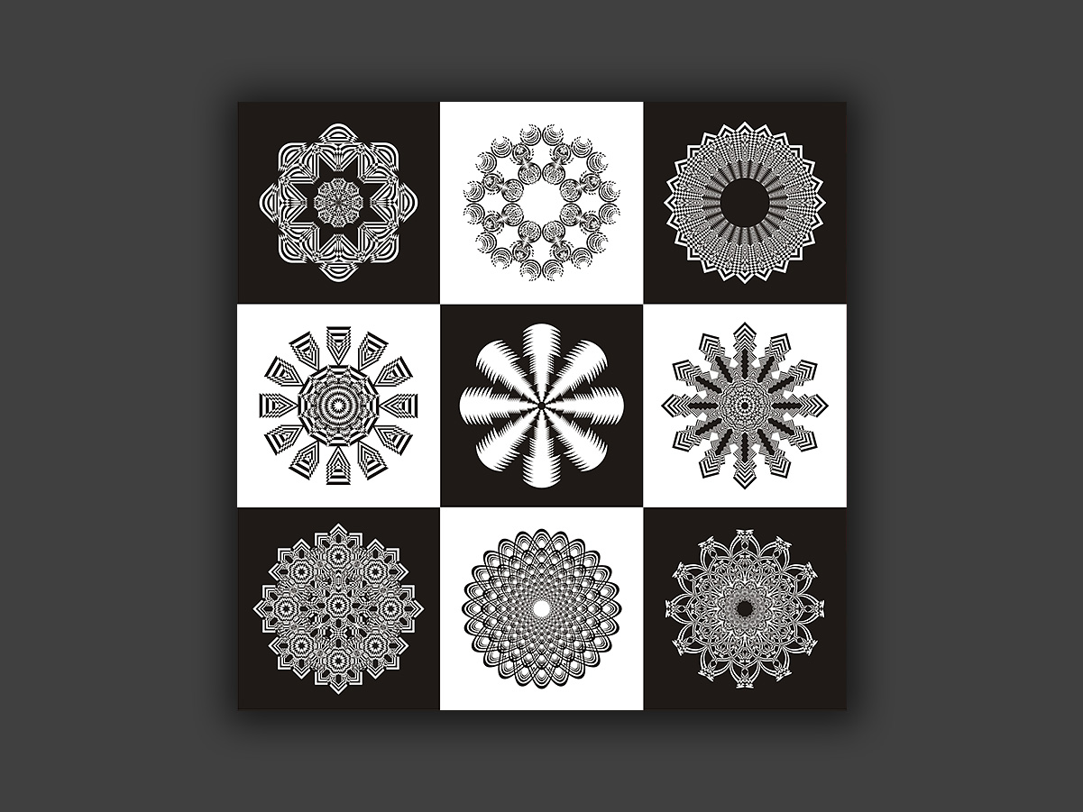
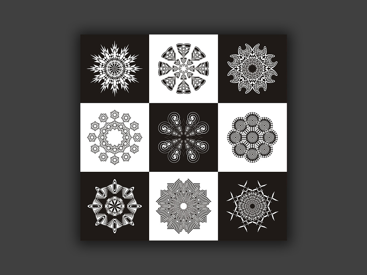
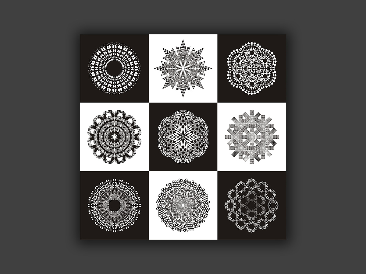
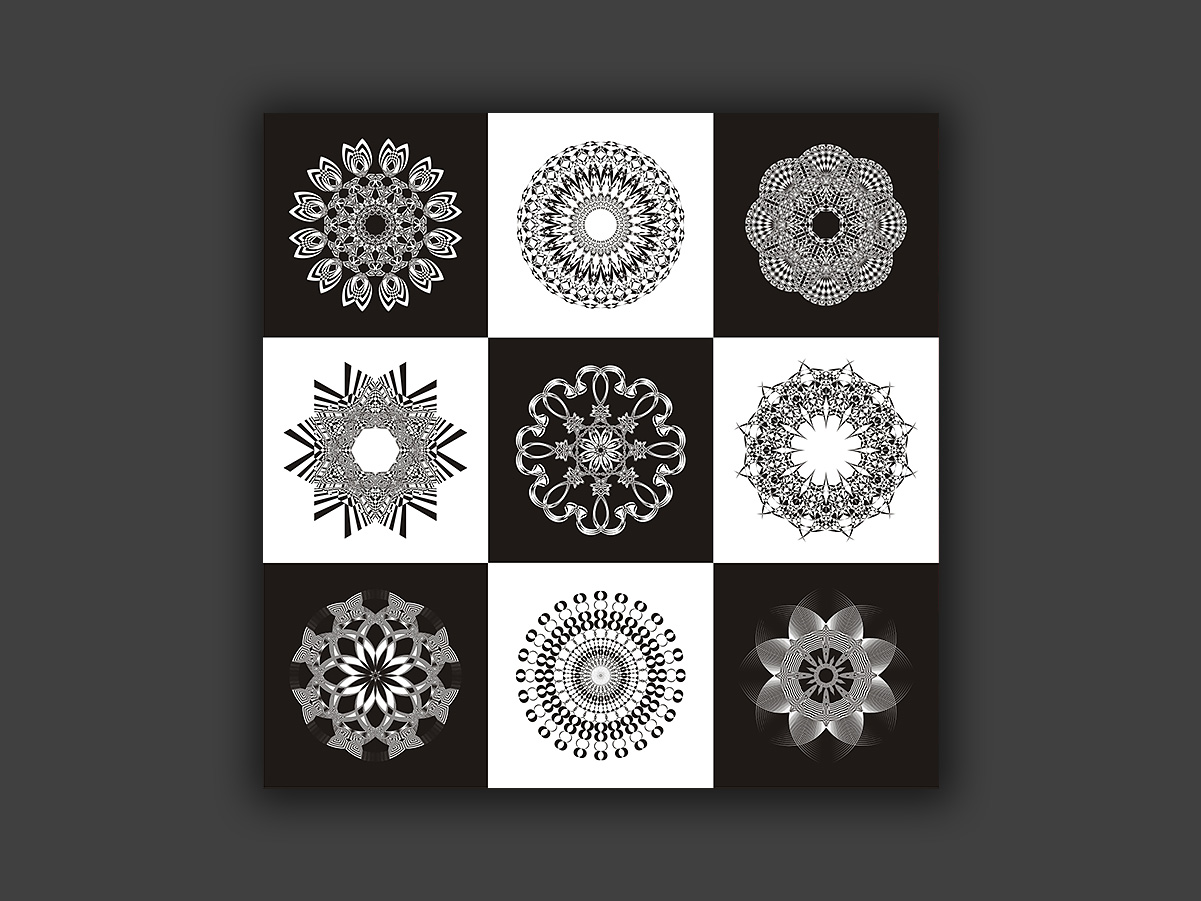
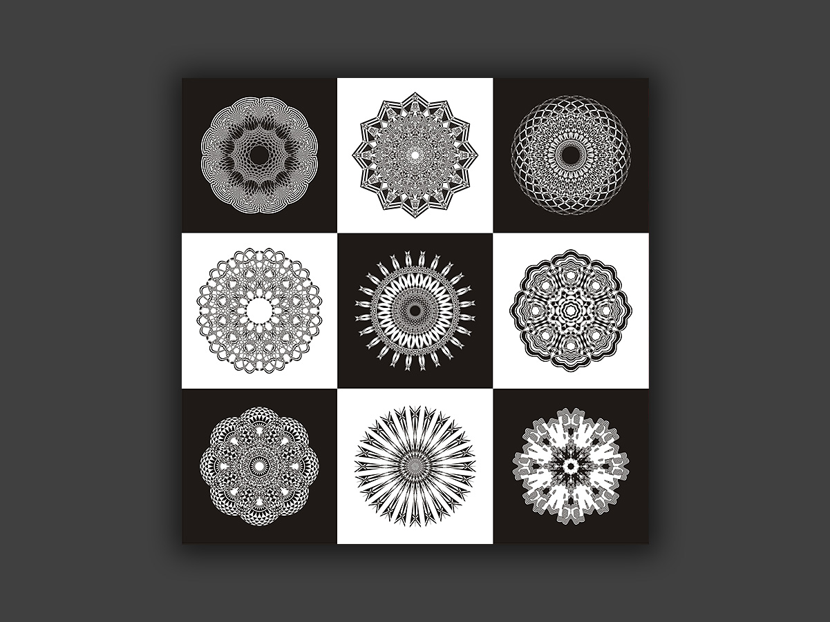
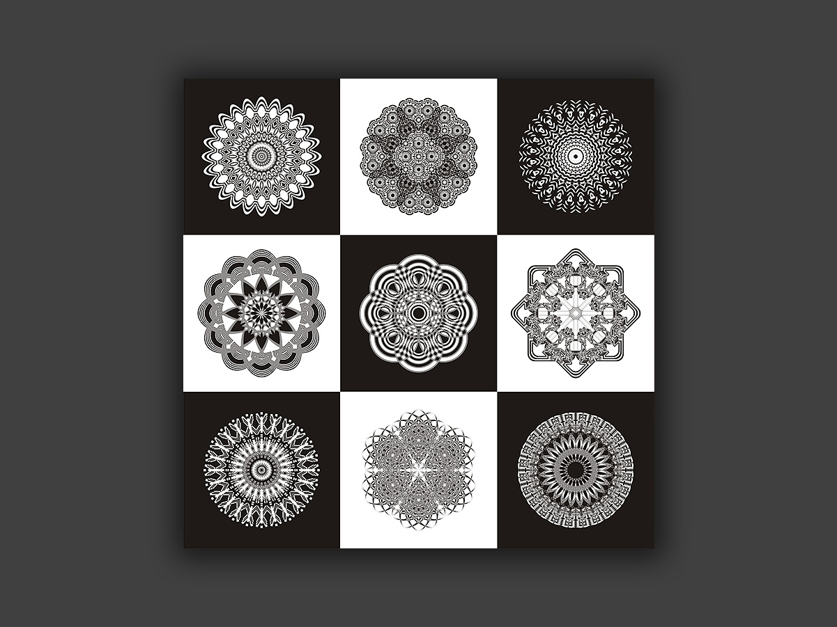
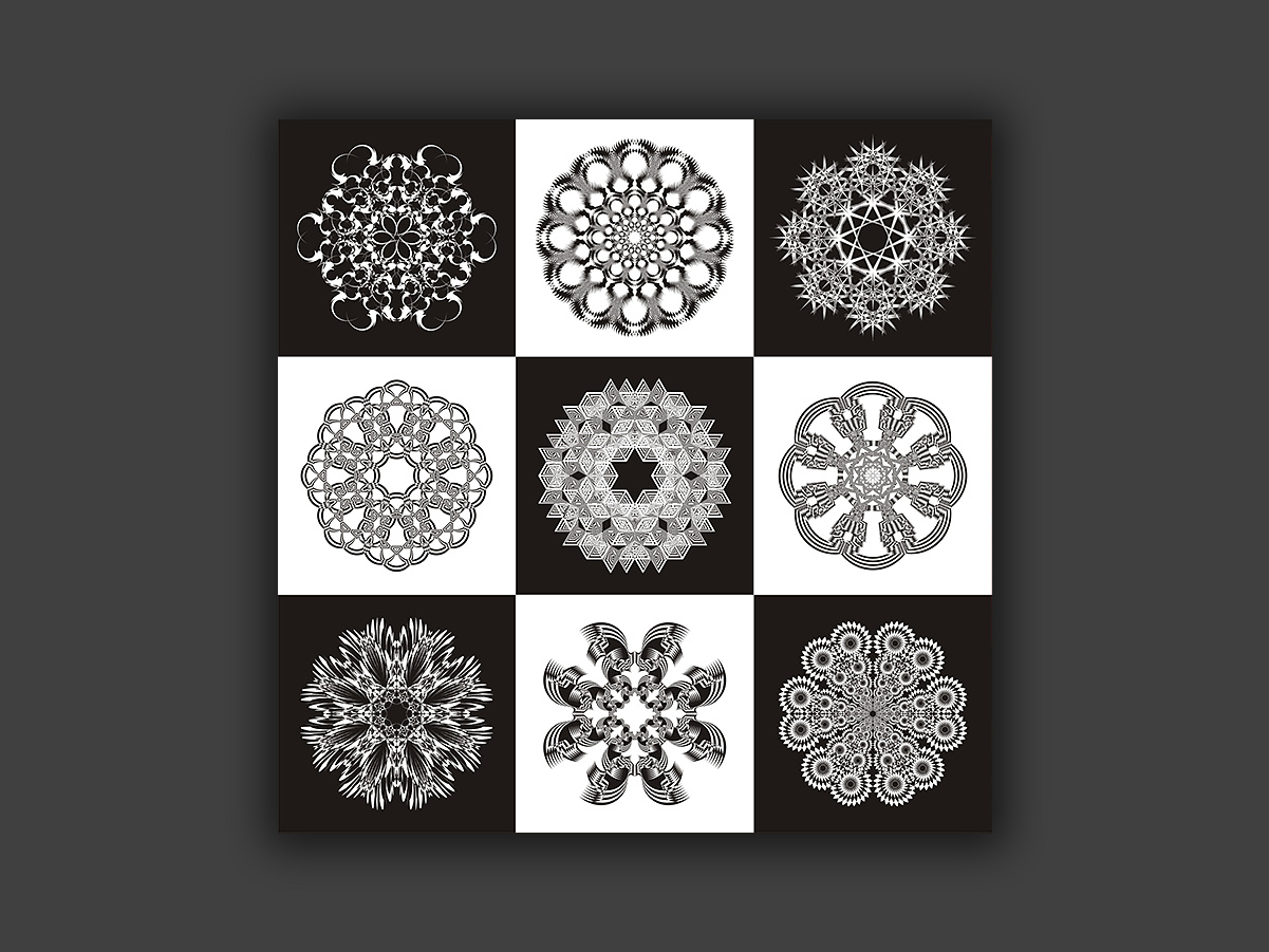
Pieces built from circular, symmetrical patterns with geometric repetition — done purely as a visual exercise.
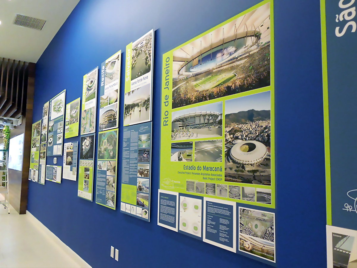
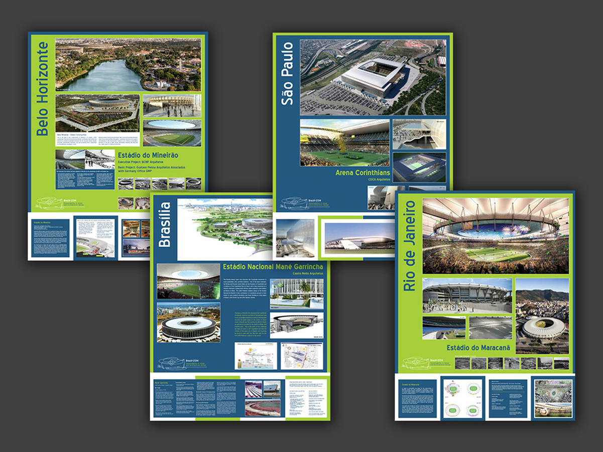
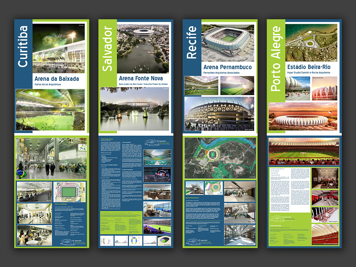
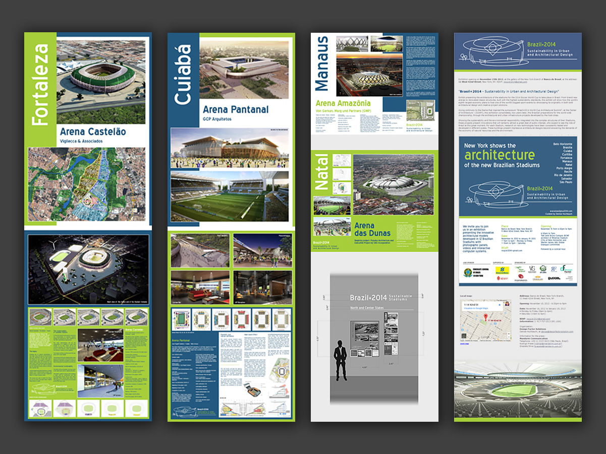
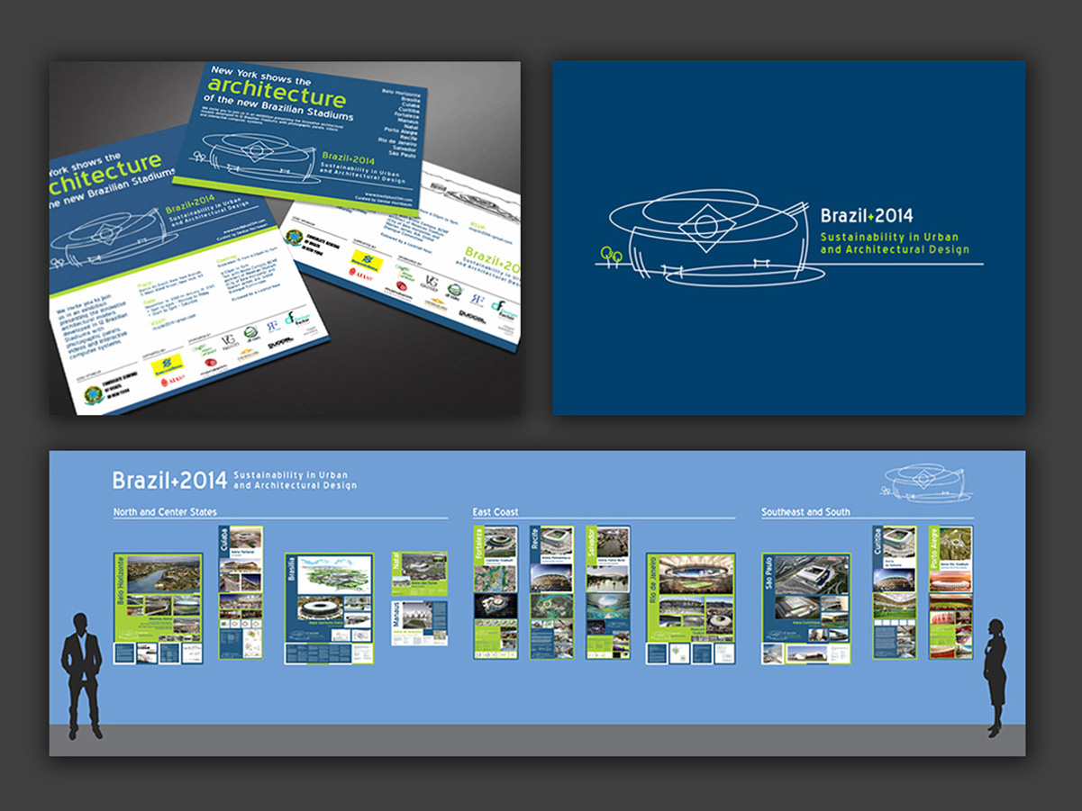
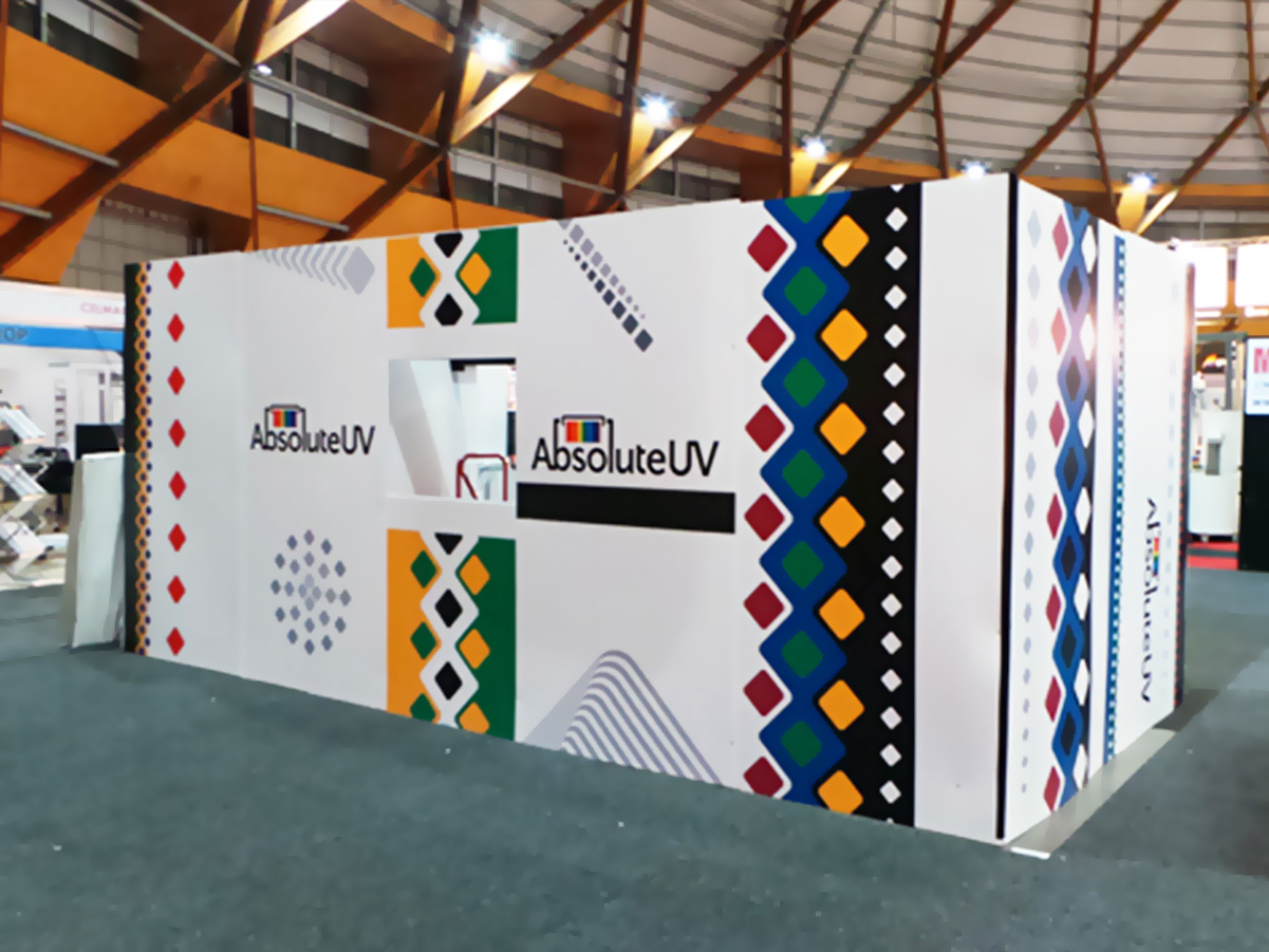
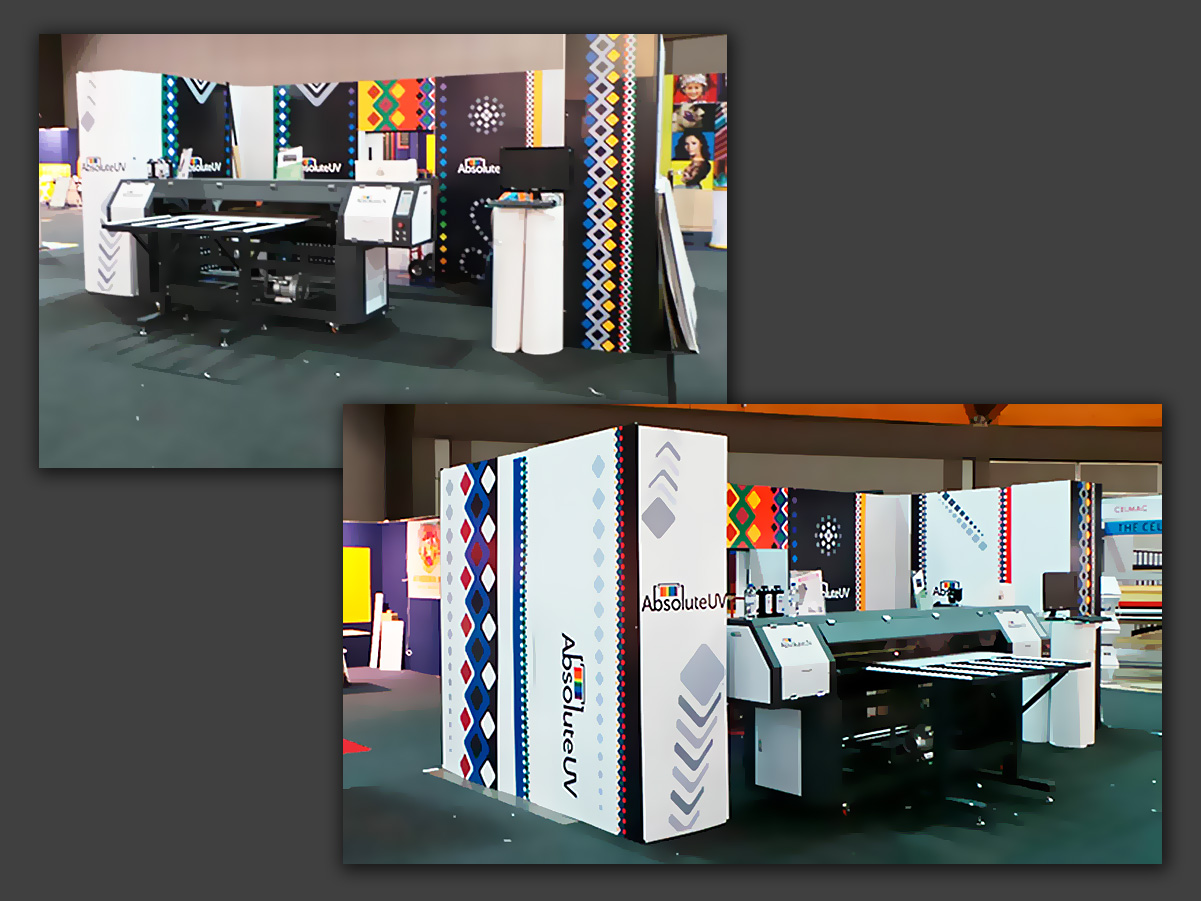
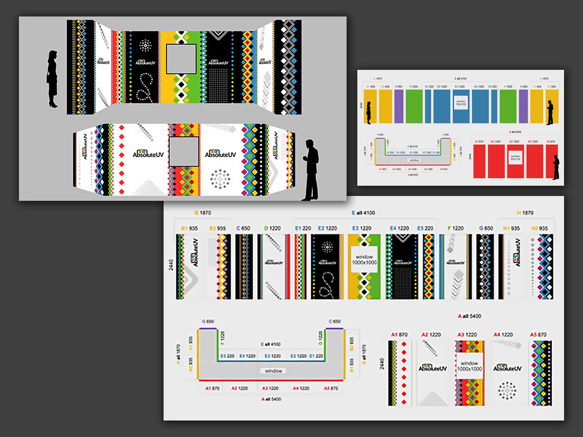
Informational and signage material developed for the 2014 World Cup, focused on the host stadiums. Besides creating the exhibit’s murals, I was responsible for developing the event’s visual identity, as well as print and digital communication materials and a microsite.
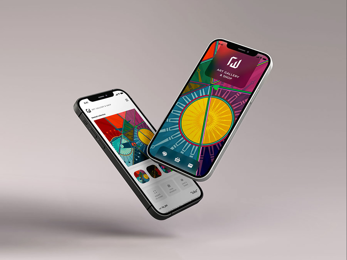
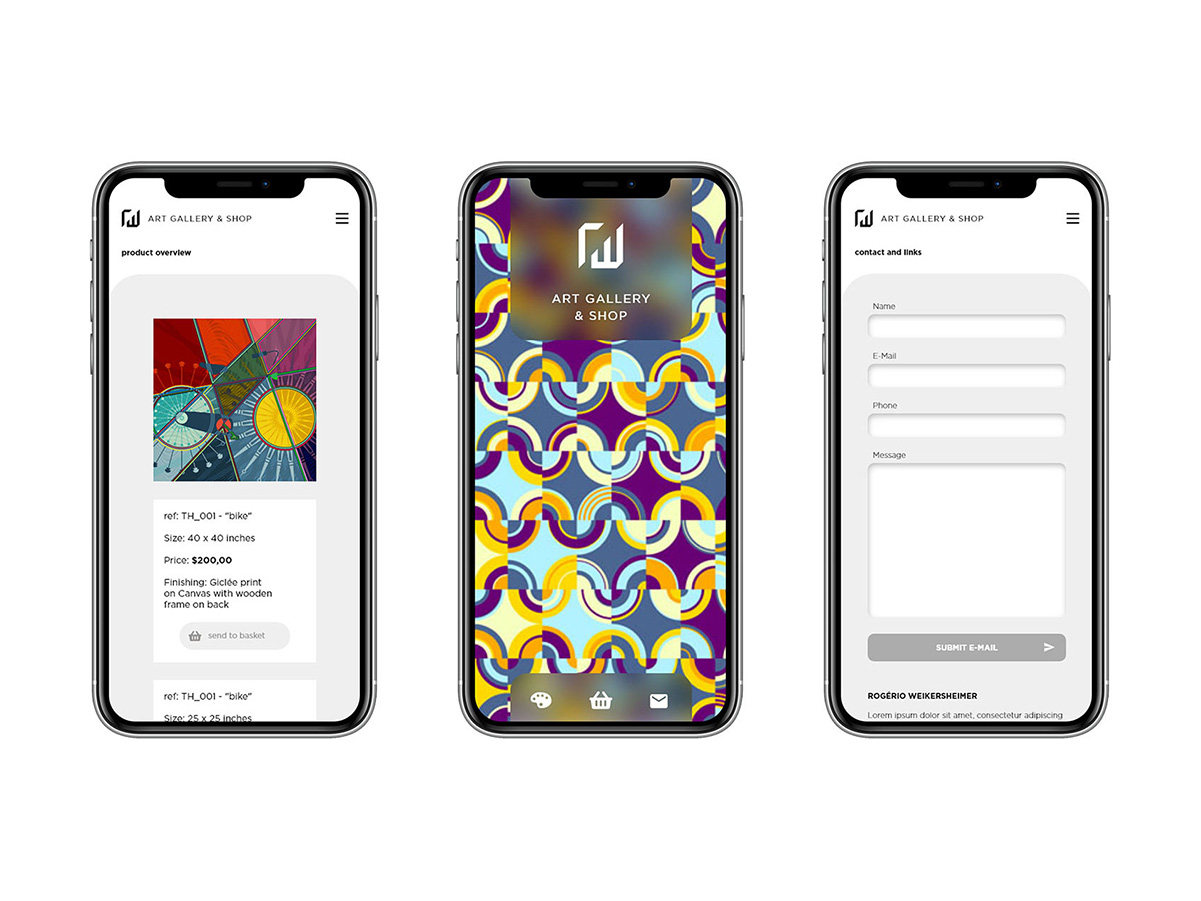
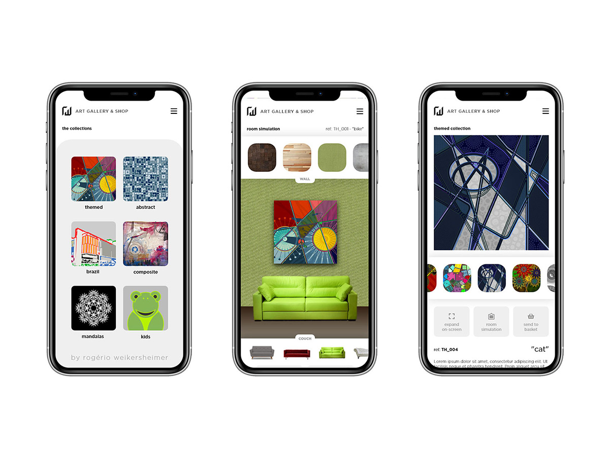
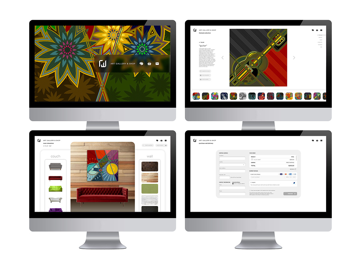
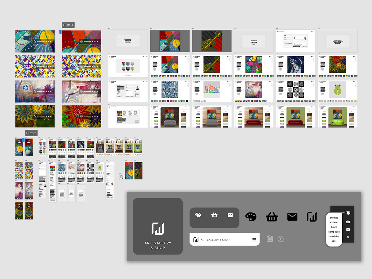
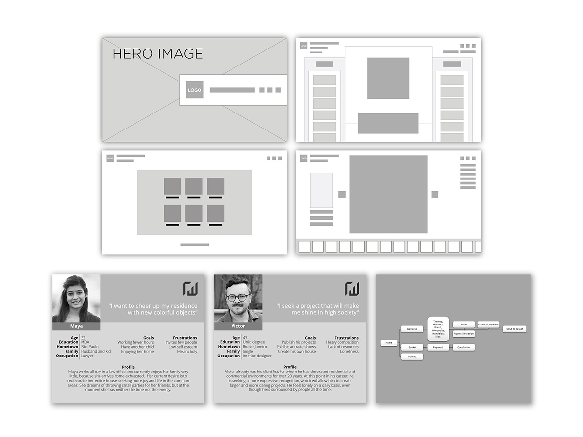
The idea was to use my own artwork, shown in this portfolio under the “Art” tab, as the subject for developing an online-store app concept. In it, the user could choose a setting to preview the artwork, set the size, canvas type and finish, and, at the end, request a purchase through a contact form.
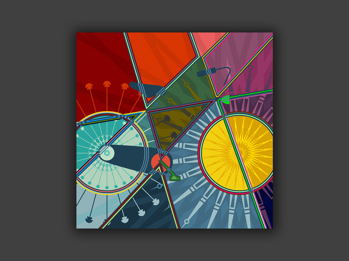
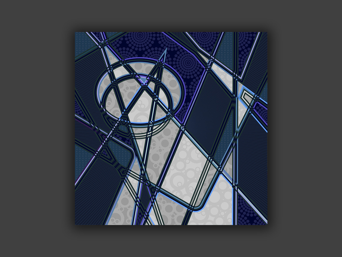
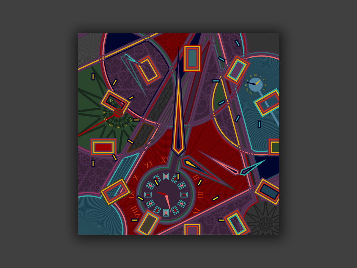
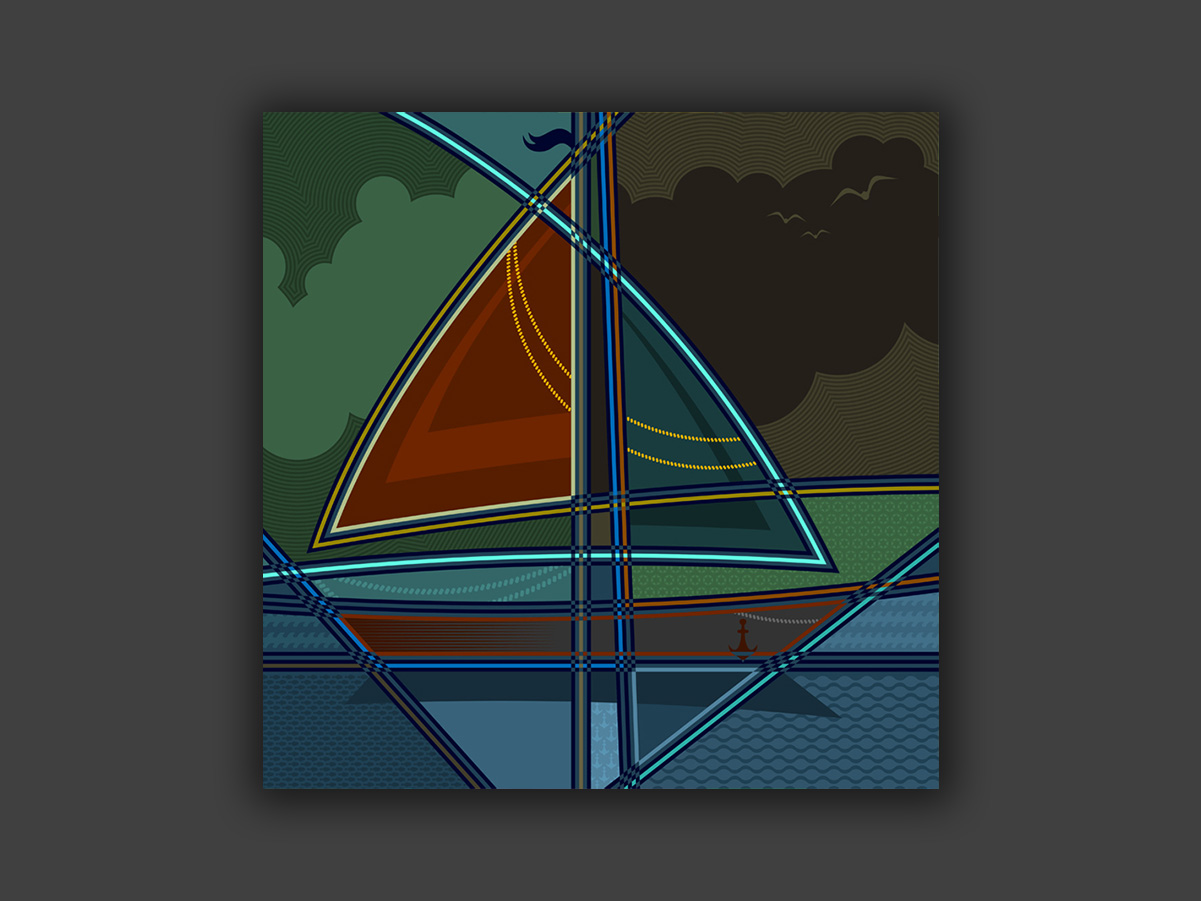
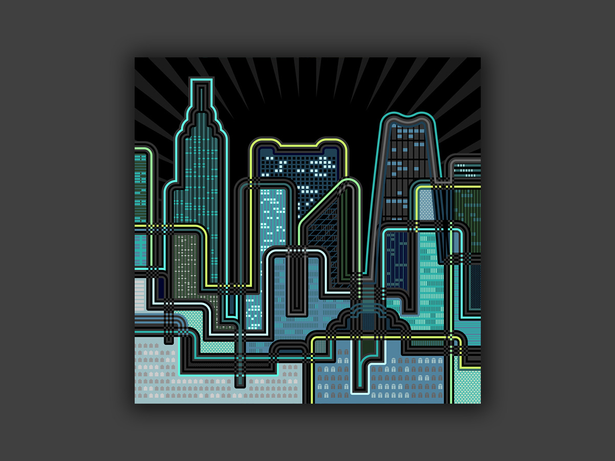
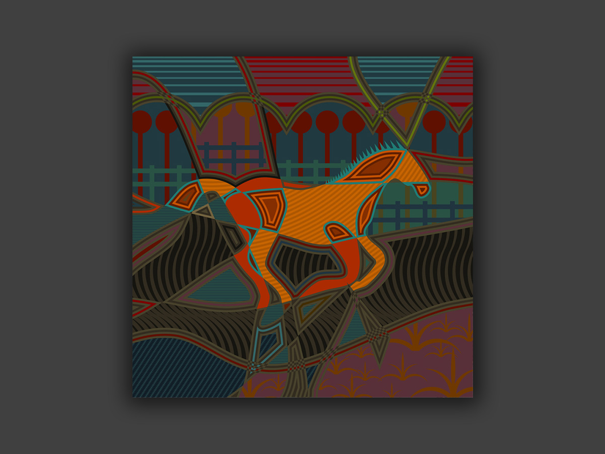
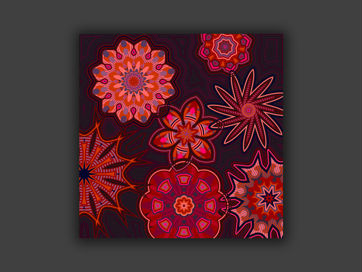
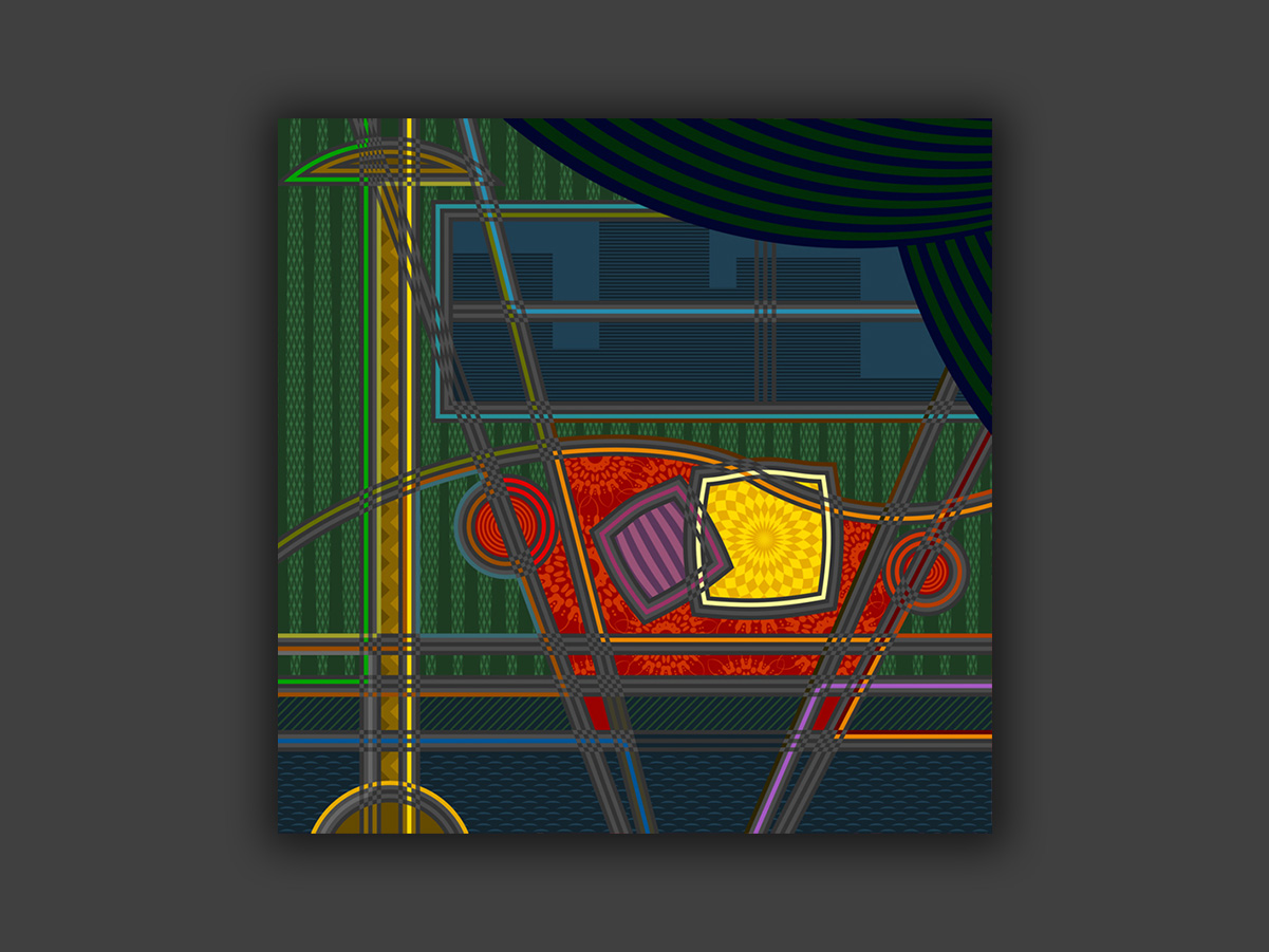
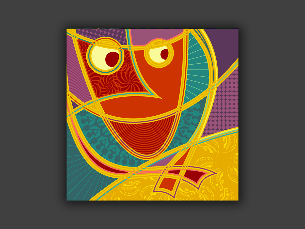
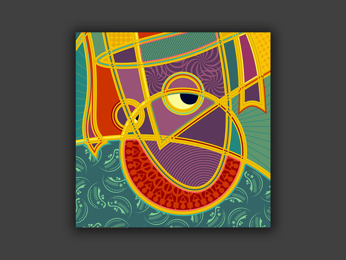
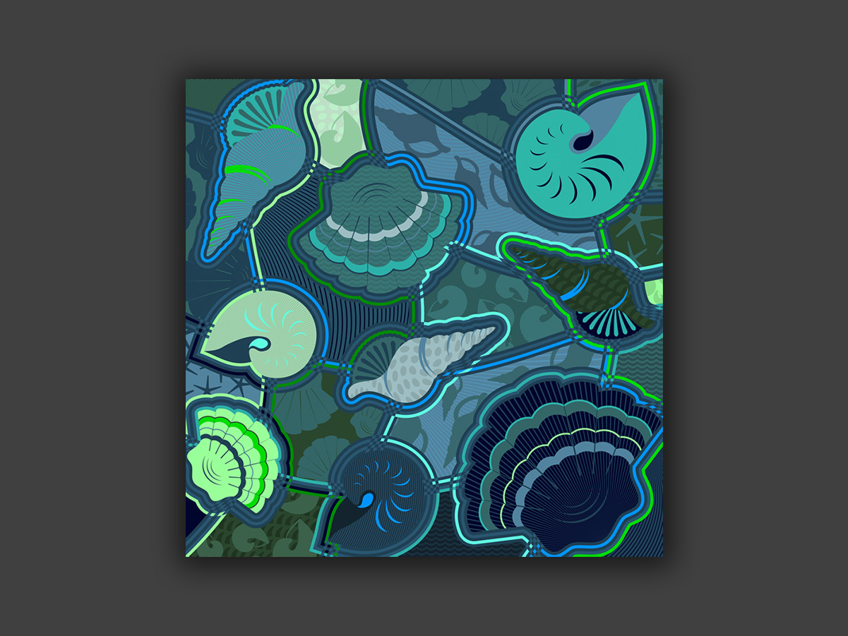
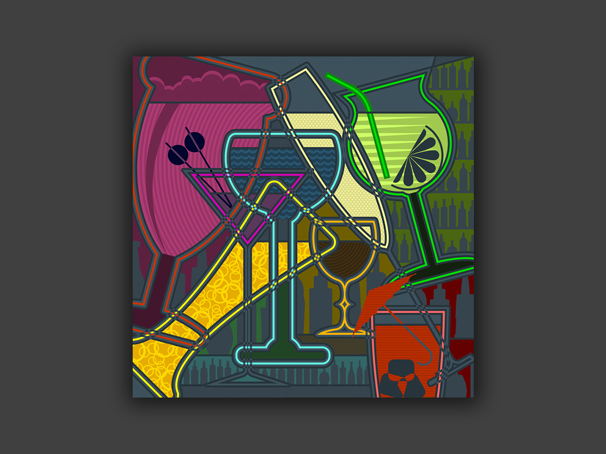

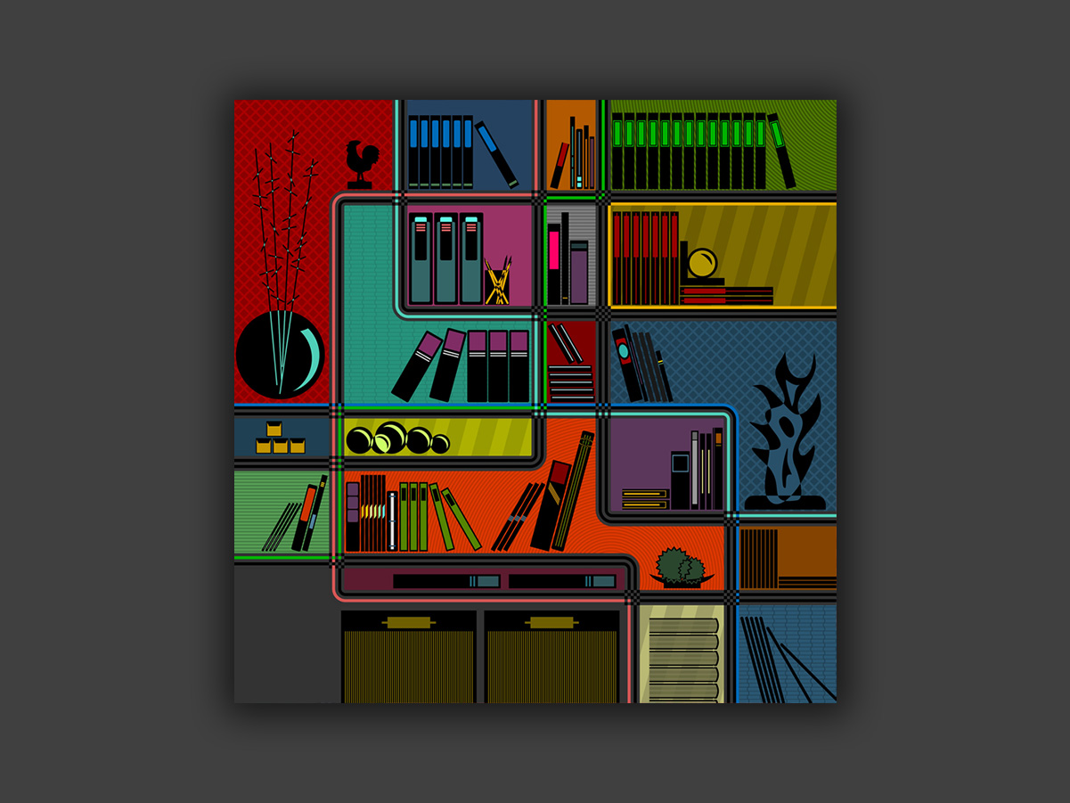
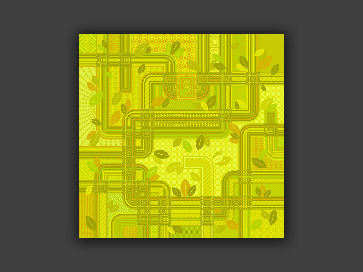
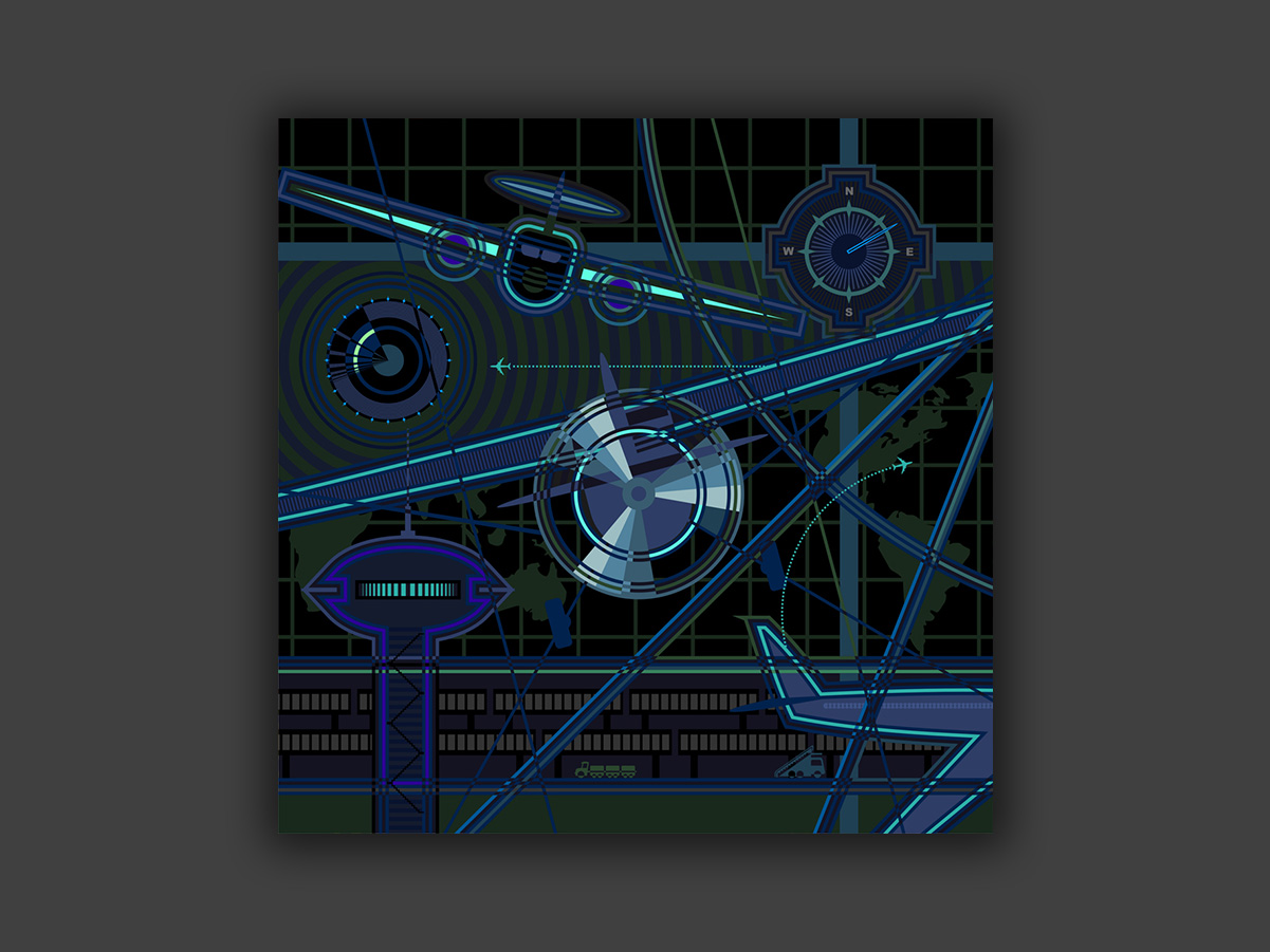
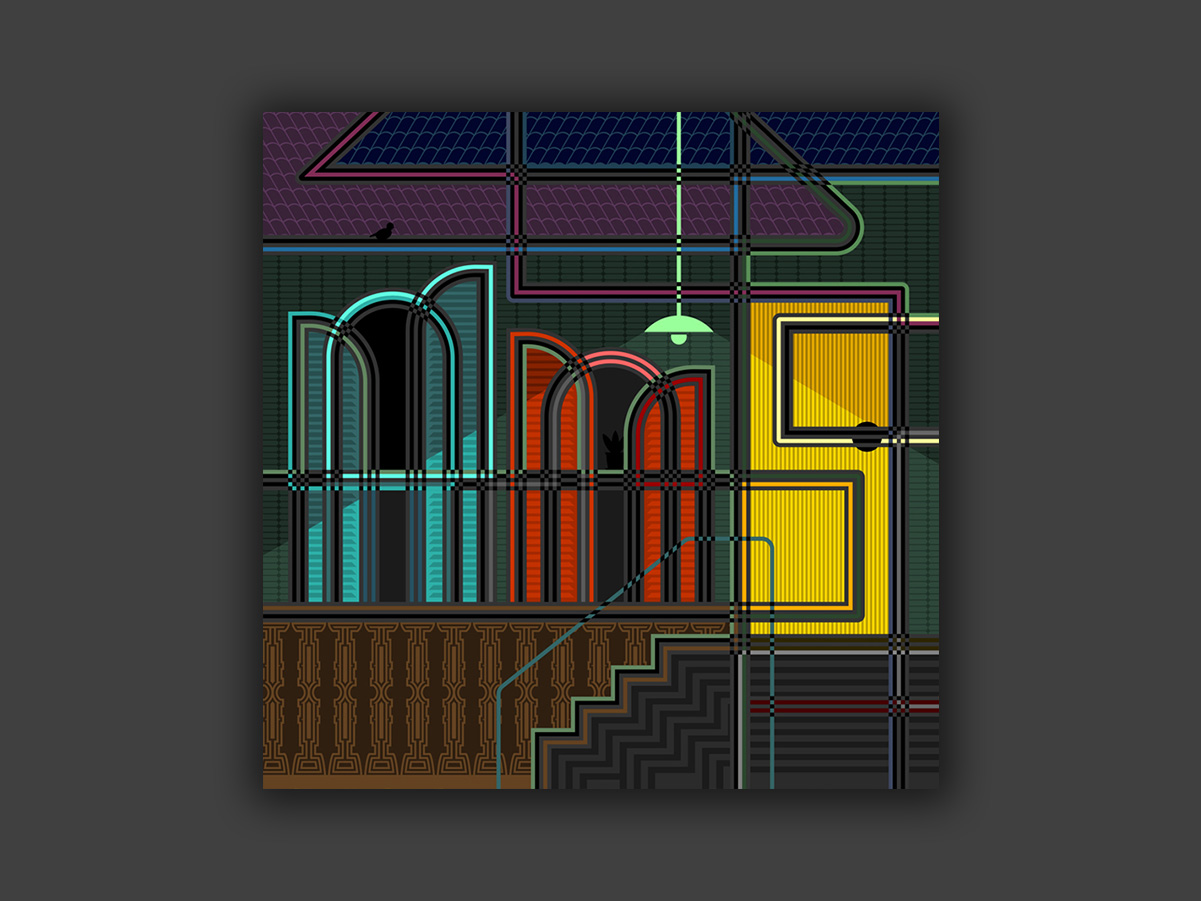
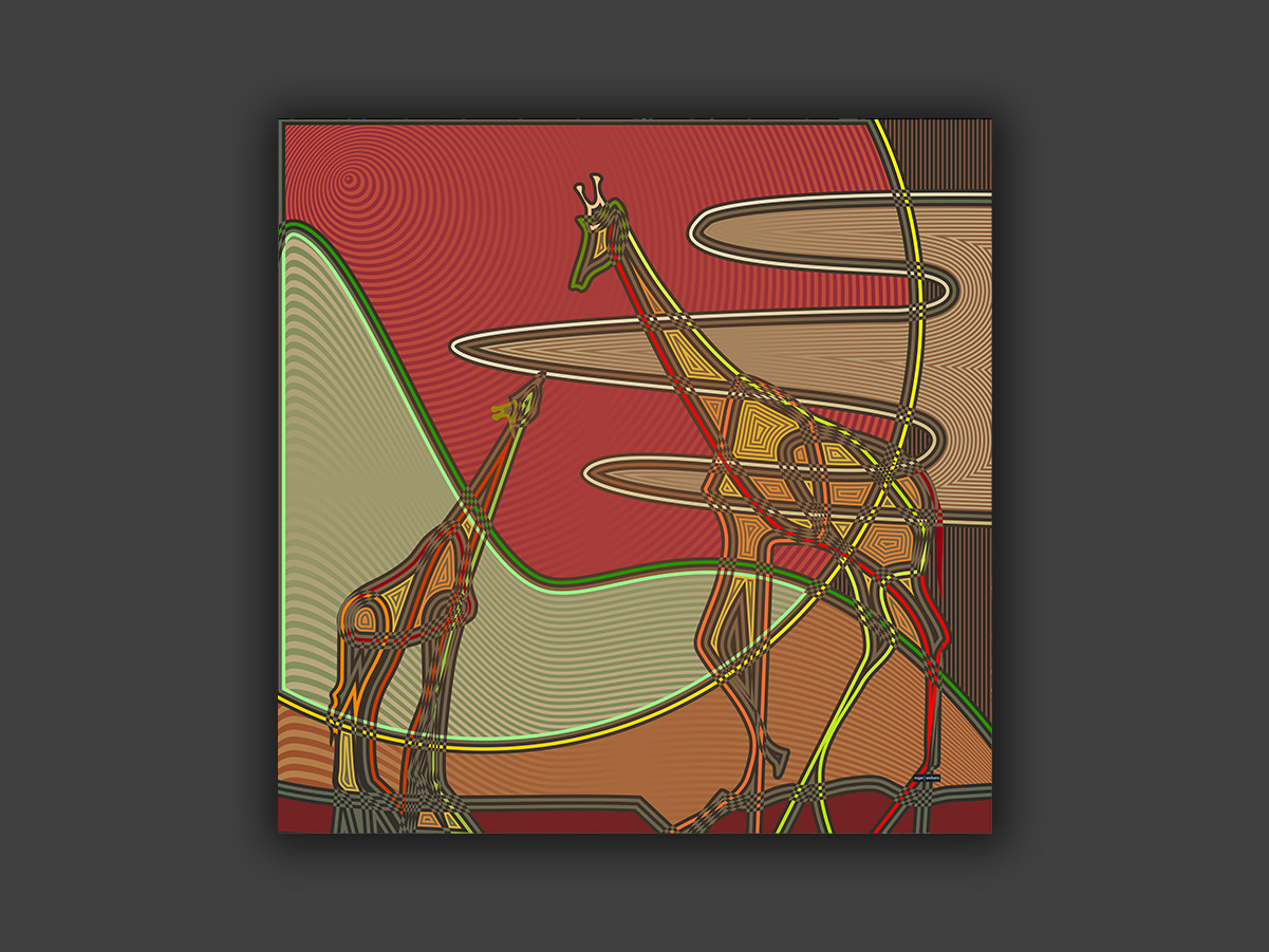
Compositions developed around random themes, combining visual storytelling and experimentation. These pieces are vector-based, so they can be printed as high-quality canvases in any size.
My art can also be seen on this Instagram.
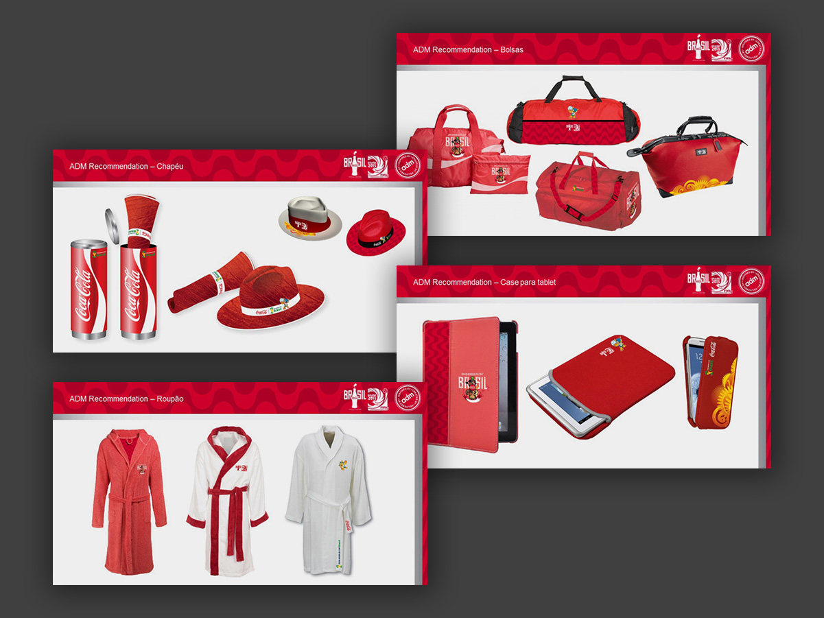
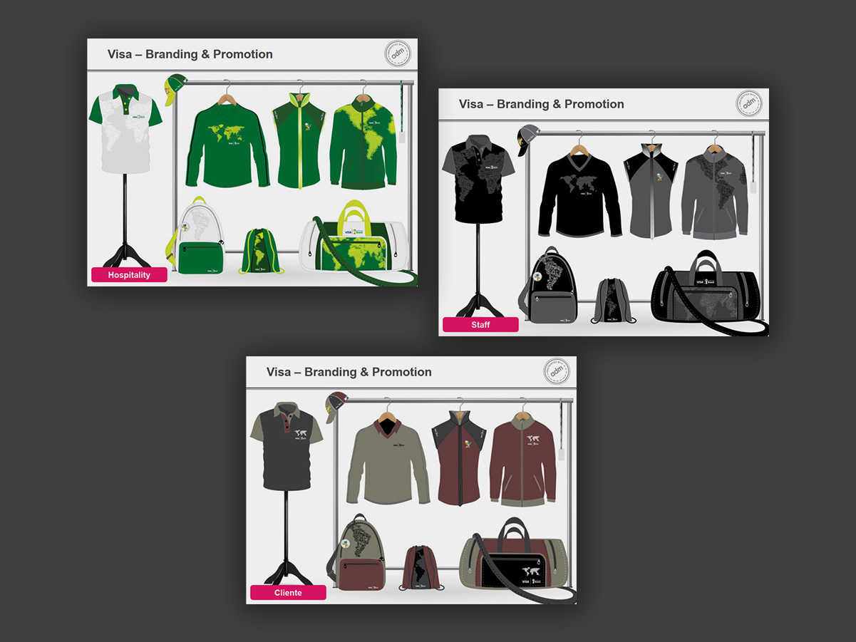
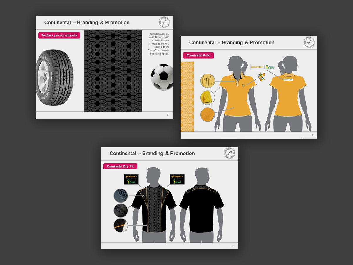
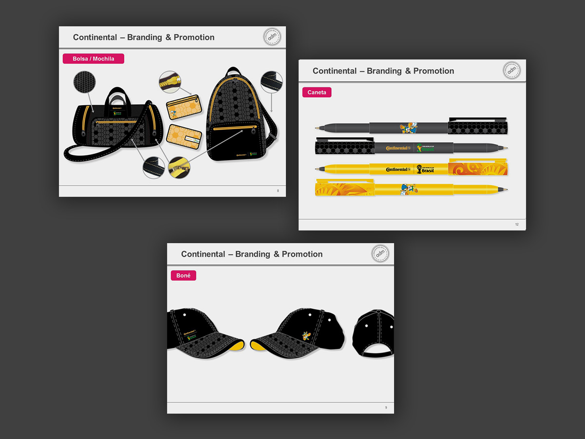
ADM agency was an official participant in the 2014 World Cup in Brazil, authorized to apply sponsor brands on the event’s official materials. I was responsible for the layout of pieces for Coca-Cola, Visa and Continental Tires.
A collection of logos where the visual solution comes purely from the letterforms themselves, with no supporting graphic symbols. Most were developed for logo contests on Freelancer.com.
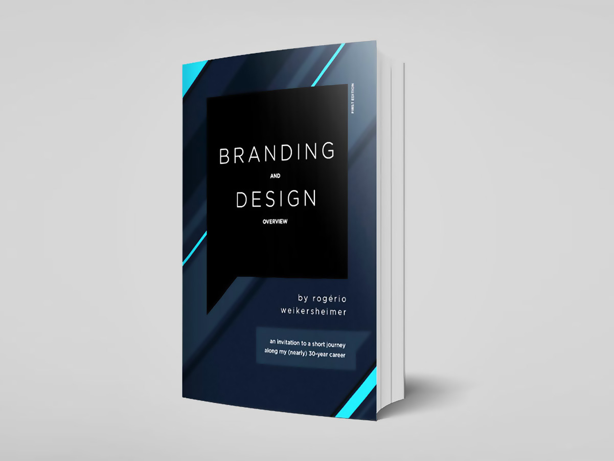
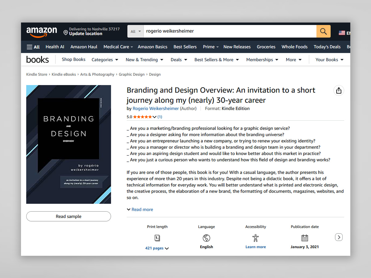
A self-published title offering an overview of branding and design, produced as a personal project during the pandemic. Written at home throughout the lockdown periods, the project was a way to stay creative and active during a time of isolation and uncertainty. It was also a major writing exercise in English, as well as a chance to bring together, in a single publication, the knowledge, experience and reflections built up over my 30 years career.
The full content can be found at this link.
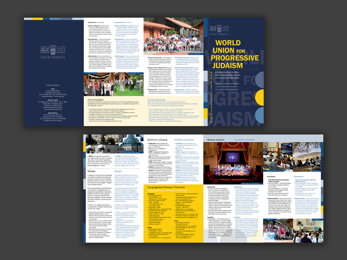
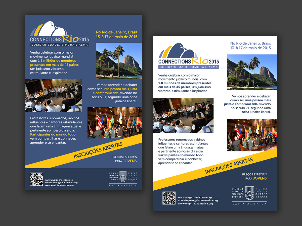
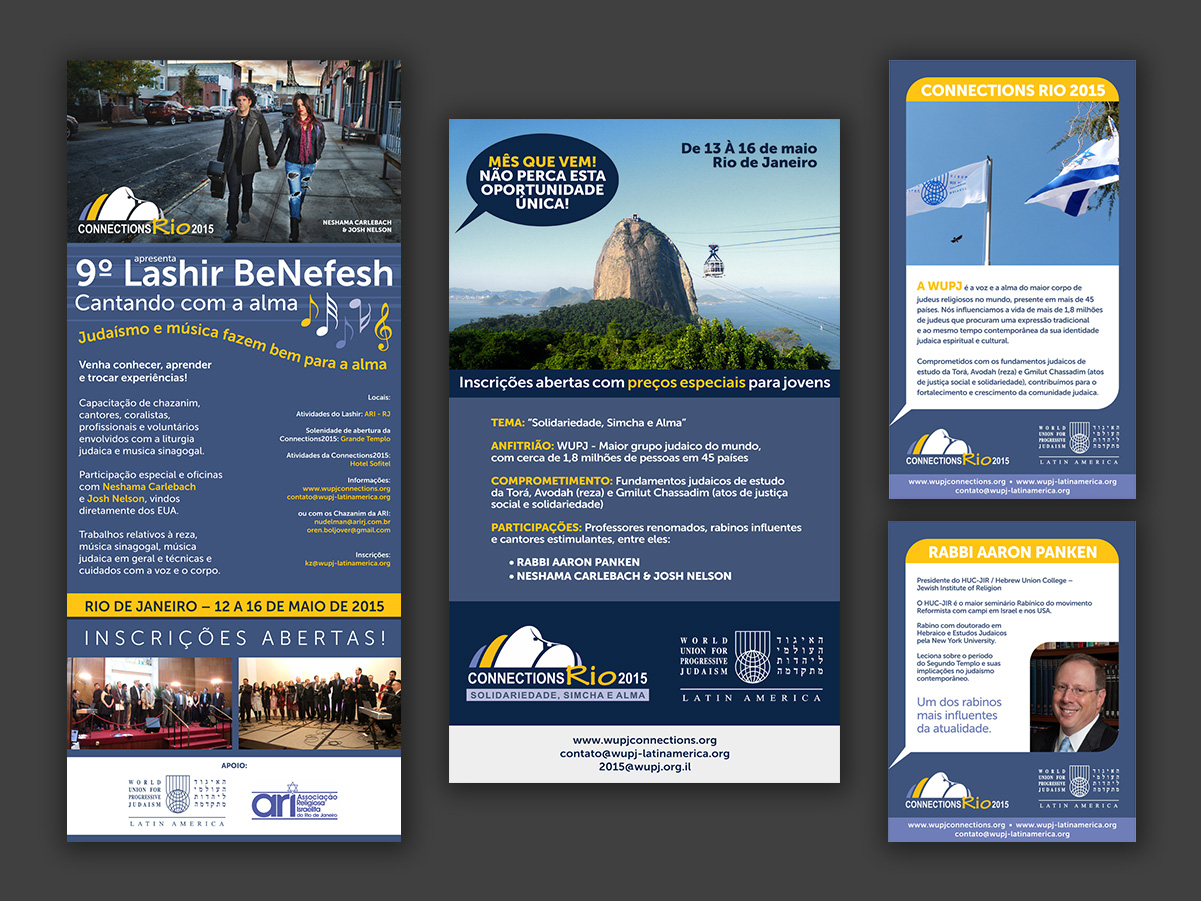
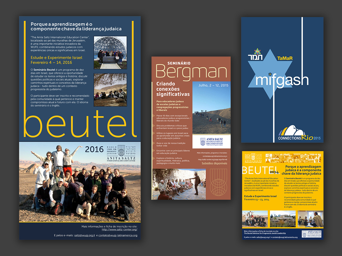
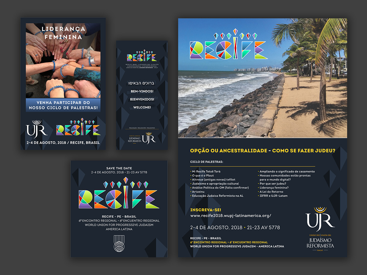
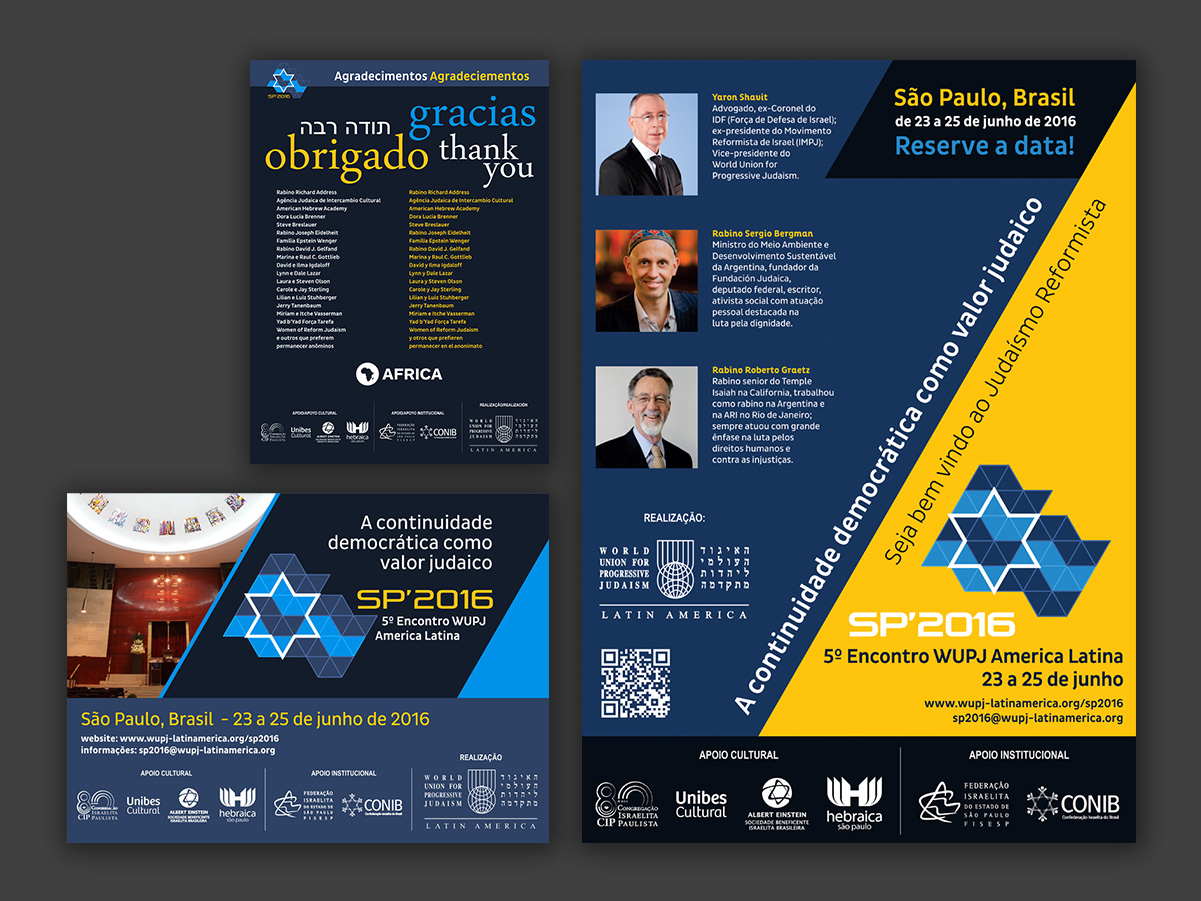
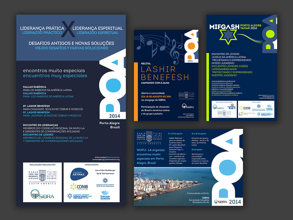
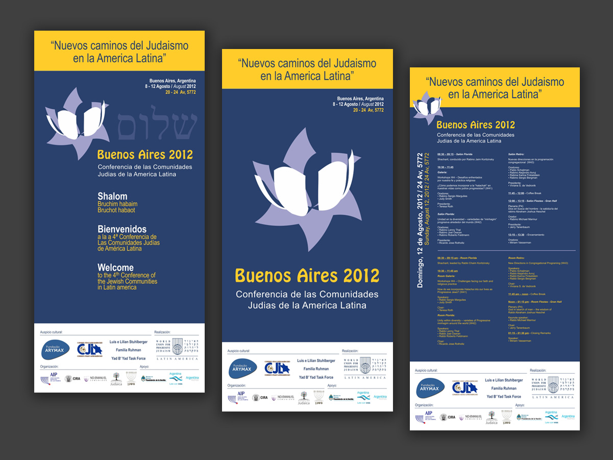
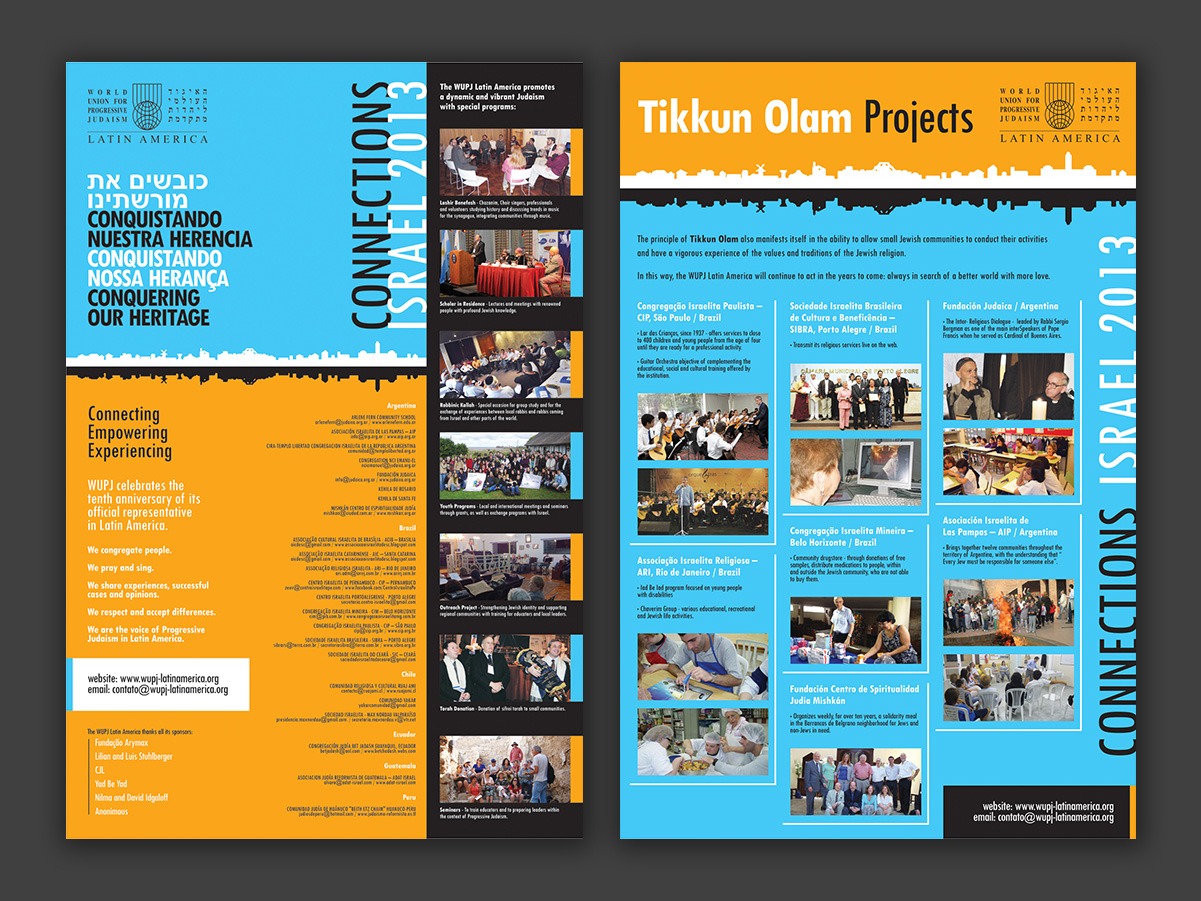
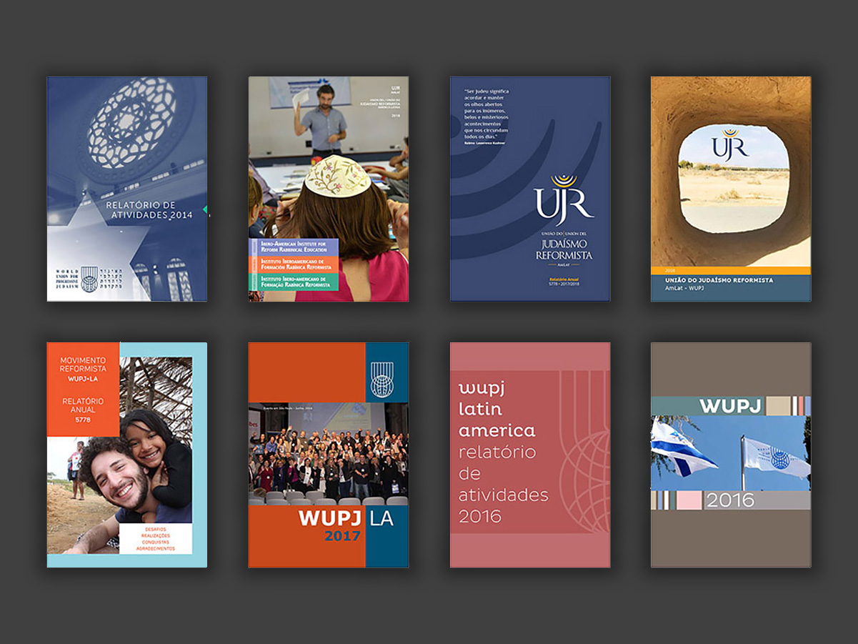
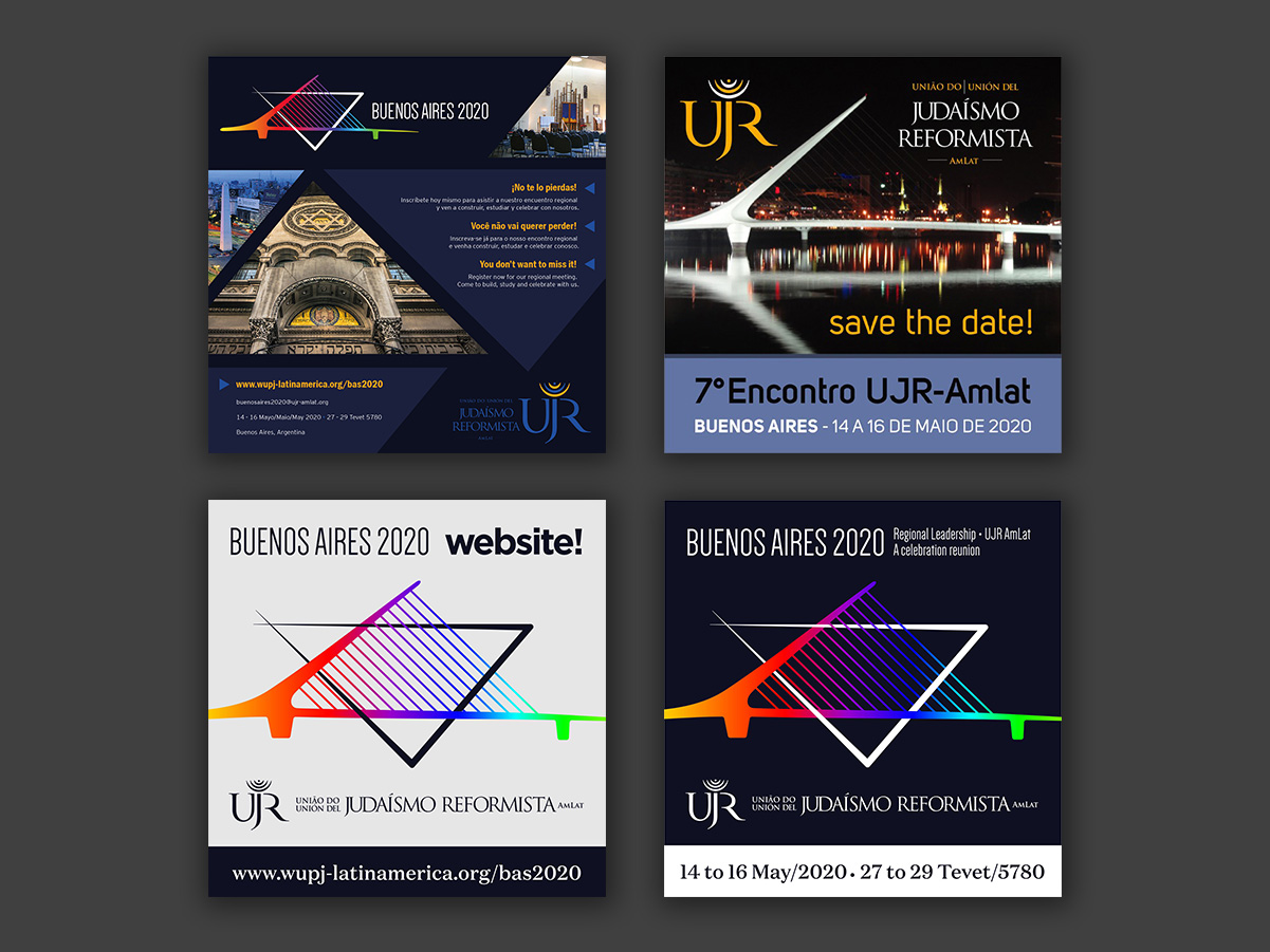
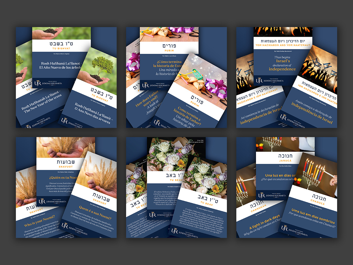
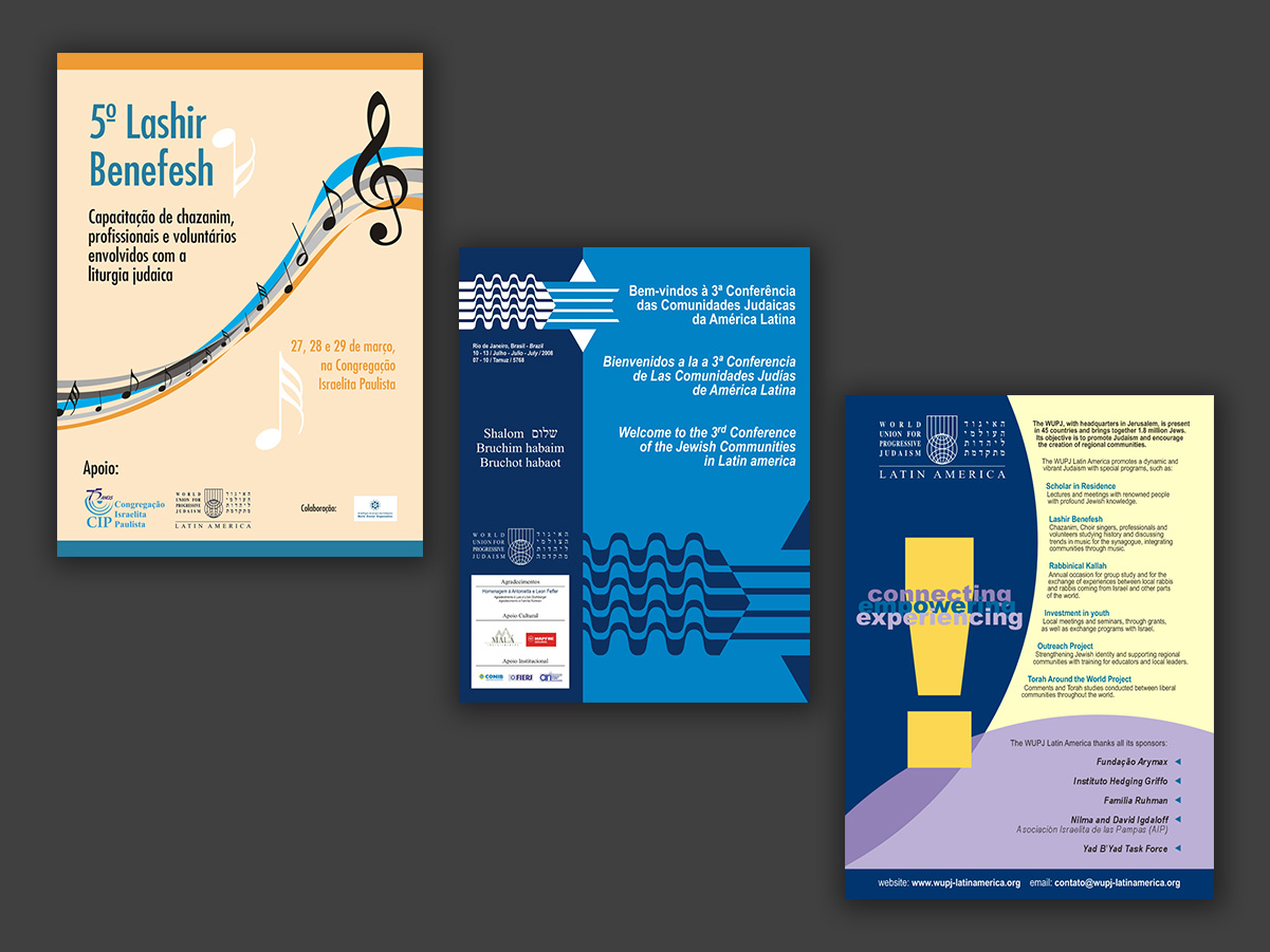
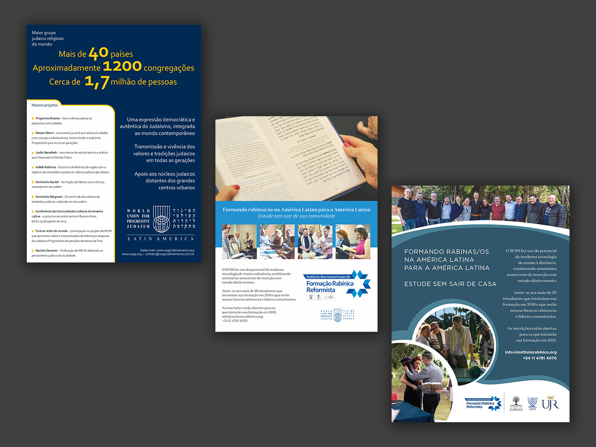
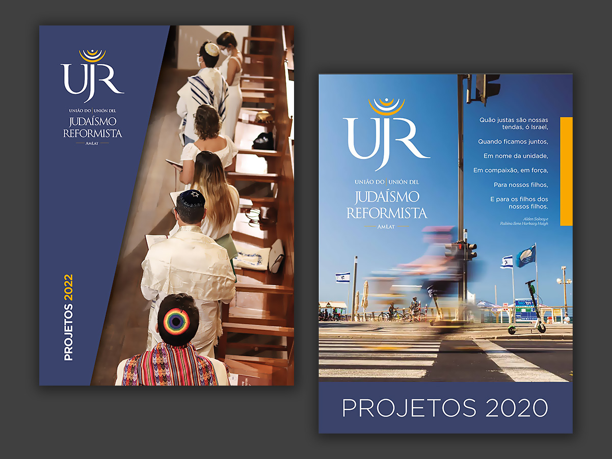
More than seven years of partnership with WUPJ Latin America, later renamed UJR, developing printed and digital materials for its institutional communications — including events, campaigns, reports, fundraising initiatives, newsletters, and brochures for Jewish holidays (chaguim). All materials were produced in Portuguese, Spanish, and English, and occasionally in Hebrew as well. During this period, I was also responsible for the organization’s complete branding redesign and the creation of the new UJR brand.
These pieces explore visual synthesis and communication through simple, minimalist shapes. Some of these symbols were used in logo compositions; others as graphic elements in publications, presentations, campaigns and signage projects.
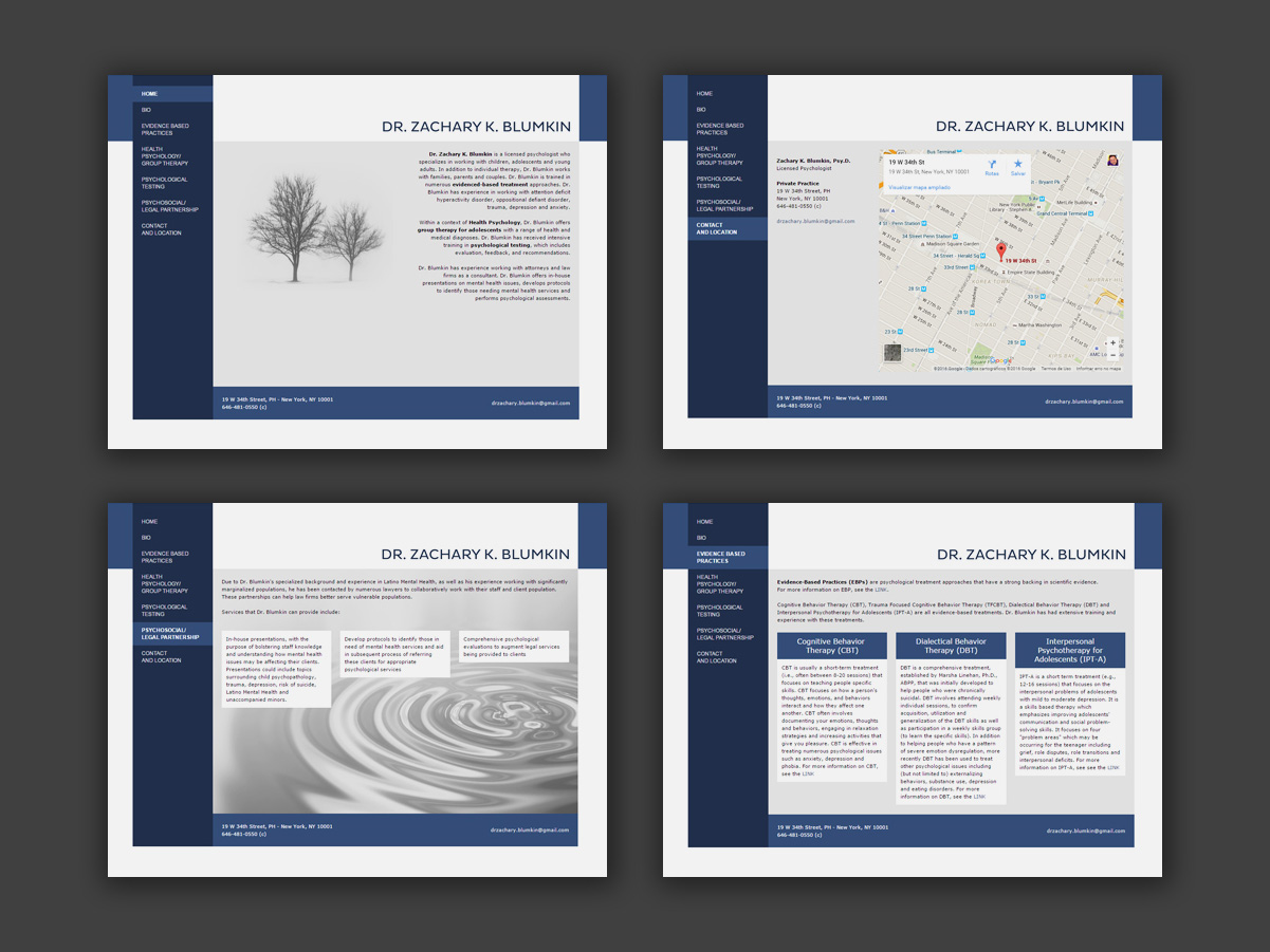
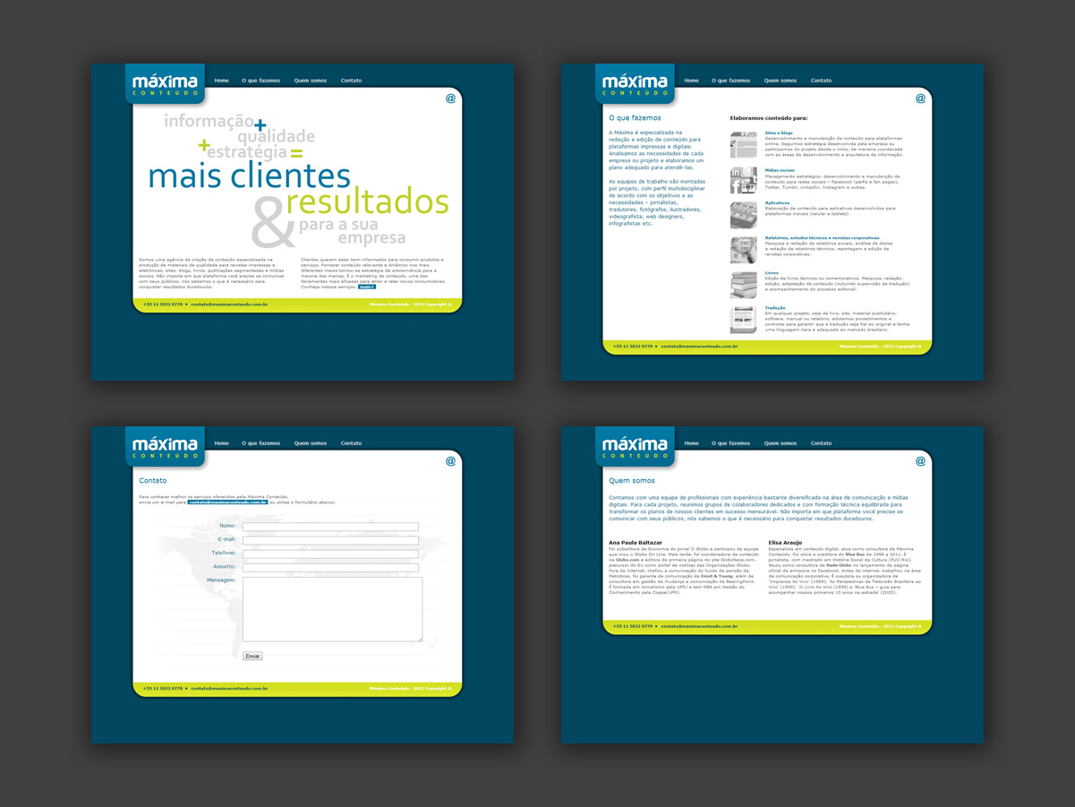
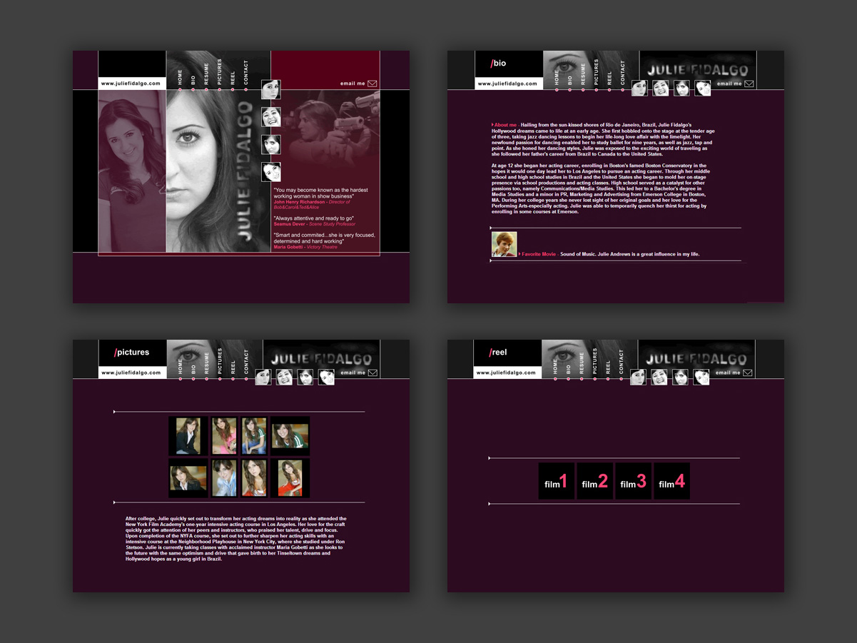
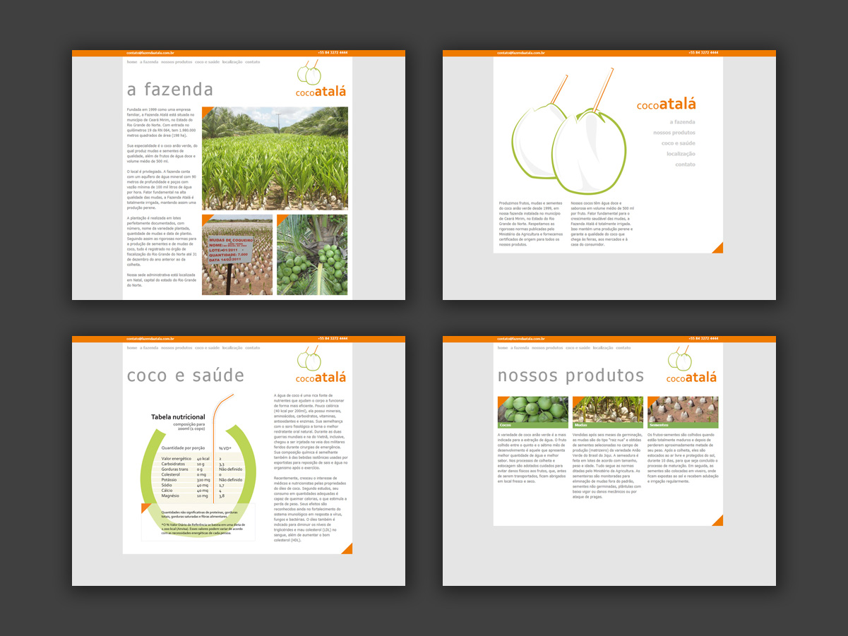
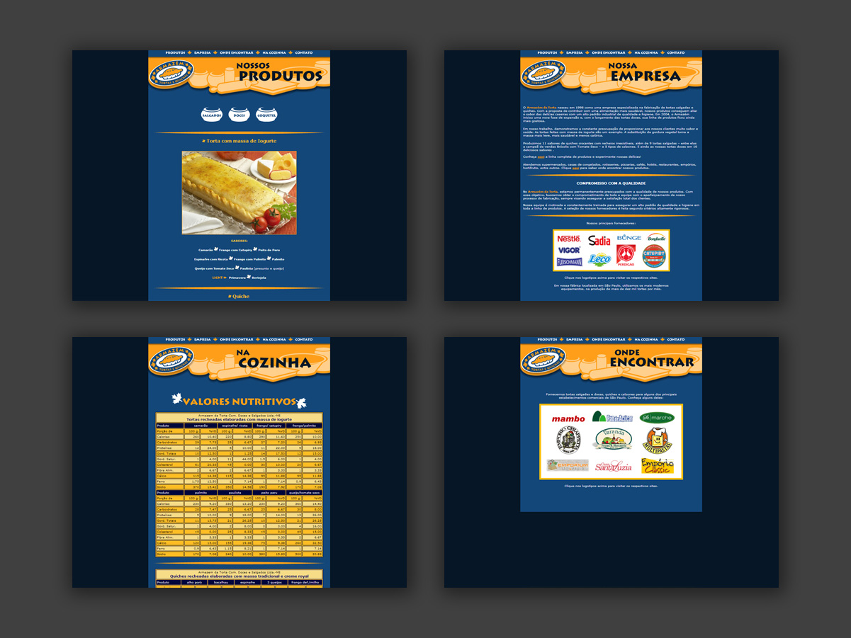
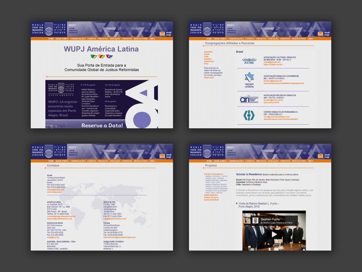
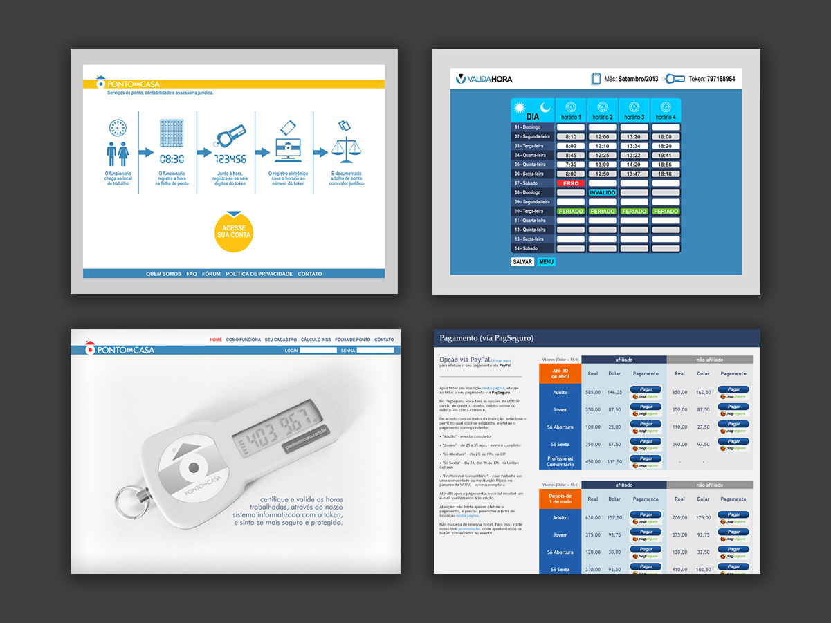
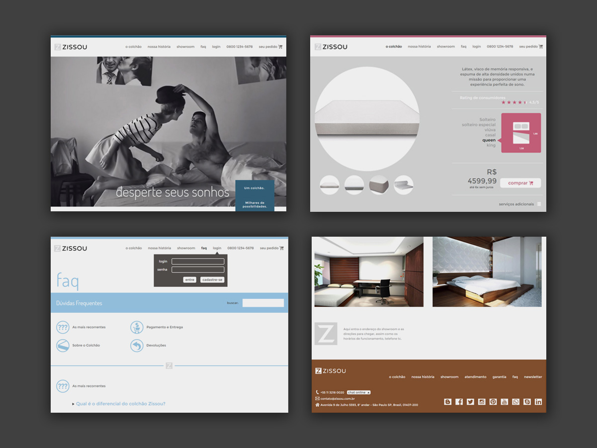
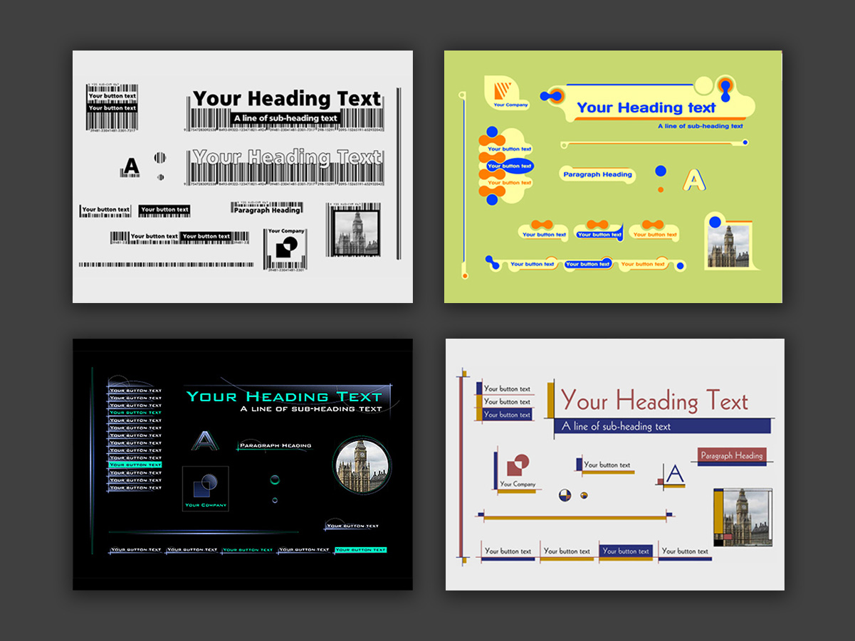
A collection of pages and navigation flows developed for various web projects, bringing together work from different moments in the evolution of the internet. From early sites built almost entirely by hand in HTML, through WordPress and Flash, to today’s prototyping tools, templates and AI-assisted development. A record of this transformation and of the different ways of creating for the web.
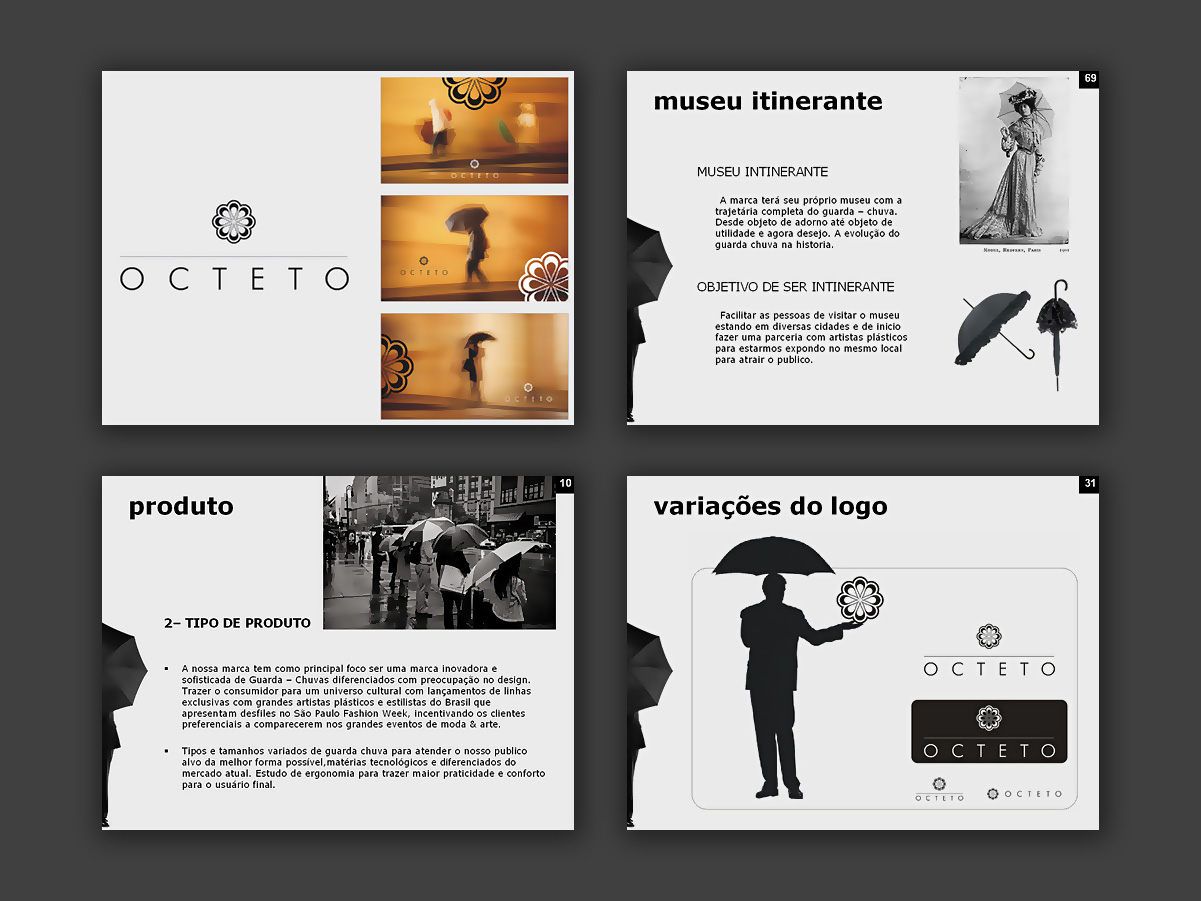
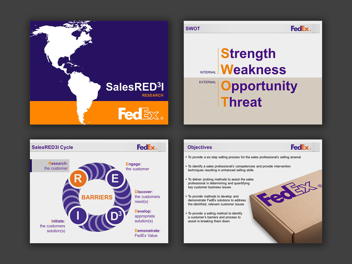
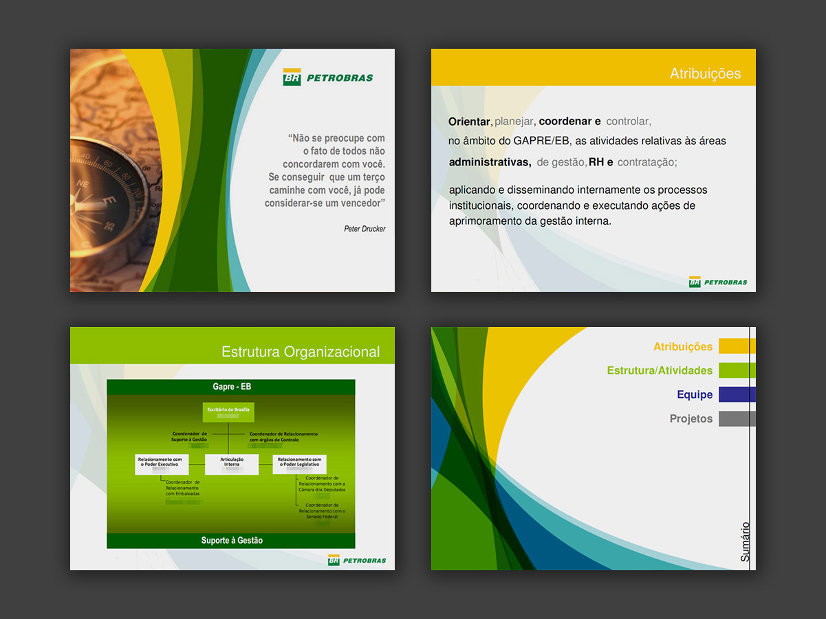
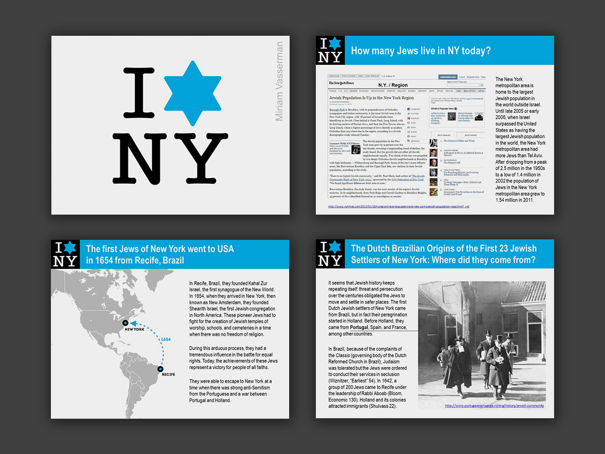
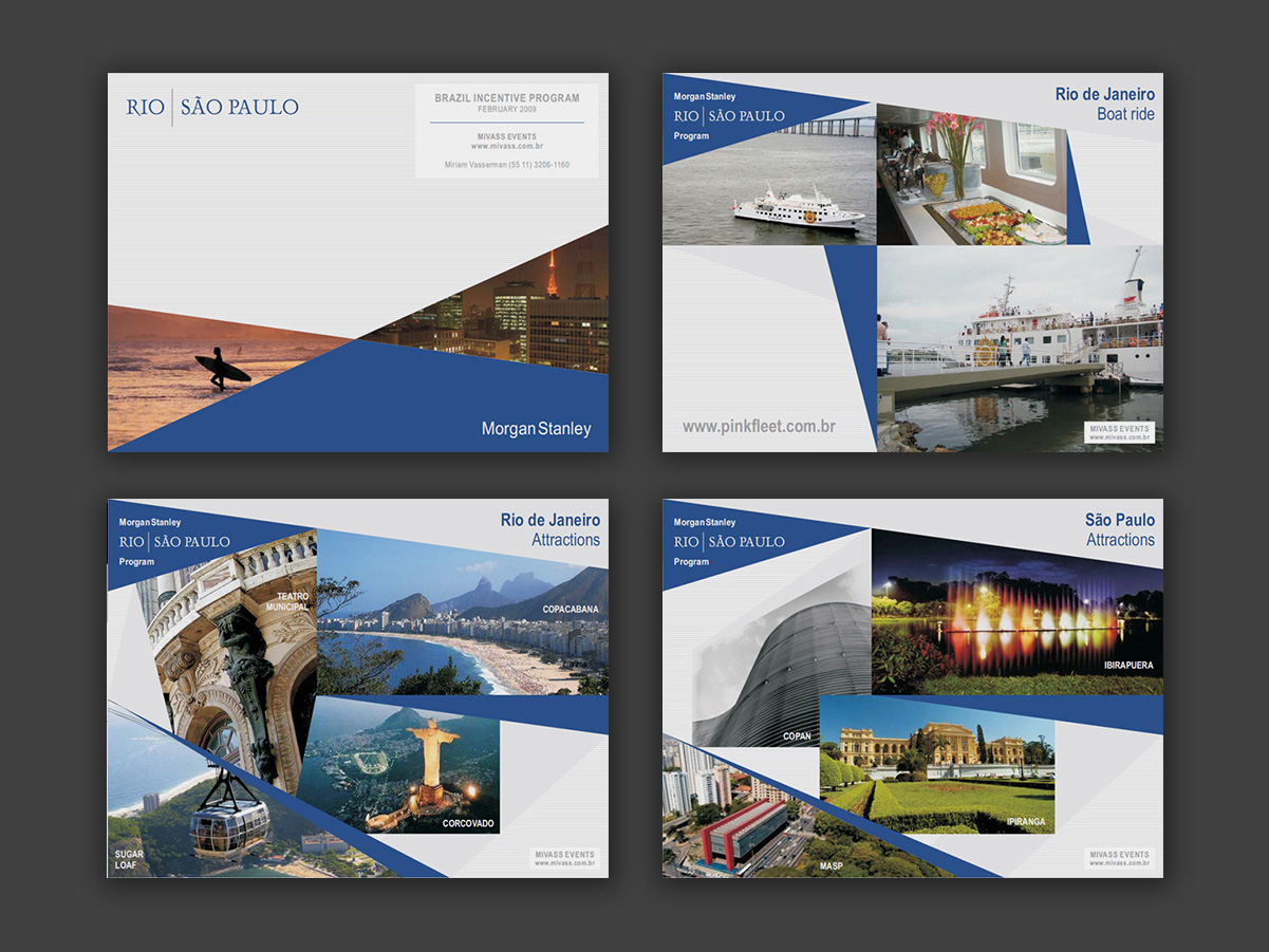
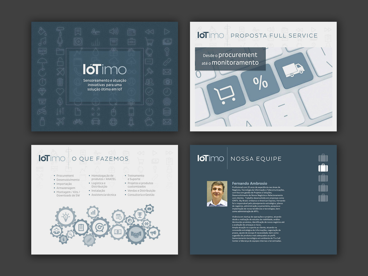
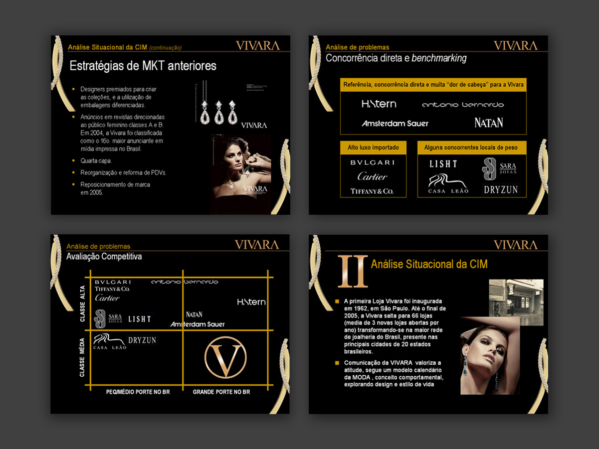
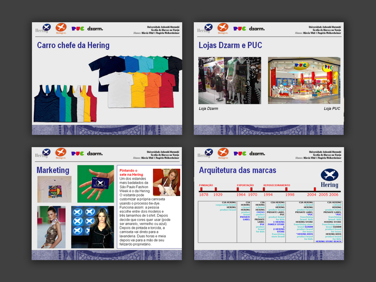
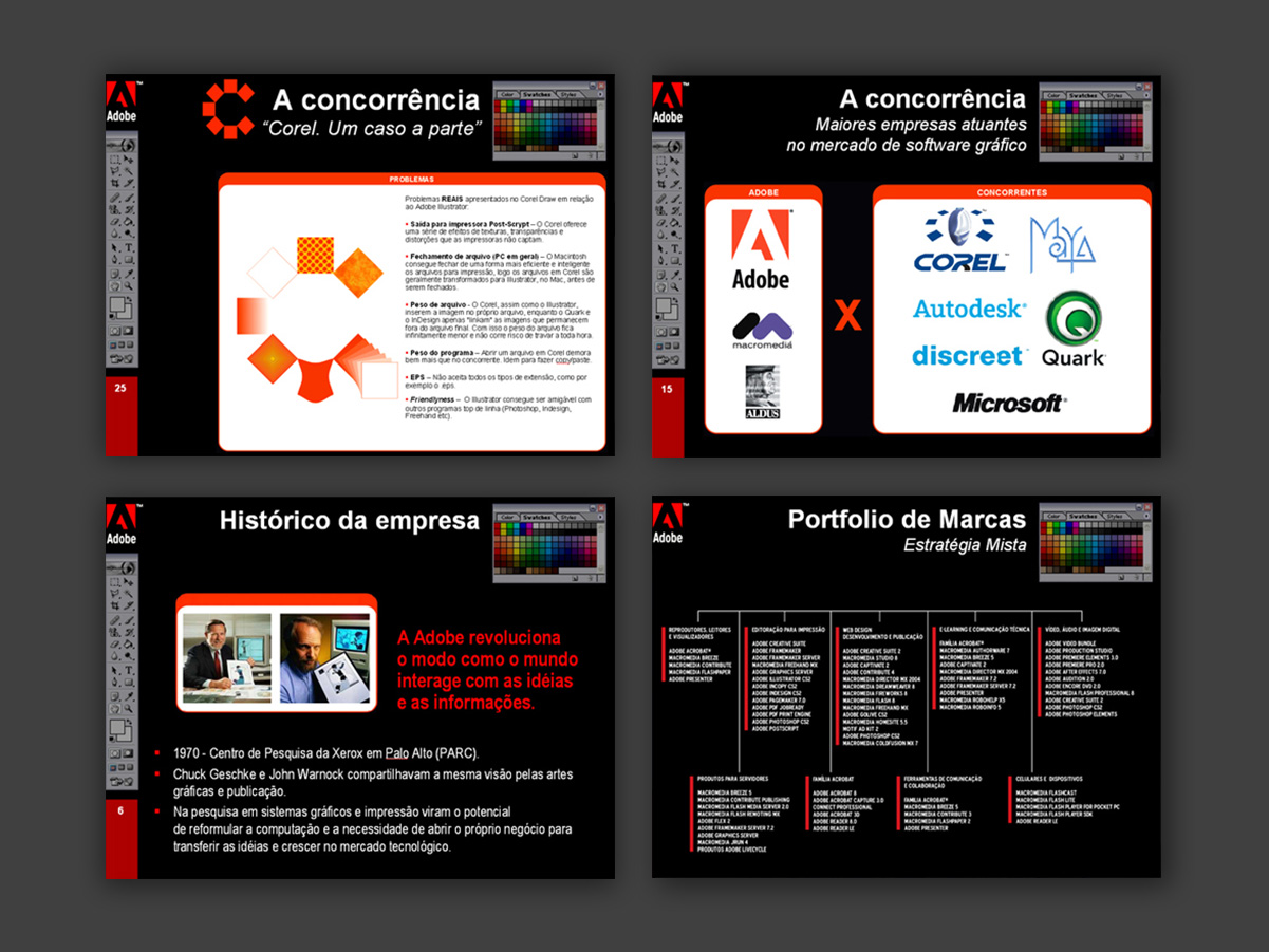
A collection of institutional, commercial and academic presentations developed at different points in PowerPoint’s evolution, with a focus on visual clarity and brand identity. The work reflects the resources, formats and visual languages typical of each period. In several cases, I also took part in creating and editing the content, from organizing the information to writing and reviewing the text.
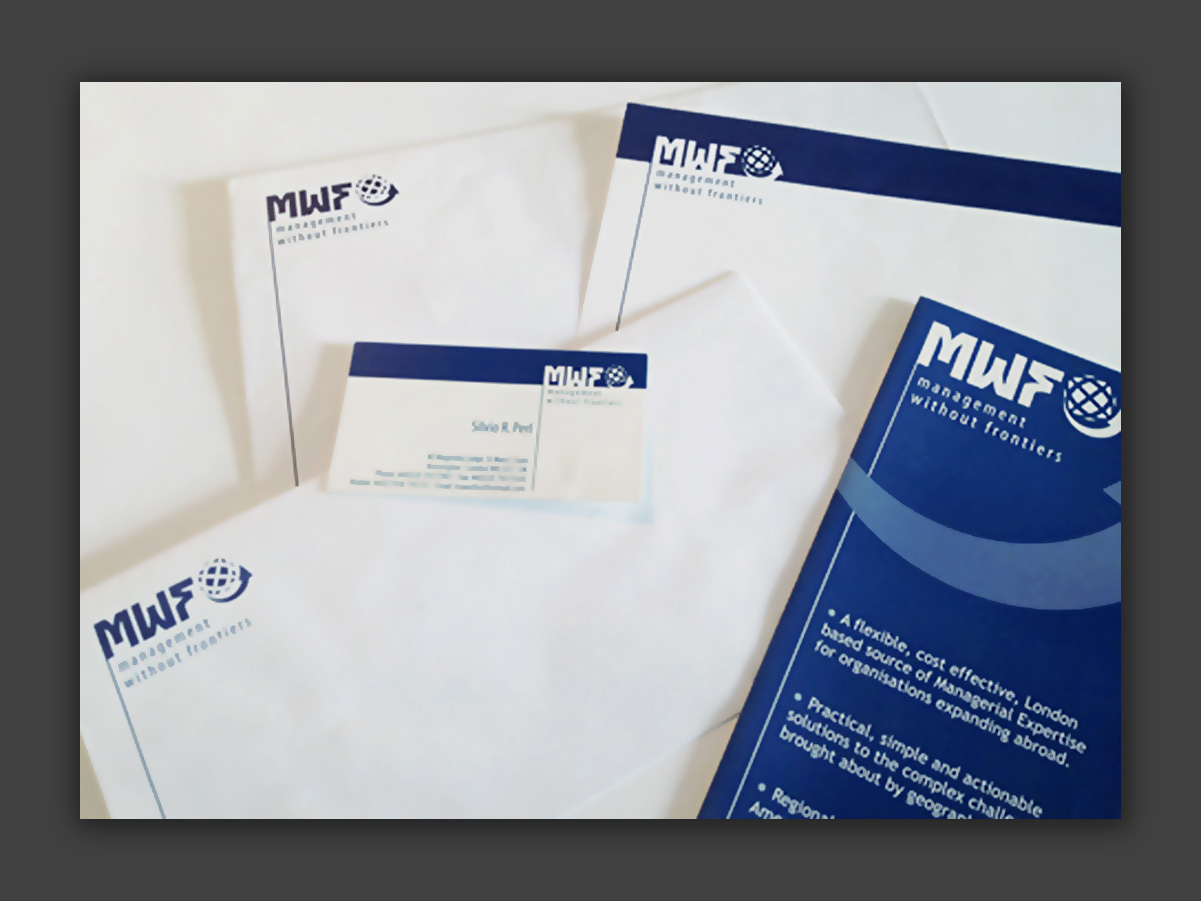
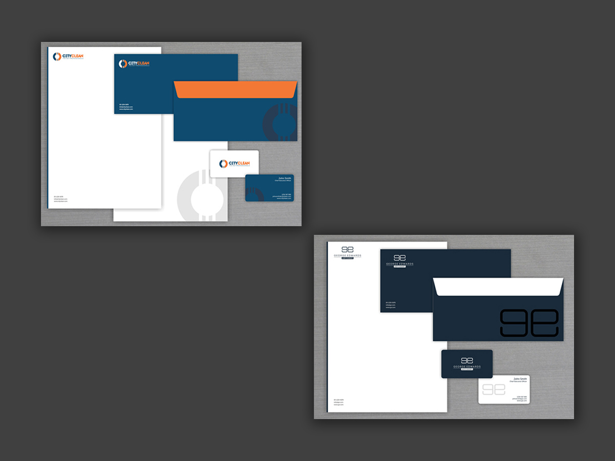
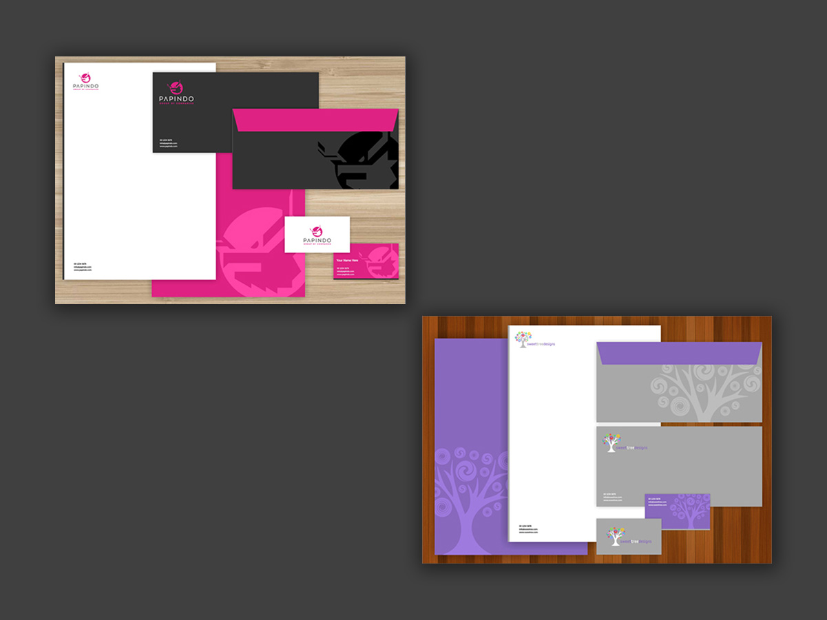
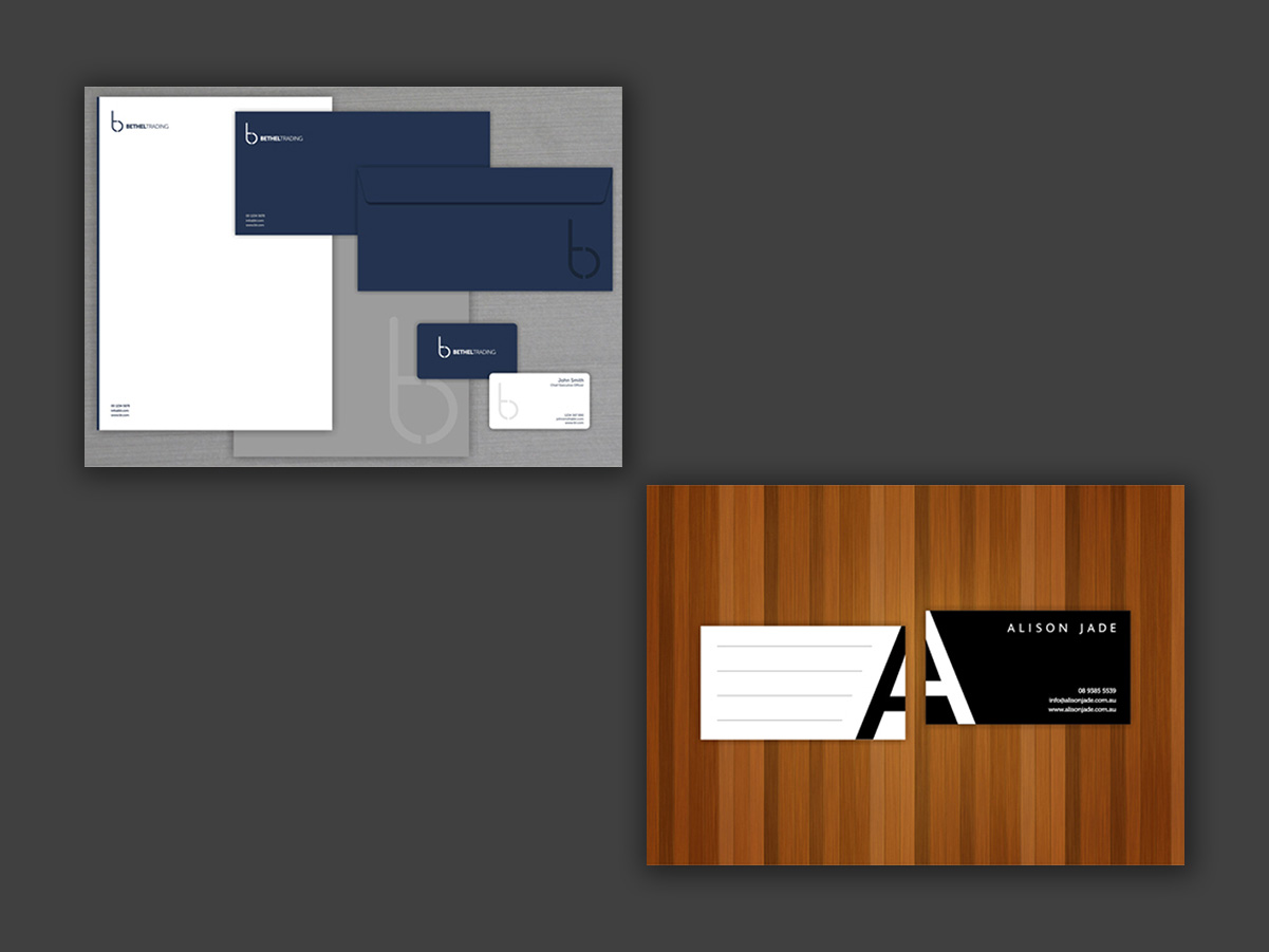
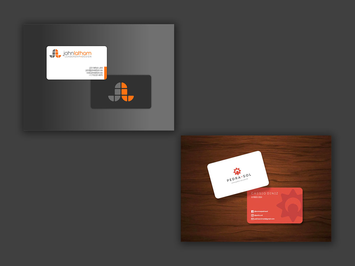
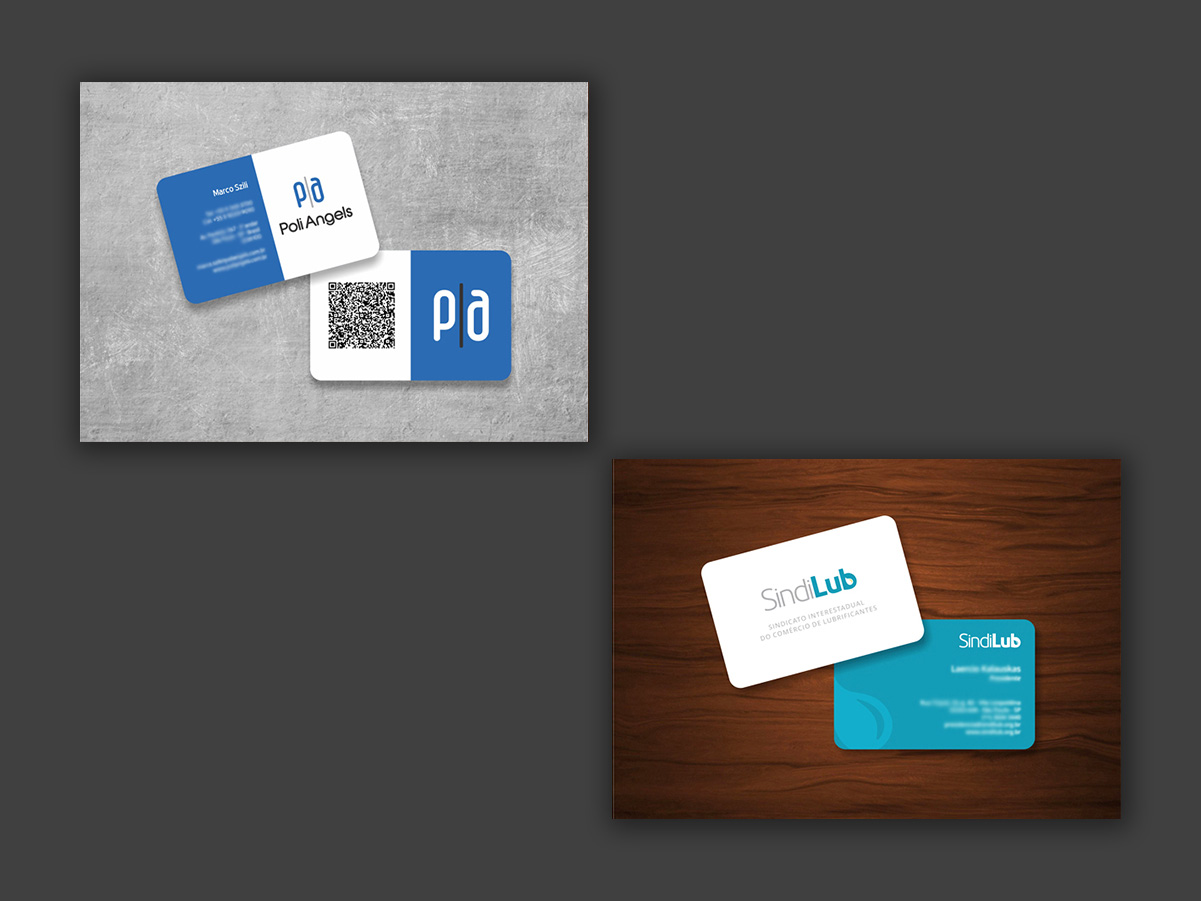
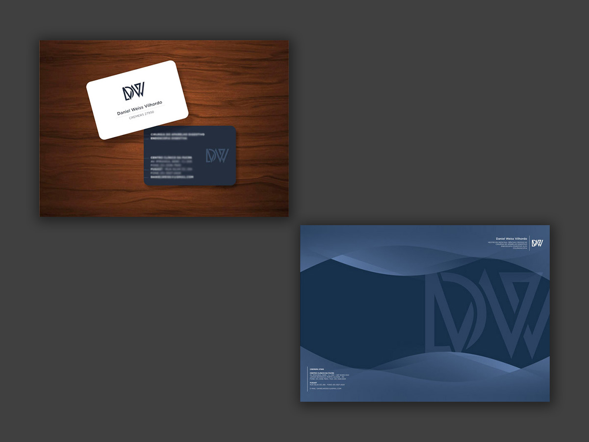
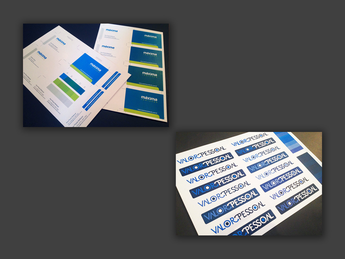
A record of logos applied across different contexts, from print to digital. For every brand I develop, besides the visual identity guidelines, I usually create a basic set of applications, including stationery, business cards, digital templates and email signatures.
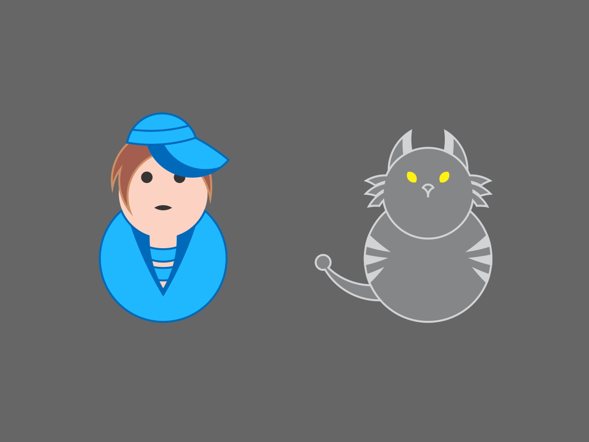
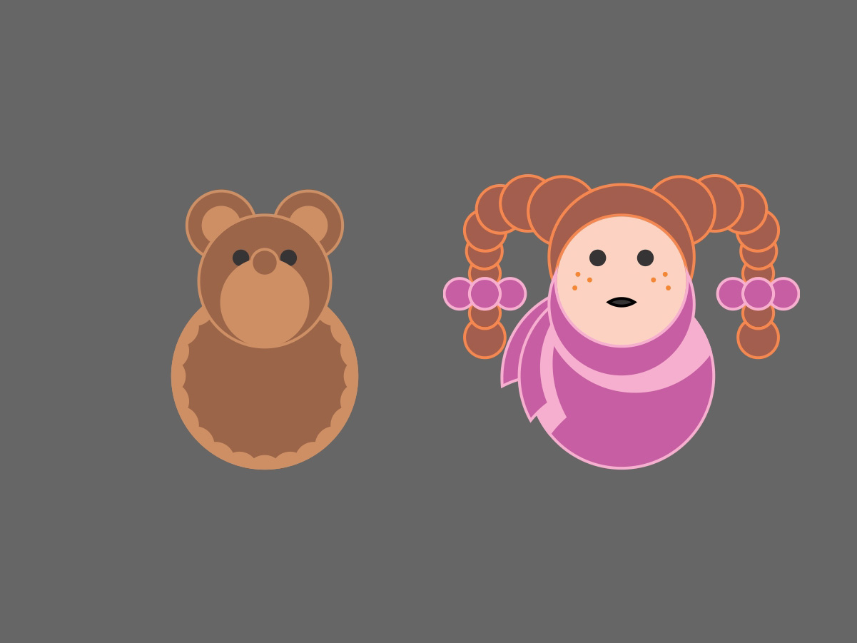
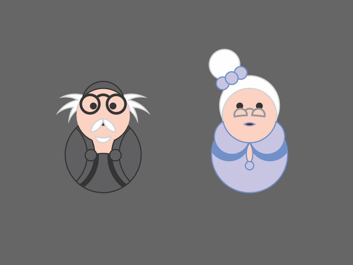
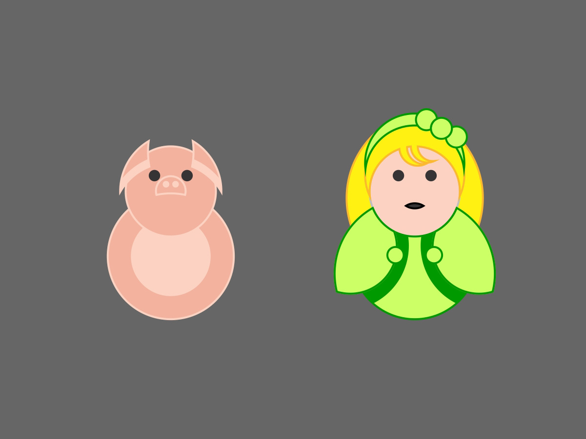
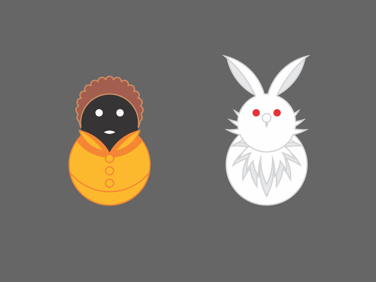
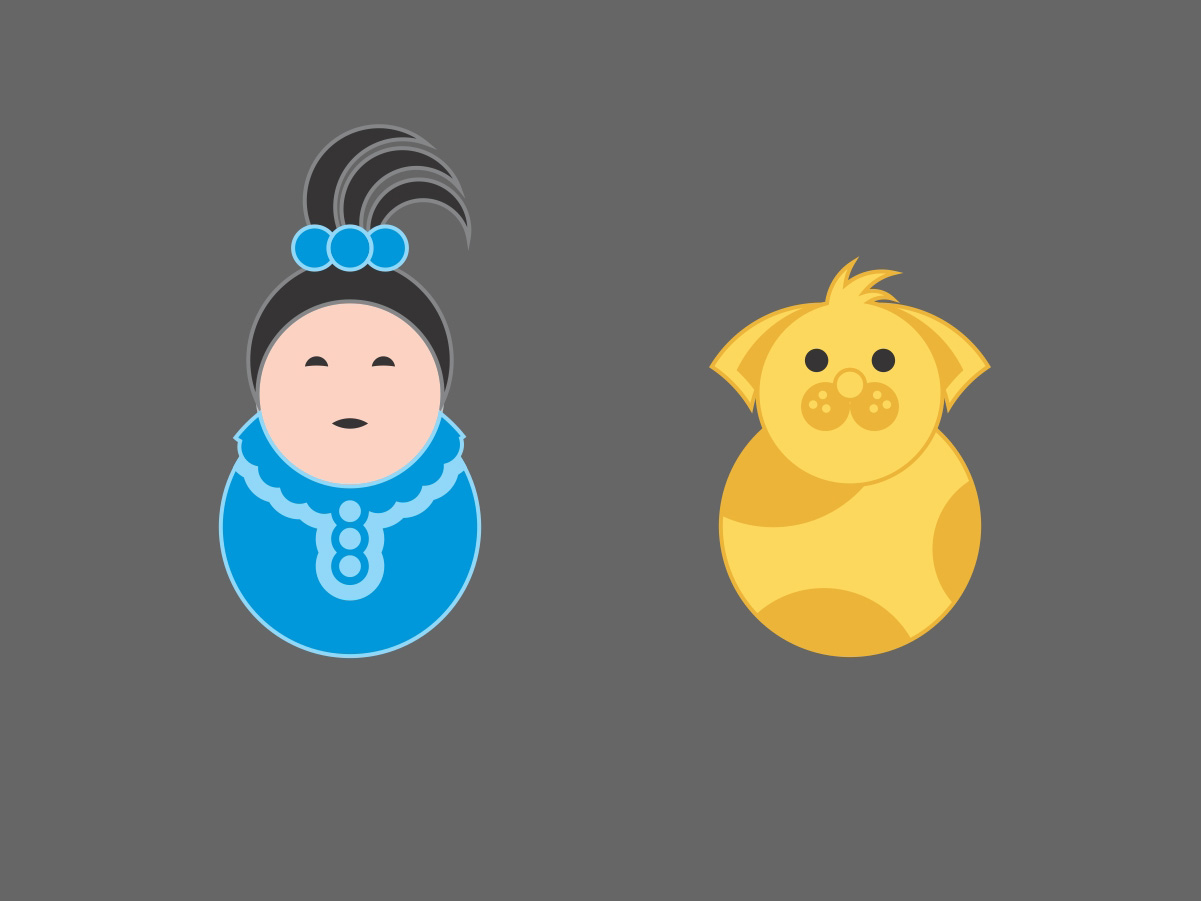
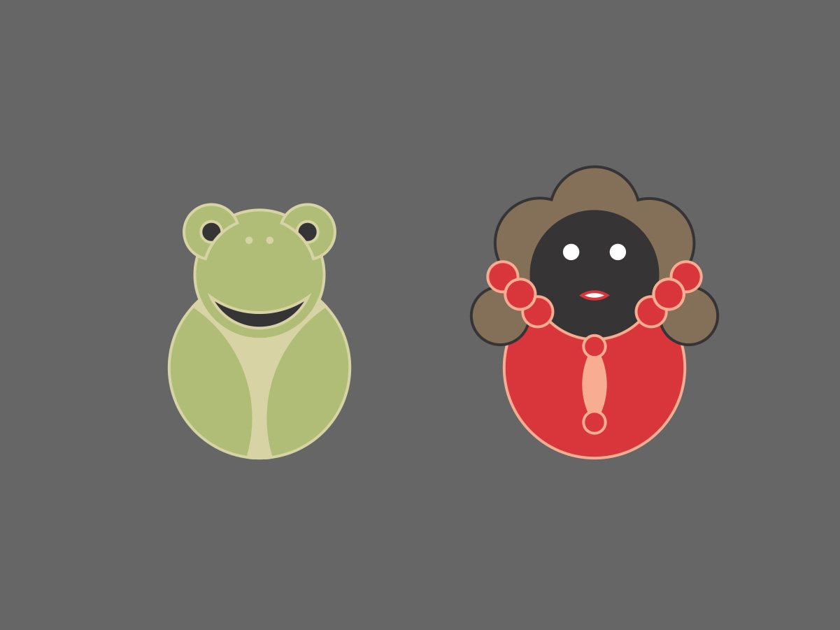
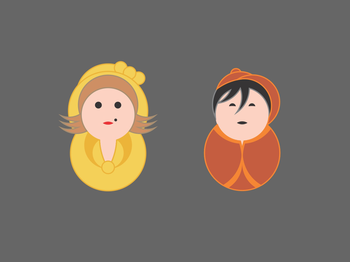
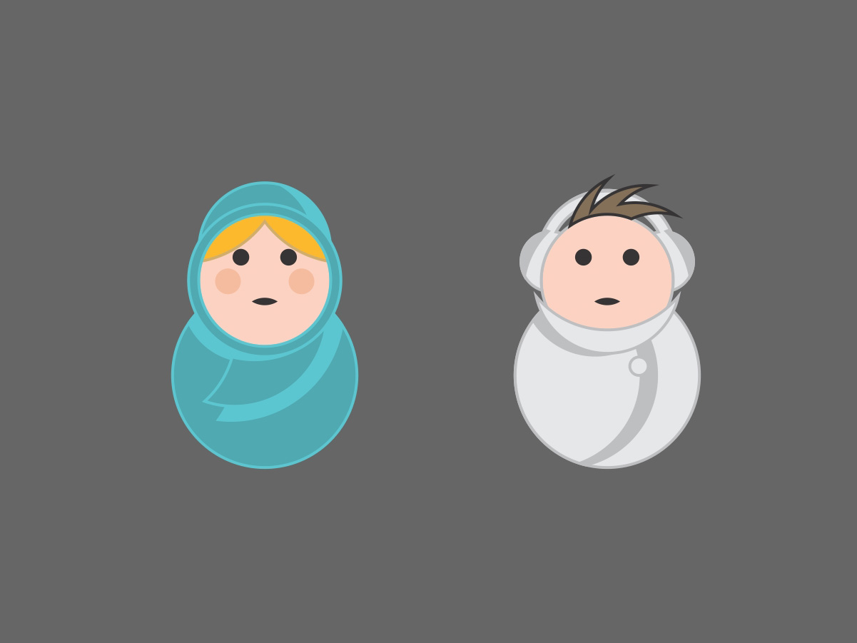
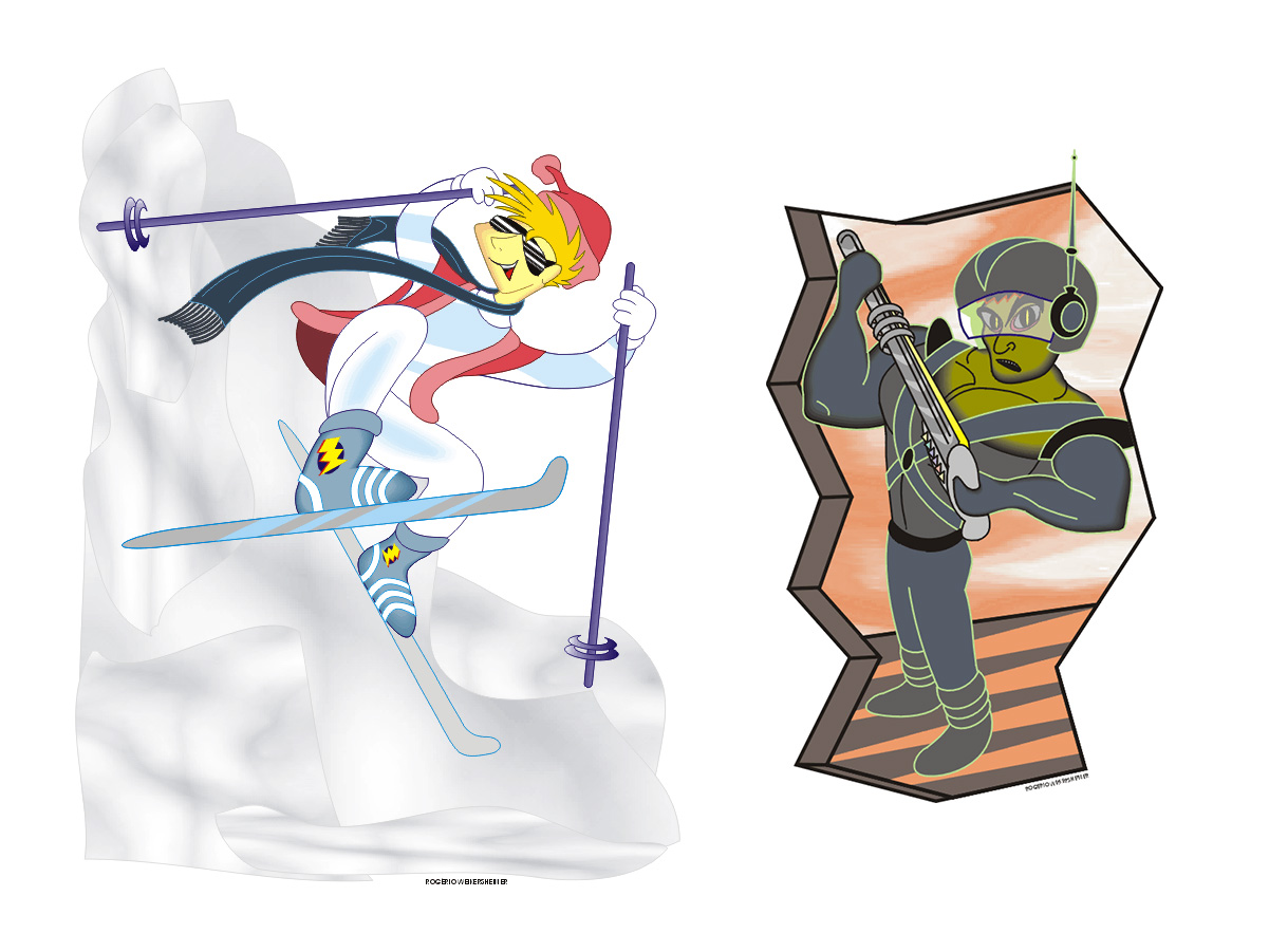
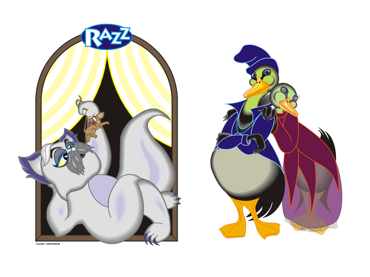
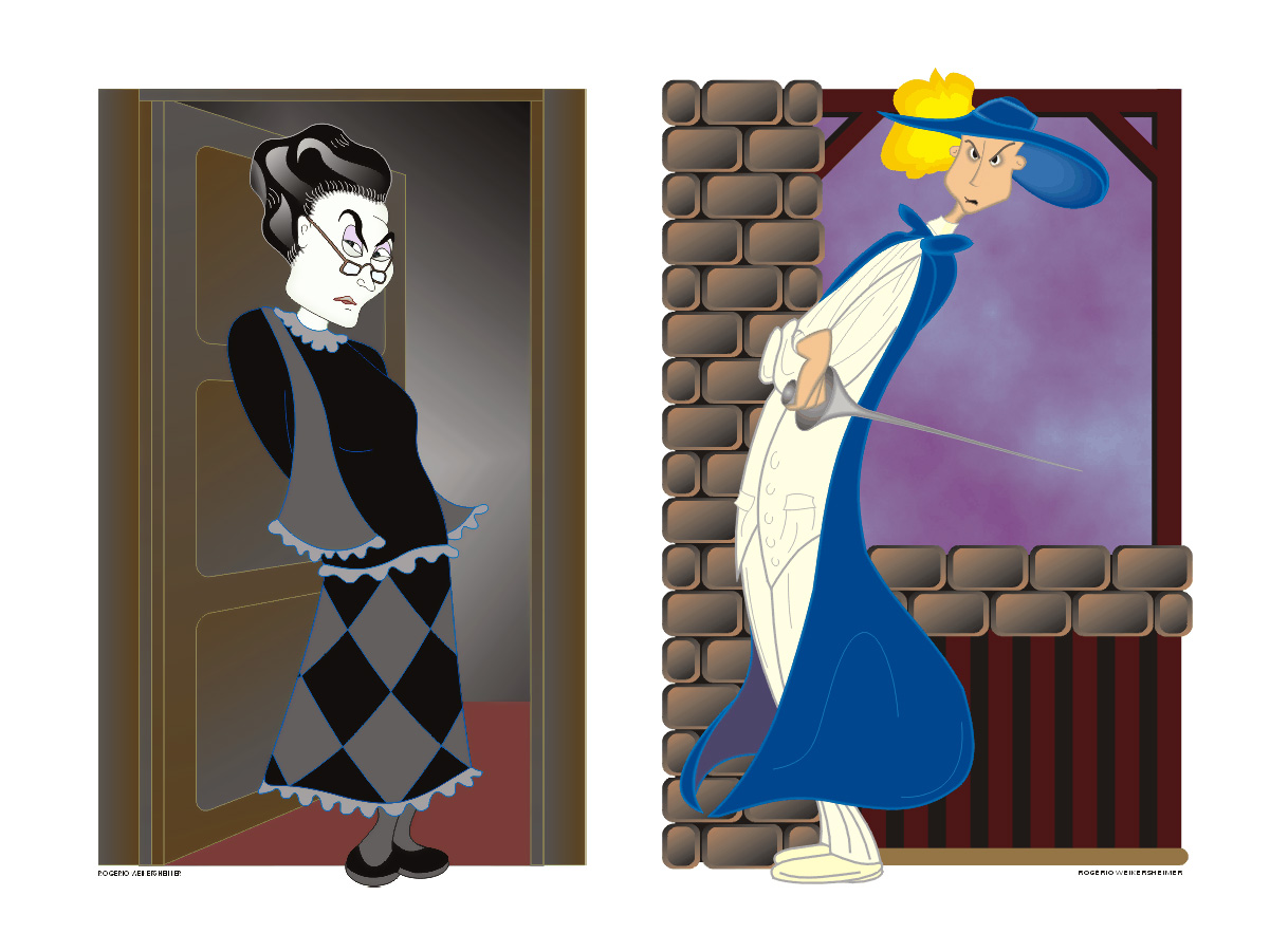
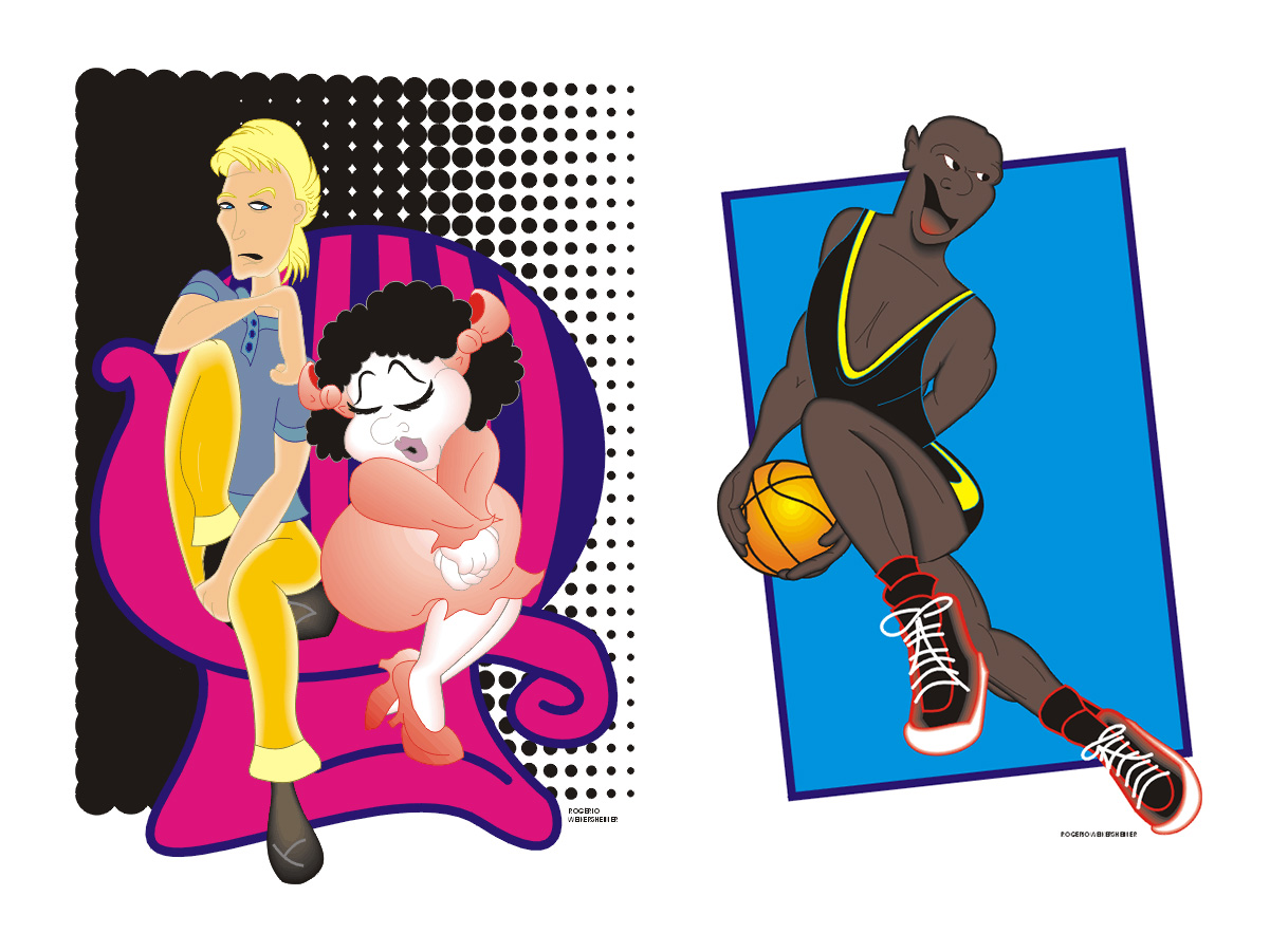
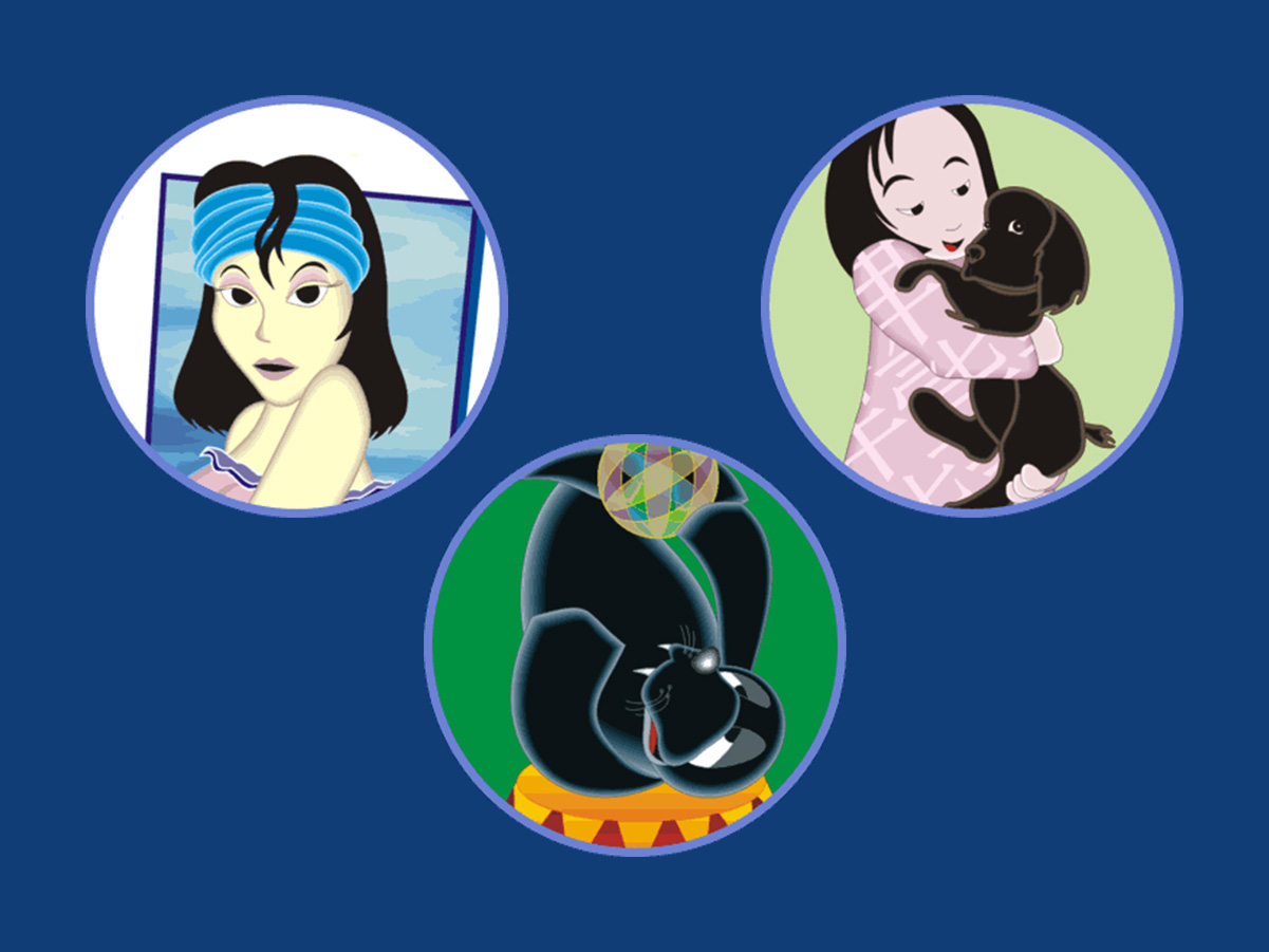
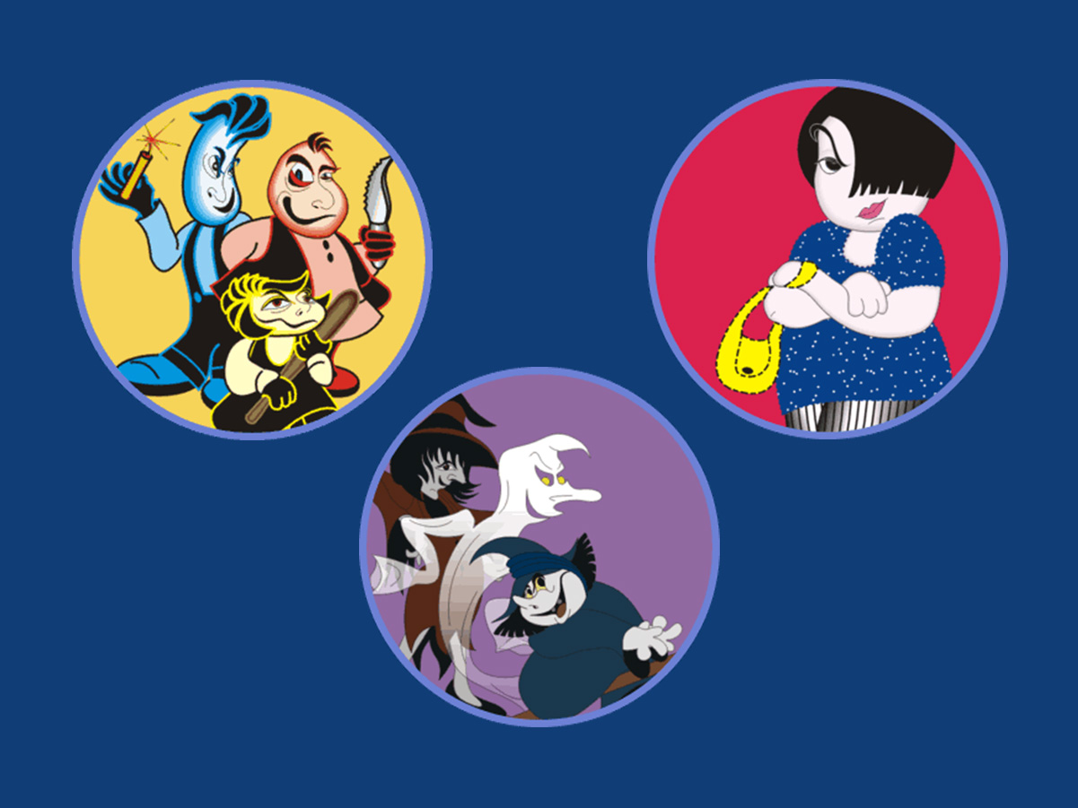
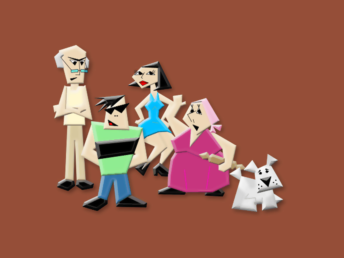
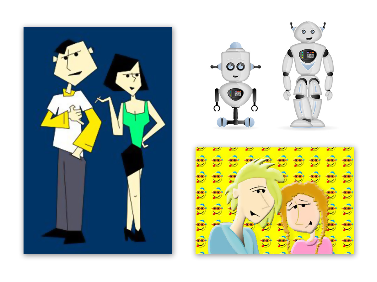
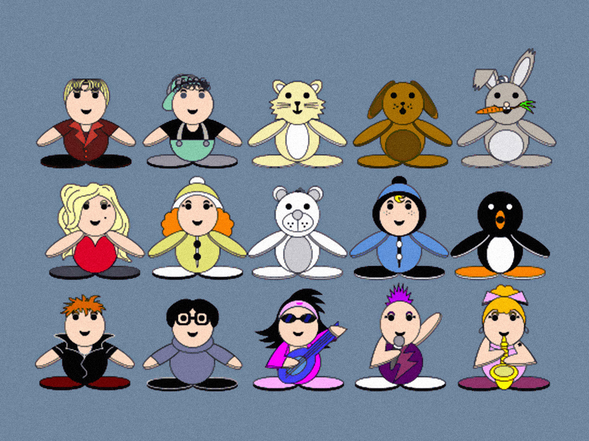
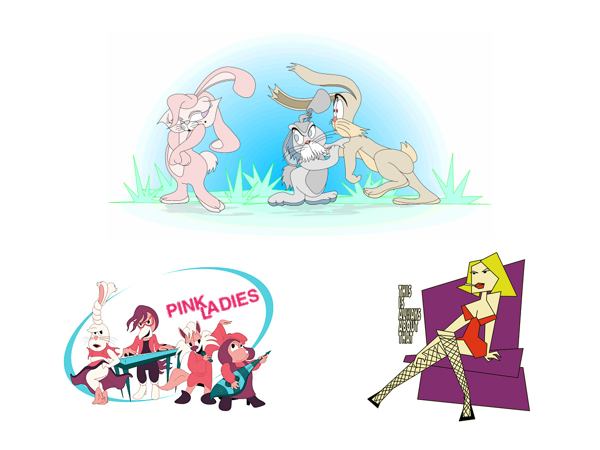
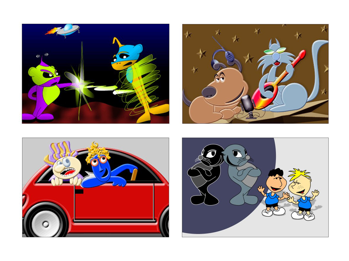
Drawing characters has been part of my life since I was young — always as a hobby, a creative exercise and a way to relax, with no particular commitment or goal. This selection brings together characters created freely, drawing on imagination and experimentation, exploring a variety of styles.
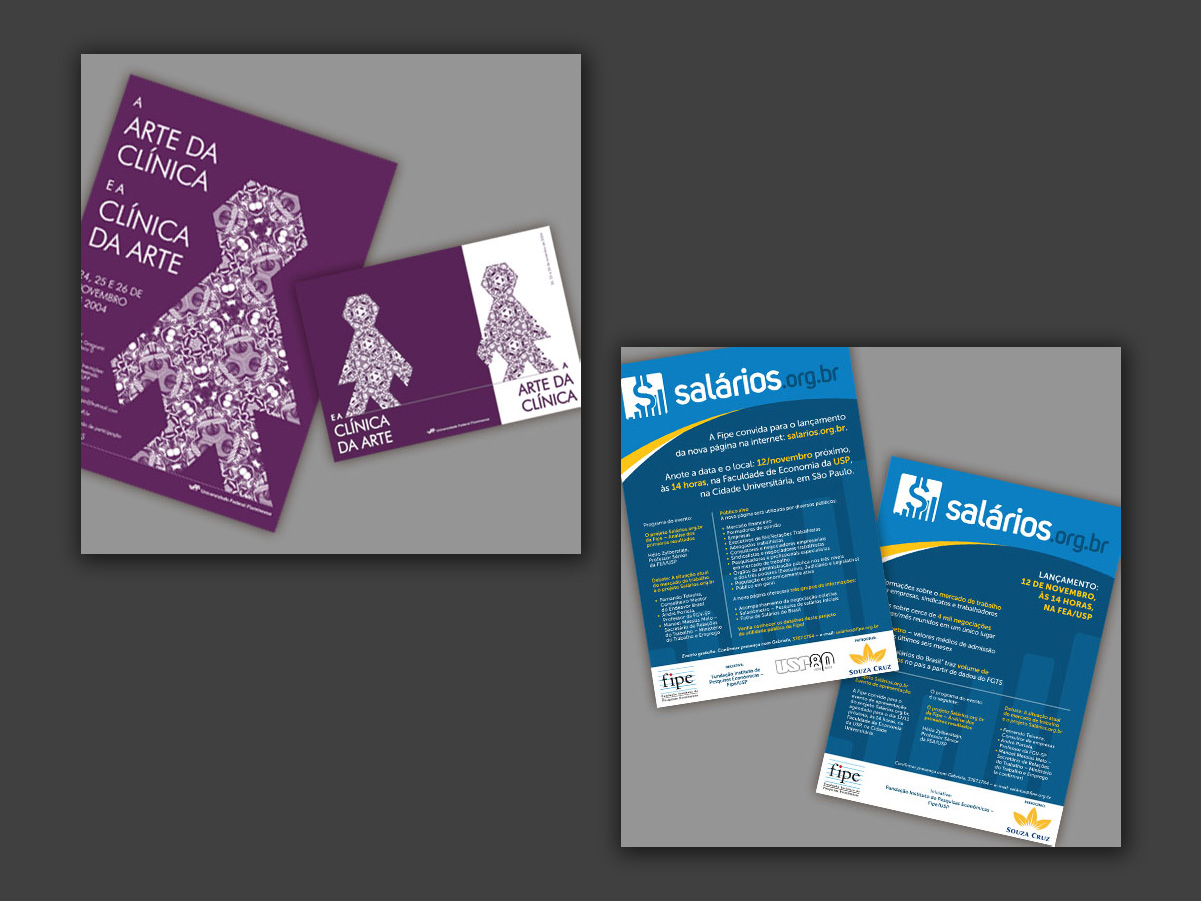
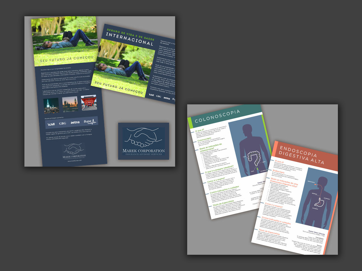
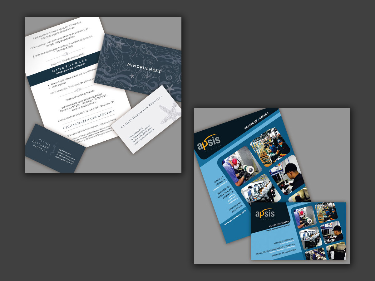
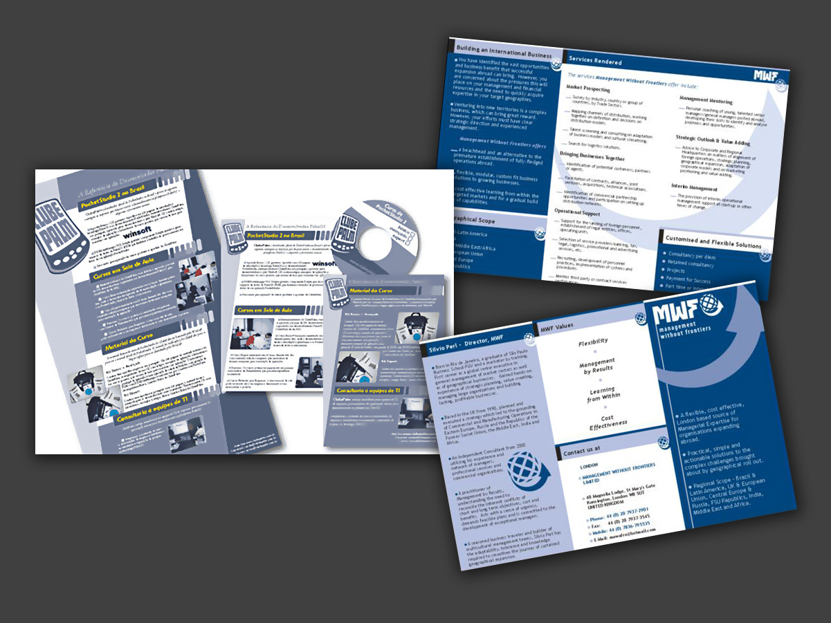
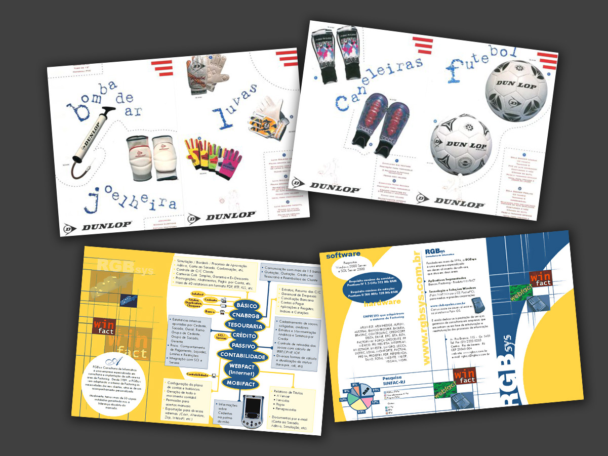
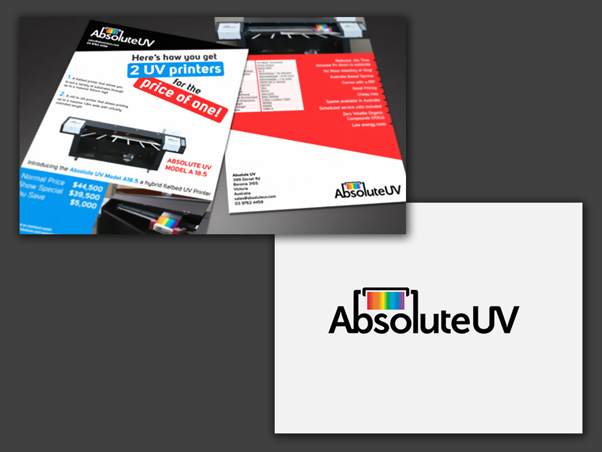
A collection of promotional graphic pieces, including flyers, folded brochures and other printed materials. These are works from different periods, preserving the visual languages and solutions typical of their time, each developed according to the client’s brief.
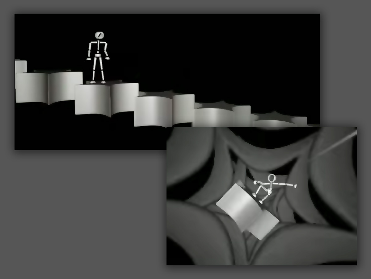
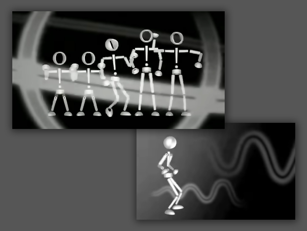
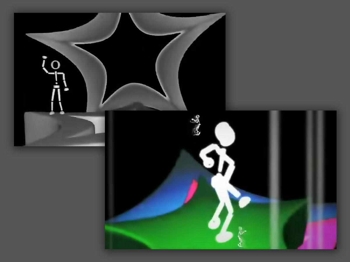
Academic post-production project: concept, art, modeling, animation, lighting, rendering, VFX and final edit. All the work was done digitally, at a time before the AI tools available today.
Music: rawk (rawkbr@hotmail.com). Lyrics: Frank Haguio.
The full film can be watched in this video.
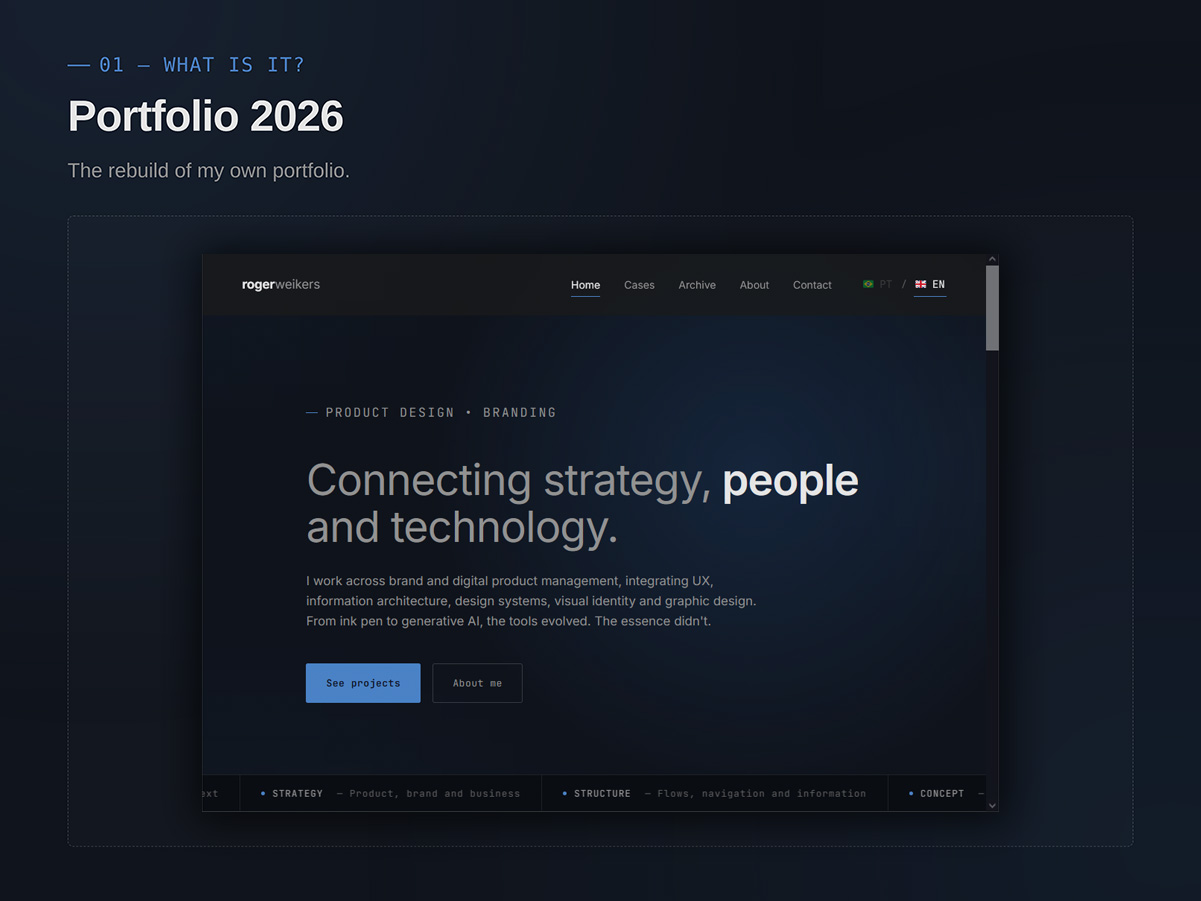
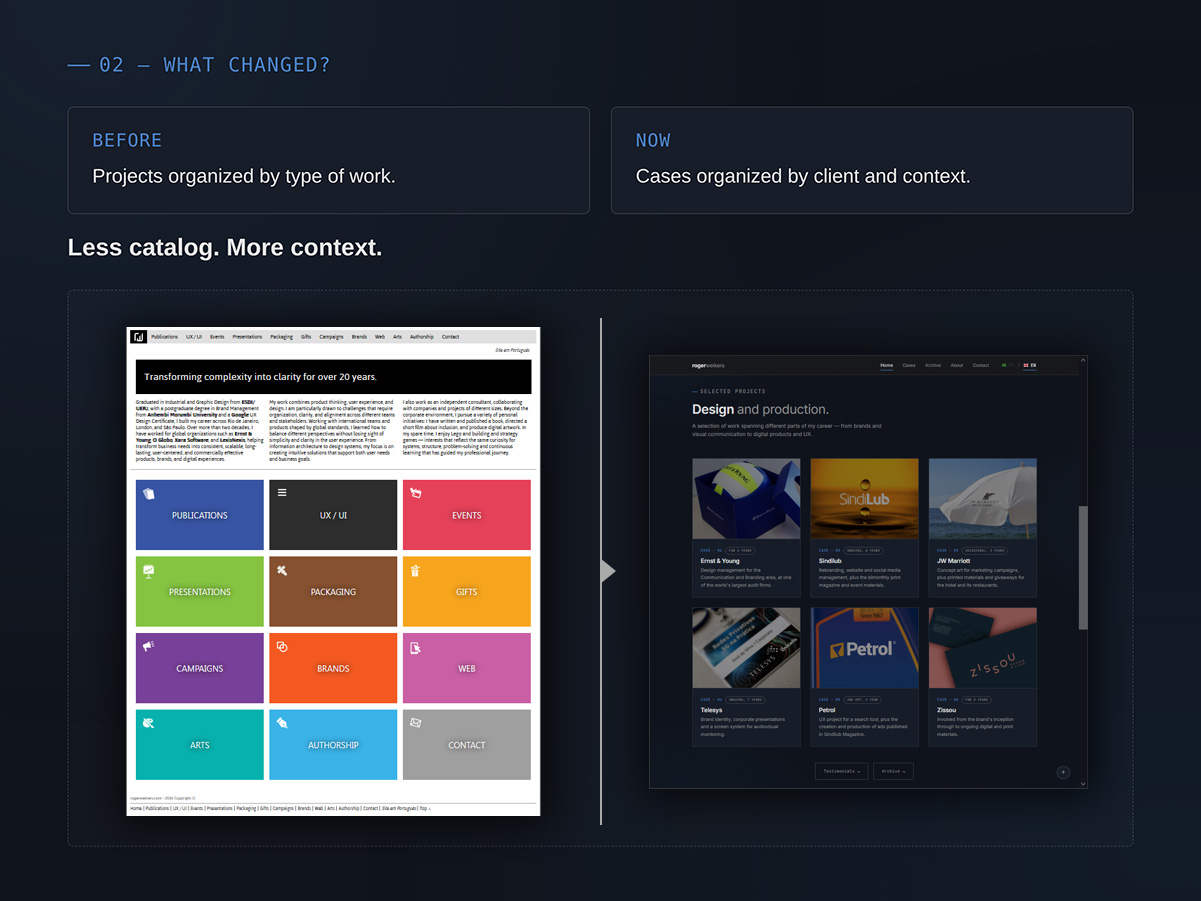
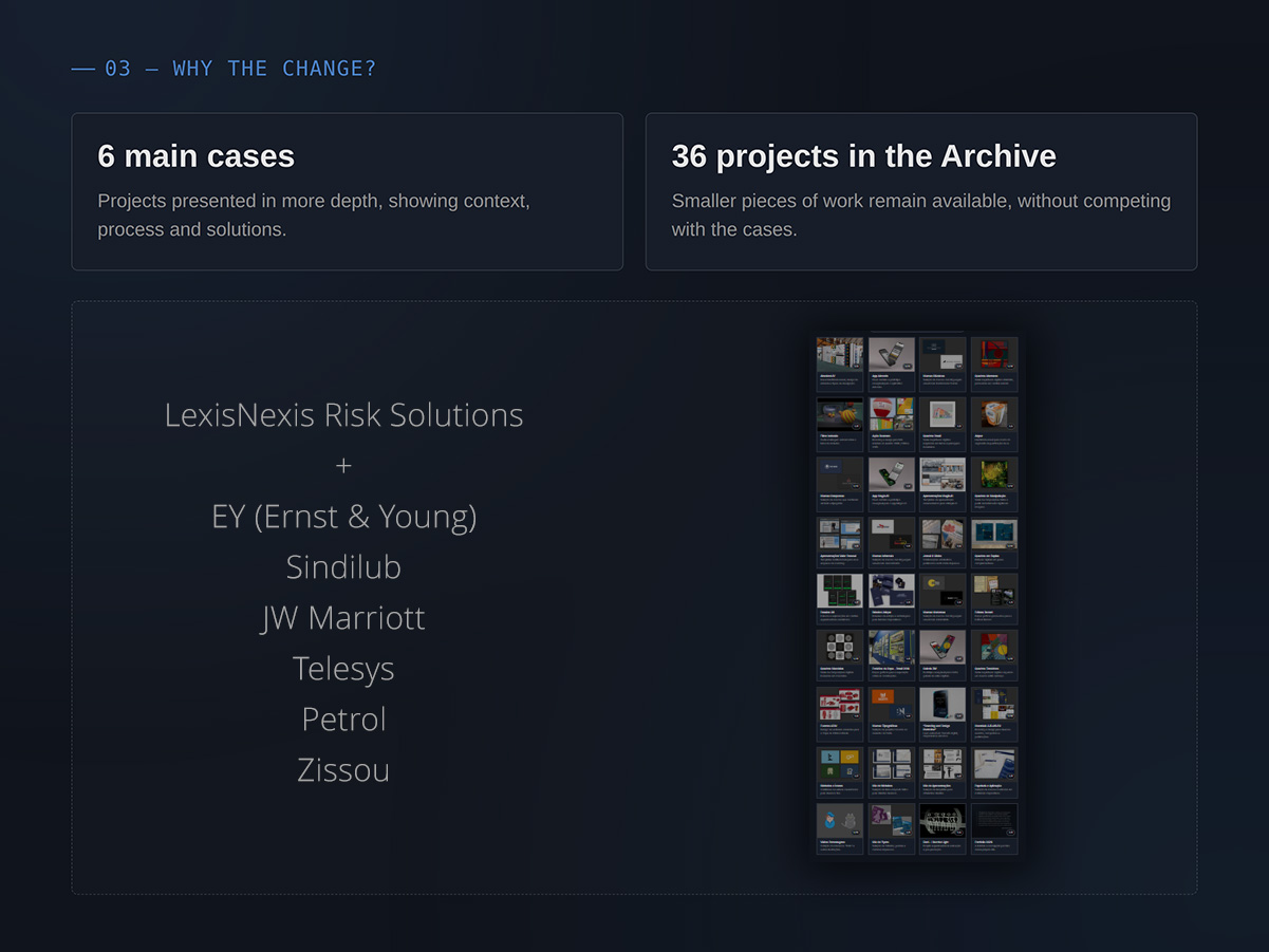
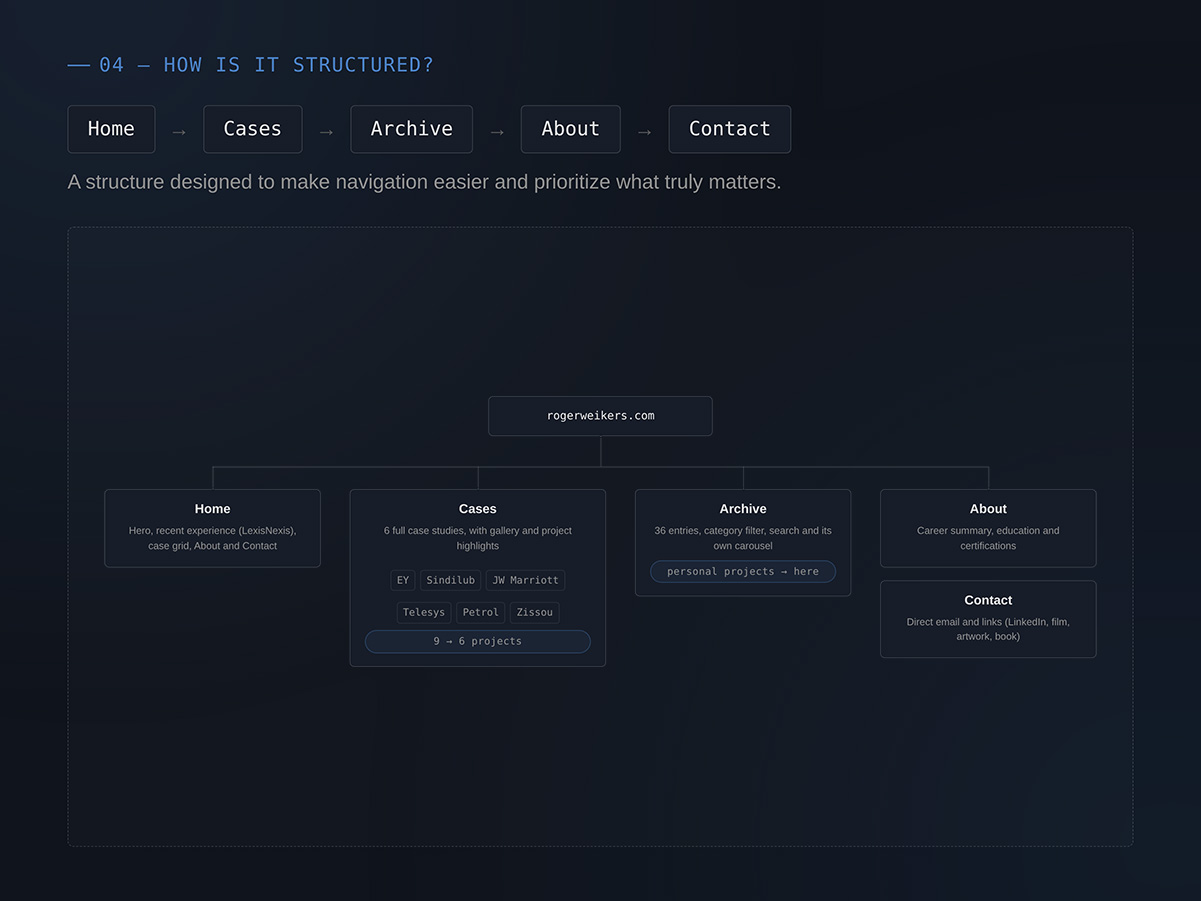
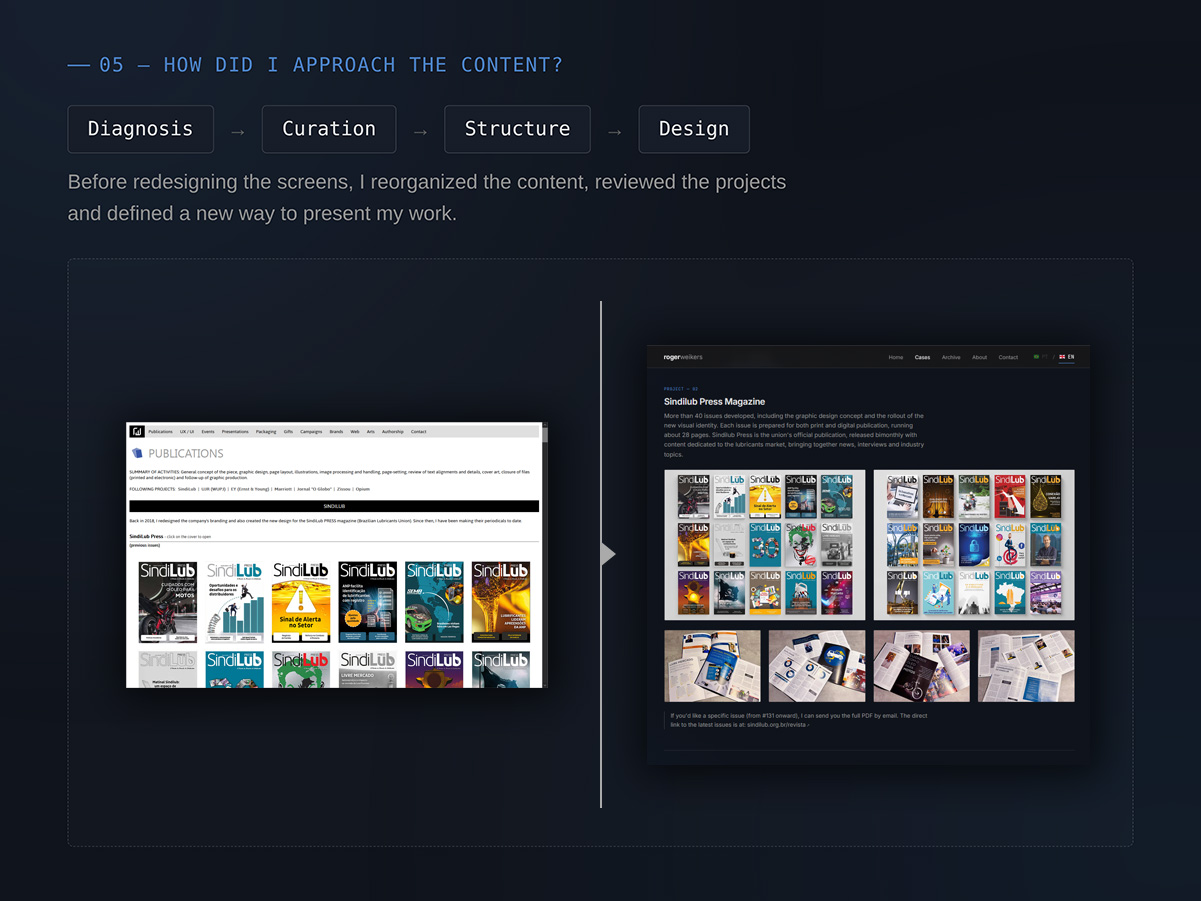
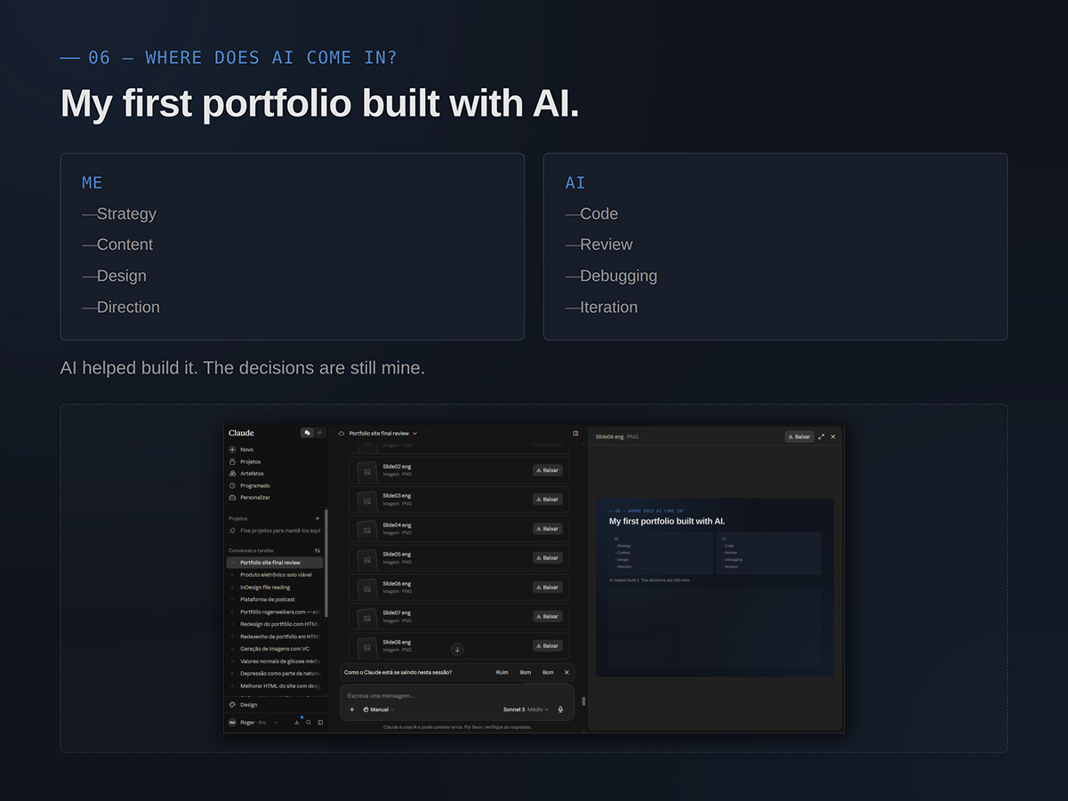
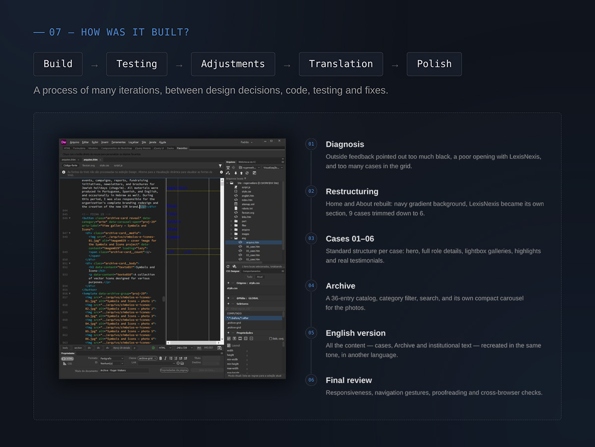
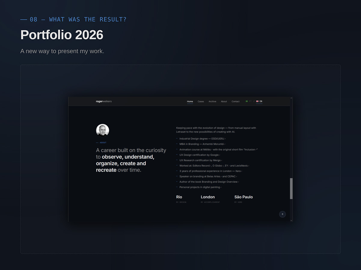
Here I’m making room to share a bit about how this very site/portfolio was built. I personally handled every detail: structure, logic, organization, navigation, text, images and finishing touches. After all, it’s no simple task to “squeeze” more than 30 years of career into a single virtual file. For building the HTML, I had Claude as support, and used GPT and Gemini mainly to review and polish the text.